WordPress decompresses the image size of the final renders but all of the RAW images and Maya/Nuke project files can be found here – https://mega.nz/file/twwTiIDD#vLxlNVnJHXkn6mjx0I4zi_lXWlKoOOHpP0h9nR3_P5M
Component 1 Recap:
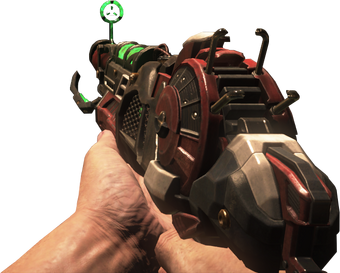
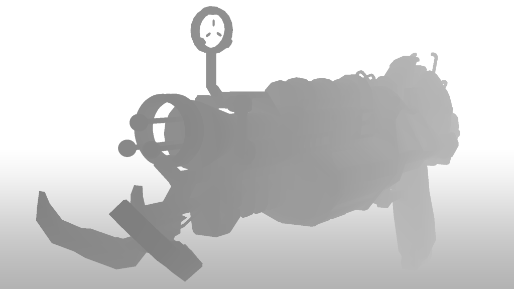
Within component 1 I managed to make good progress with modelling a Ray Gun Mark 2 from Call of Duty Zombies. This weapon is a fictional “futuristic” wonder-weapon designed to fight off against the undead hoards.
From Wikipedia: “The Ray Gun Mark II is a wonder weapon that was released alongside the Zombies map, Buried, and is featured in all Zombies maps in Call of Duty: Black Ops II, in Call of Duty: Black Ops III in all the remastered maps featured in the Zombies Chronicles map pack, and in Call of Duty: Black Ops 4 in Zombies and Blackout. It is the successor and the evolution of the Ray Gun, although, unlike its predecessor, the Ray Gun Mark II fires in three-round bursts with no splash damage. It also has a very high penetration ability, capable of killing many zombies with one burst. Its successor is the GKZ-45 Mk3.“
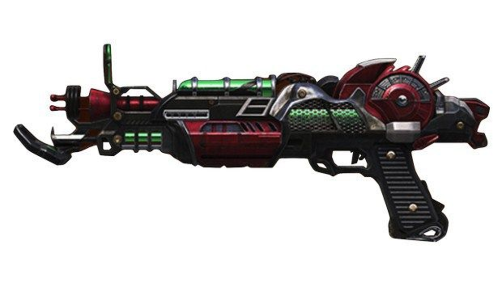
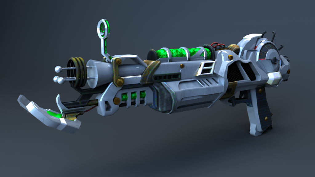
Here is what the gun looks like that I used for inspiation:

Within component 1 I had pretty much completed my asset besides some further adjustments that I needed to make.
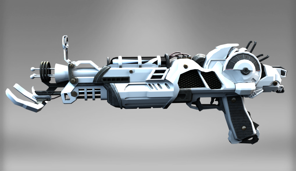
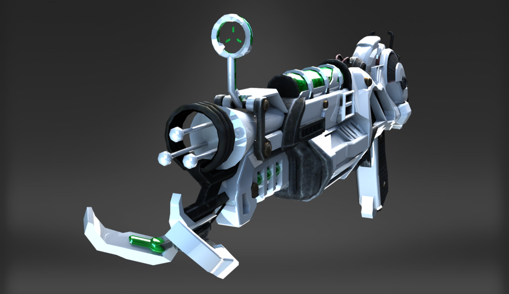
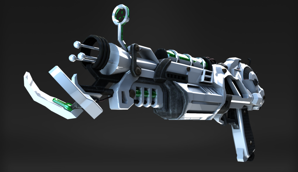
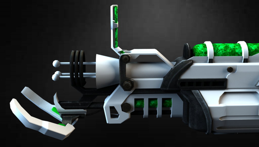
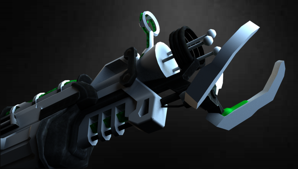
Here are my *non-final* final renders from component 1:


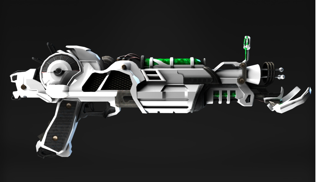
With green ammo/optic glow:


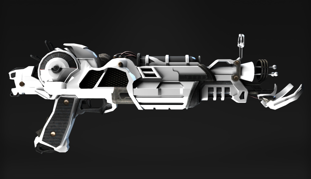
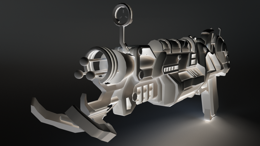
These following renders were using the “Lambert” surface shader, as apposed to the “Phong” surface shader:


For these last few renders, I applied this texture file onto the white surface – https://www.deviantart.com/jrmb-stock/art/Dream-texture-86290571


For my weapon asset, I used textures for the Ray Gun Mark 2 from Call of Duty Black Ops 2 directly from the PC files of the game – https://store.steampowered.com/app/202970/Call_of_Duty_Black_Ops_II/
These are the texture files that I used:
I found applying the textures and UV unwrapping to be pretty straight forward within component 1 and didn’t struggle at all in that regard.
Similarly, I used this red texture instead of the green one from Call of Duty Black Ops 2 to see what it would look like:
However, I preferred the green to red, as the red looked like blood was flowing through the weapons. This looked cool but I felt like the green made the weapon look more “alien”.
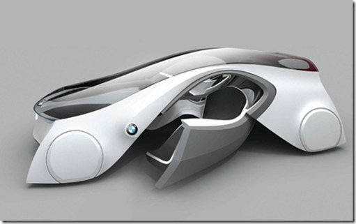
During component 1, I tested the water with various different alternate colour schemes (such as pink and blue) but I ended up settling with a contrast between black and white, as I felt like it made the weapon stand out and look really sleek. It also retained a very “futuristic look” and made it look more unique compared to the design that I was basing it off of. The Ray Gun Mark 2 is supposed to be a very powerful weapon so it should look a lot more advanced than modern technology and a lot of technology is already utilising this “trendy” look too:
Furthermore, most websites and furniture are taking on this colour scheme trend too – I think that it is popular due to simplicity and the fact that it’s not over-cluttered with a bunch of different colours.
Most futuristic concept designs use this colour scheme too:


I took big inspiration from this in choosing the colour scheme of my weapon. It is why I also used the Phong material for my asset so that it would have high reflectivity and look polished/refined like the above examples showcased.
I wanted to ensure that it stood apart from its inspiration and wasn’t just a direct re-creation, at least in terms of its aesthetic, and the black/white camo made it look very different to its red counterpart.
Feedback:
For component 1, I was given feedback from my tutor on how to improve the topology of the front of my weapon. As you can see, the front of the weapon is very jagged and so I needed to smooth it:
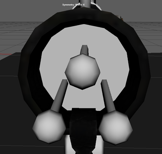
In order to improve the topology, I simply used the smooth tool to create more subdivisions.

Here is the result:

Overall, I am much happier with the look of the weapon and it massively helps improve the sleek/clean look that I was going for:
The next piece of feedback that I was given from my tutor was to give more detailed reasonings for the choices of my references used to help me model my weapon.
Here are the reference images that I used:
First of all, I used this side shot of the Ray Gun Mark 2. I used this because it gave a perfectly perpendicular view of the side of the weapon that allowed me to easily base my model off of and distinguish the shapes.
Contrastingly, when hunting for reference images online, I found this side shot of the Ray Gun Mark 2, however, if I would’ve used this as a reference image instead, it would’ve made it more difficult to model. This is because it is on an ever so slight angle and that is why at the front of the weapon you can see the back node and prong, despite them being directly behind the front node and prong, so should not be visible at a right angle.

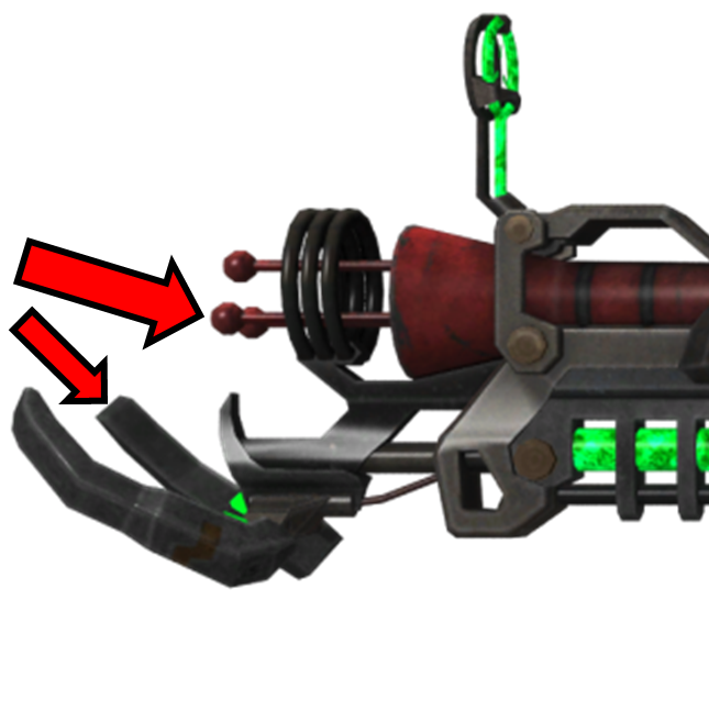
Should I have started modelling my weapon with the above reference, my dimensions/proportions would’ve been slightly off.
The next reference that I used was a front and back perspective of the weapon. Specifically, I found a blueprint of the weapon that outlined the features of the weapon quite distinctly in bold white. This made it much easier to model as I could clearly see where each part was.
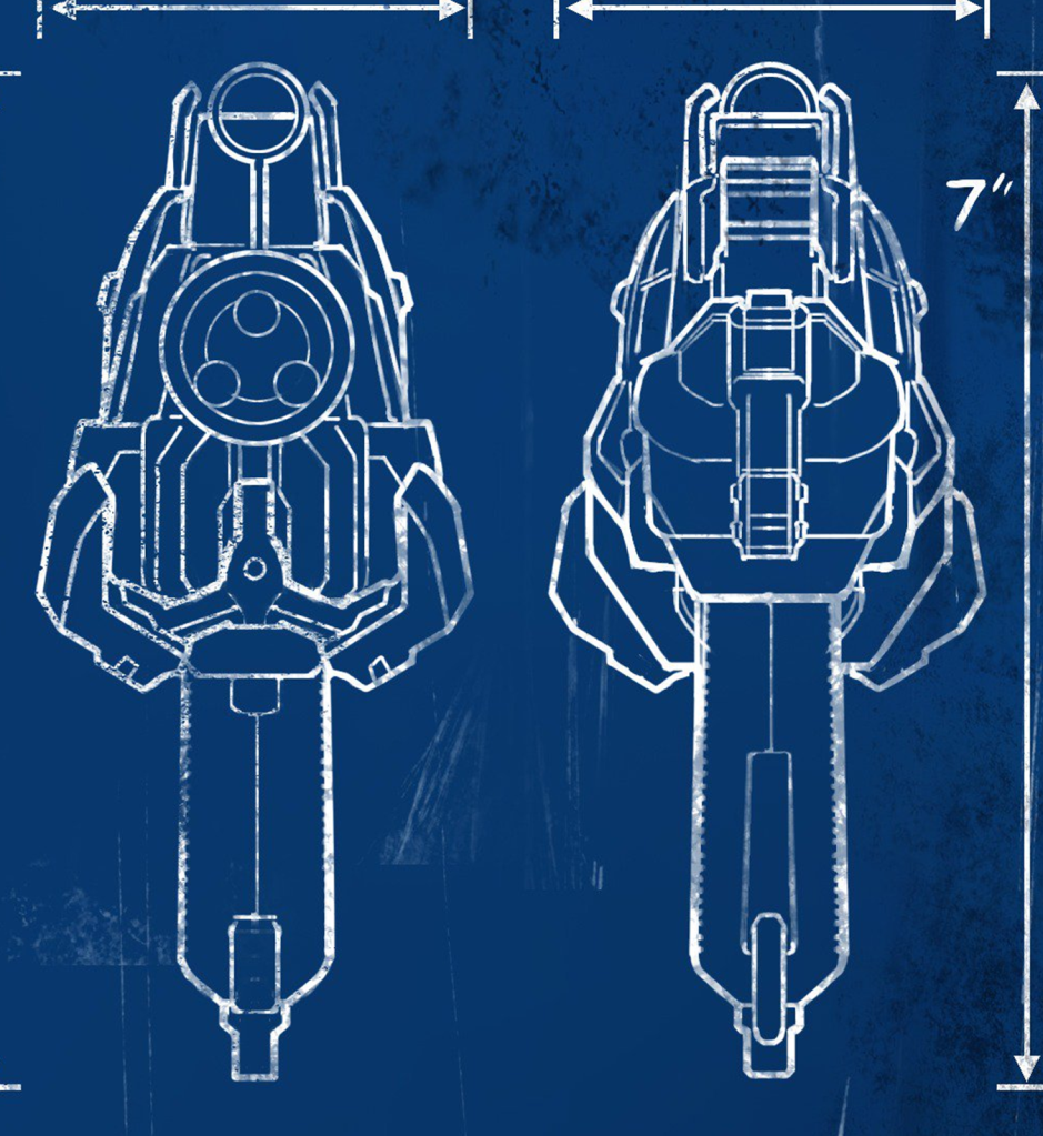
However, despite this benefit of using these images for reference, there were some minor bits of detail missing. To aid me, I used this render of the gun simply for clarity on some fine details for the weapon. I didn’t directly import this image into Maya but rather just glanced at every now-and-again whilst modelling to make sure that I wasn’t not missing out on any key details:

Unfortunately, I couldn’t find any images online that showcased a top-down or bottom-up view of the weapon, and so I played the game myself to obtain the weapon. After which, I then went into the games’ theatre mode to take screenshots of those perspectives myself:
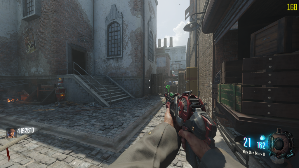

These helped me a lot when it came to modelling the top and bottom of my asset, although I did pretty much have it finished just based off of the side view of the gun.
This is what it looked like in Maya once I had imported my reference images:

That was all of the constructive feedback that I received for component 1, however, I was still not entirely happy with the outcome of my asset. I think that I did exceptionally well with modelling my asset from simple shapes to create a much more complex one, and I love the colour scheme that I chose, but it still needed some finishing touches.
I felt as if my weapon looked a bit “too clean”. This is because I was not using a texture file for the white surface of my weapon and had it set to plain white. Although it made the weapon look super clean, it looked as if it was straight out of a factory and had never been used before. I wanted the white to have some slight smudges on it and variation in its tonality.
After coming to this conclusion, I began to search online for appropriate textures for my asset and I ended up finding this image that I felt worked quite nicely:
SOURCE: https://www.poliigon.com/texture/smudges-large-001

The only issue with this texture is that it wasn’t large enough for my weapon, so when I would apply the texture onto my asset, it would stretch and look distorted/low quality.
In Photoshop, I slightly increased the contrast of the texture and duplicated/repeated it to look as so:

I repeated the image so that it would align perfectly and there would be no standout repeating of the texture when it came to applying it to my asset.
This is what my asset looked like with this texture applied:

Personally, I think this looks slightly better than before, as it adds an ever so slight “used/worn” aspect to the aesthetic.
Additionally, in Photoshop, I played around with increasing the saturation, brightness and contrast of the textures to see what the outcome would look like:
I do like this design, however, I preferred the darker look of the original texture and this looks too oversaturated, so I decided to not use this for my final asset. It also made the texture look lower quality for some reason.
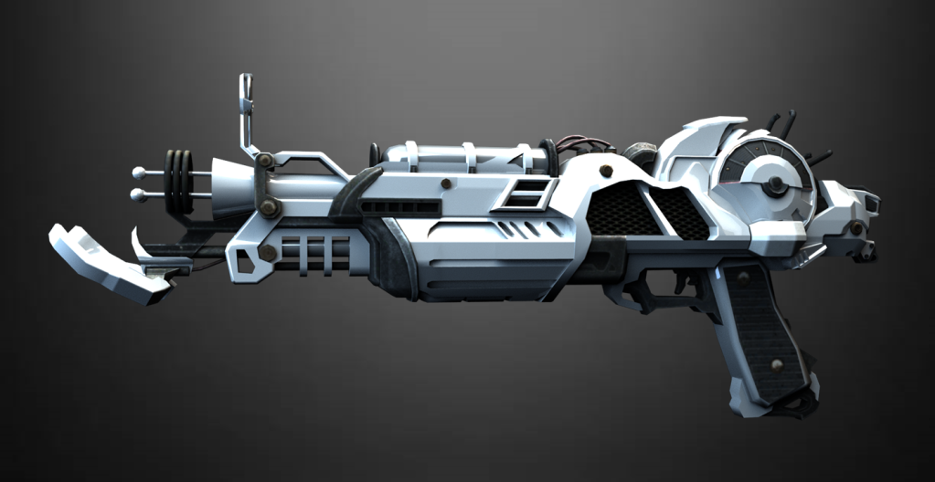
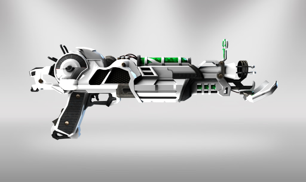
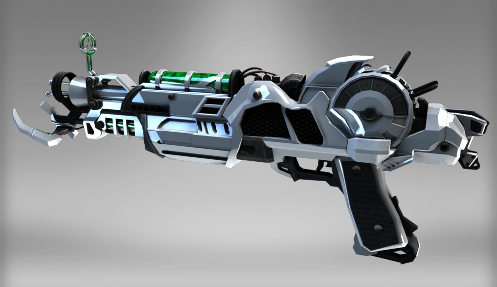
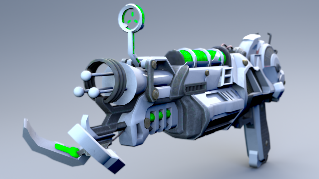
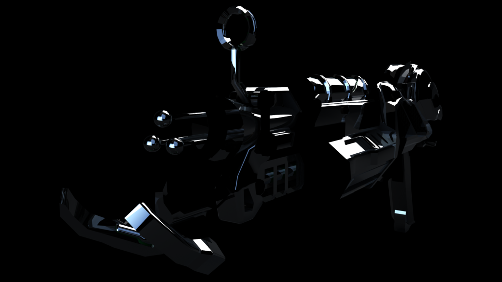
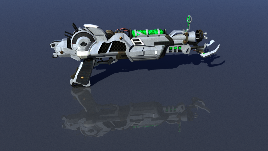
As you will have seen from my renders from Component 1, I rendered a few different alternate looks to my weapon:
With black/grey ammo/optic:
With green ammo/optic glow:
Using the “Lambert” surface shader, as apposed to the “Phong” surface shader:
Using this texture file onto the white surface – https://www.deviantart.com/jrmb-stock/art/Dream-texture-86290571
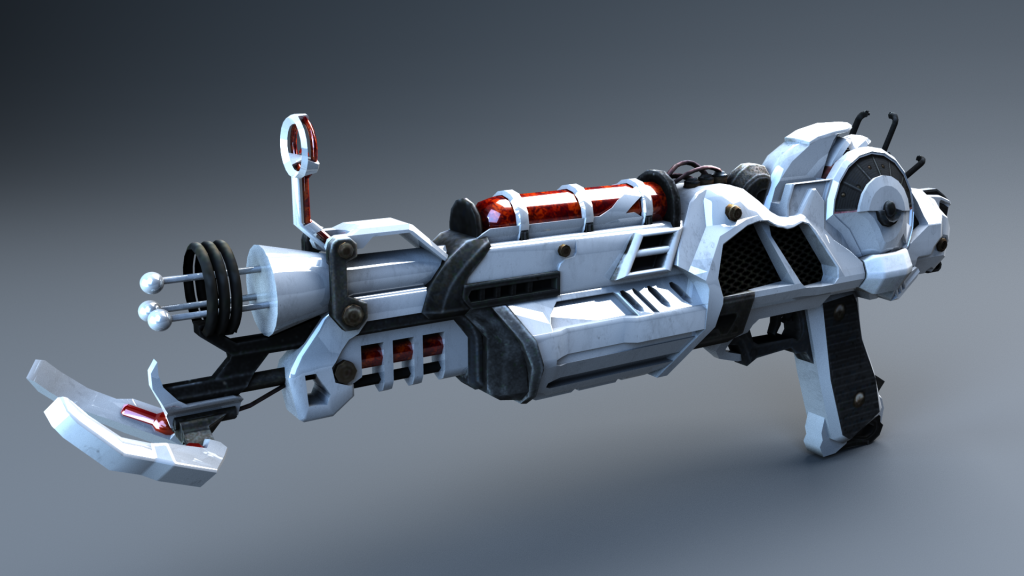
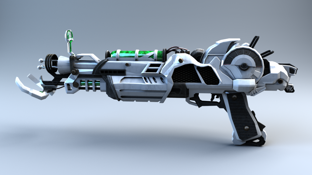
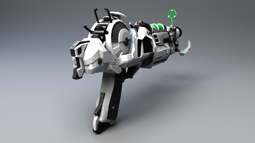
Before I could complete my final renders for component 2, I had to decide on which aesthetic I preferred for my final asset. Obviously, I ruled out the last style straight away since I had already found a better texture for the white portion of the weapon. In the end, I decided to use the Phong surface shader combined with the green ammo/optic glow. I think that the green stands out a lot more than the black ammo/optic and makes it look a lot more futuristic. The black blended in with the other dark parts of the weapon too much. The green glow also looks fluid and more dynamic. Additionally, I preferred the Phong shader to the lambert because the lambert shader made it look like a toy weapon with little reflectability. The Ray Gun Mark 2 is supposed to be a really powerful, advanced piece of weaponry, and so I wanted it to reflect and stand out. The Ray Gun Mark II is made of a made-up element from space called “Element 115” that has the capability to reanimate the dead. It makes sense for it to be shiny, like gold/silver, to give the player (should the asset be used in a video game) a sense of power-wielding it in their hands. It is not this shiny within Call of Duty, however, I wanted my version of it to look more powerful and rare.
This is the final aesthetic for my weapon that I was happy with:


Lastly, I did ask some friends/peers about what they thought of my asset for further feedback but they all told me that it looked pretty much perfect so it didn’t really help much with further constructive criticism.
Concept Designs:
Before I could complete my final renders and beauty pass, I first had to complete concept artwork for my asset. This was to help give me an idea of staging and proportions.
Here are my completed design sketches:
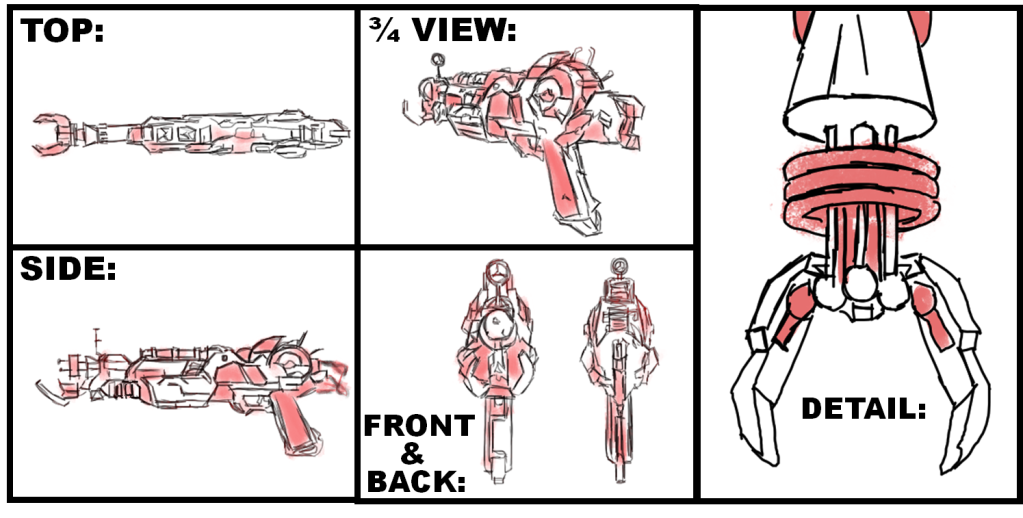
I sketched 5 different perspectives of my asset: front, back, side, top, and a three-quarter view perspective. In addition to this, I also sketched an up-close view of the front of my asset, due to this area being quite complex and intricate compared to the rest of the model. It was important for me to be able to gauge the fine detail prior to completing my final renders. These concept designs allowed me to see how my weapon would be displayed when rendered and helped when modelling to get the dimensions and proportions accurate.
Beauty Render Pass:
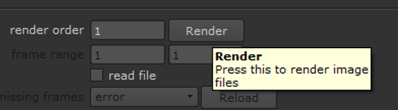
Moving on, I began to execute a beauty render pass. I used the following render settings in Maya:

For my renders, I used the Arnold renderer – this uses mathematical algorithms to calculate how the light would naturally reflect off of my object in the real world, and so I felt as if this would look a lot more realistic than simply using the Maya Hardware renderer.
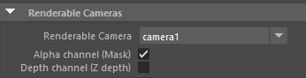
When rendering, I positioned cameras in the view that I wanted, and changed the renderable camera to whichever camera(s) I wished to render:
A good tip that I found myself using was renaming my cameras to their appropriate name to make it easier for me to distinguish between:

I setup a multitude of area lights with this “infinite” backdrop for an ambient look:

I messed around with various settings for the lights, and made some of the lights light blue to give the scene a nice dynamic shade between blues and greys.
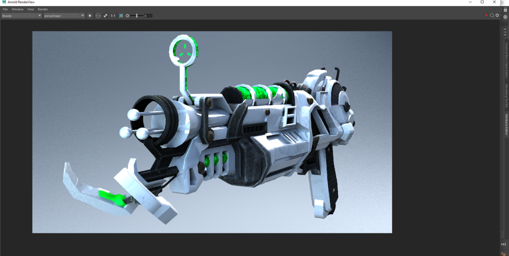
Once my render settings were setup I positioned my camera in the perspective that I wanted to view my asset for the beauty render pass:


From here, under the Arnold tab I clicked on Render:

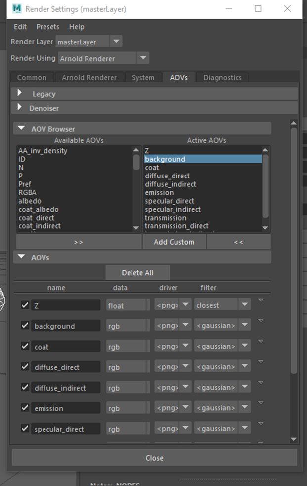
After this, I went into the Render Settings > AOVs and selected the appropriate Active AOVs that I wanted to be able to alter within my Beauty Pass:

Now, within the Arnold Real-Time renderer I was able to select each AOV to display individually:

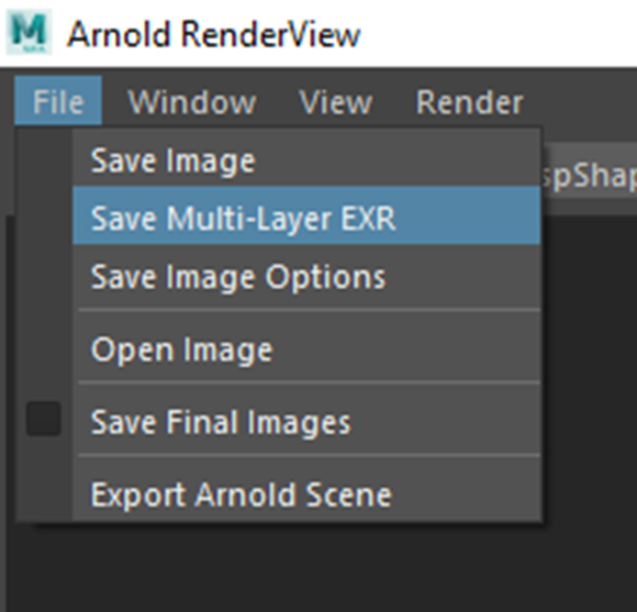
Next, I saved the beauty render as a “Multi-Layer EXR” so that I could access the individual AOV’s within Nuke:

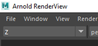
After this, I setup my Z-Pass:
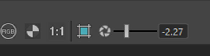
I had to lower the exposure because initially the render was plain white:
Here is what it looked like:

In order to save the image I had to apply gamma/exposure within the “Save Image Options”:
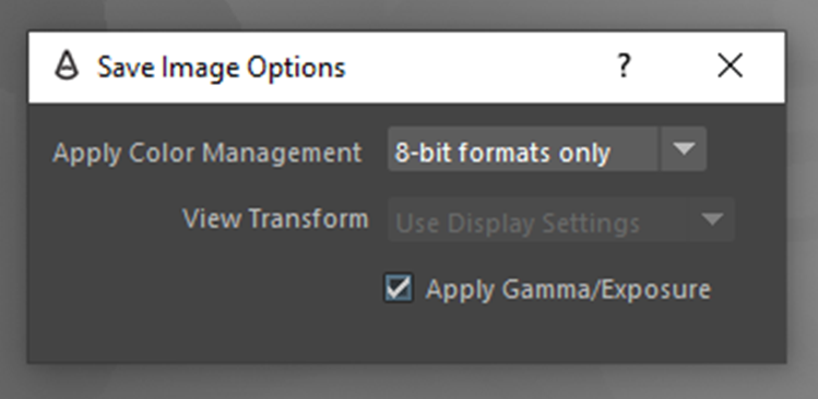
For some reason, when trying to save the image I kept on getting an error stating that it failed to apply the colour management options.
In order to fix this, I found that I had to go into the Maya preferences and “Enable Colour Management” and “Apply Output Transform to Renderer”:

This was the final result: (I added a backdrop from the above example)
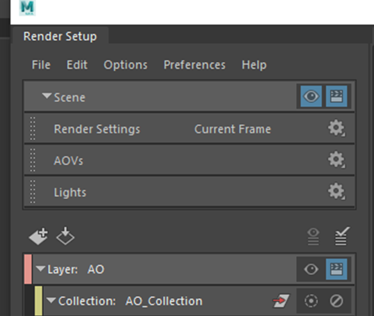
The final thing that I had to extract was the ambient occlusion. I did this by opening the Render Setup tab and creating a new render layer. I renamed it to “AO”. Next, I created a collection and renamed it to “AO_Collection”.
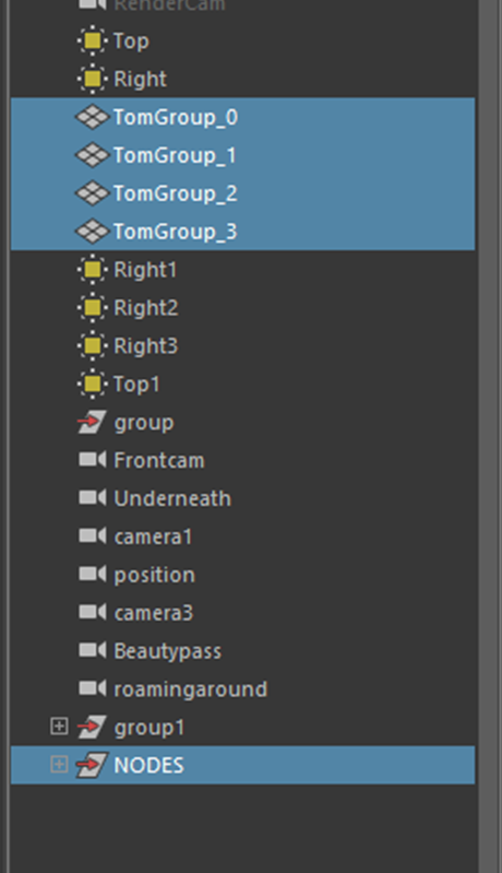
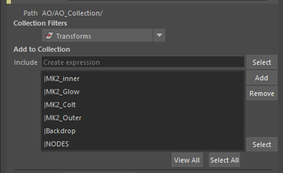
Then I added my asset parts and backdrop to the collection:
I set the collection filter to “transform”:
After, I created a shader override:
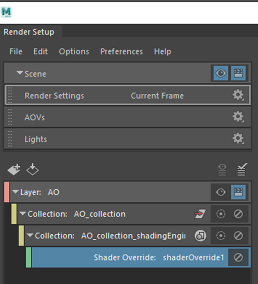
Then I applied “aiAmbientOcclusion”:


To display the ambient occlusion pass I had to click the eye to “Set layer as visible”. I could then switch between the beauty or Ambient Occlusion layers:

I adjusted the ambient occlusion setting slightly until I was happy with it:

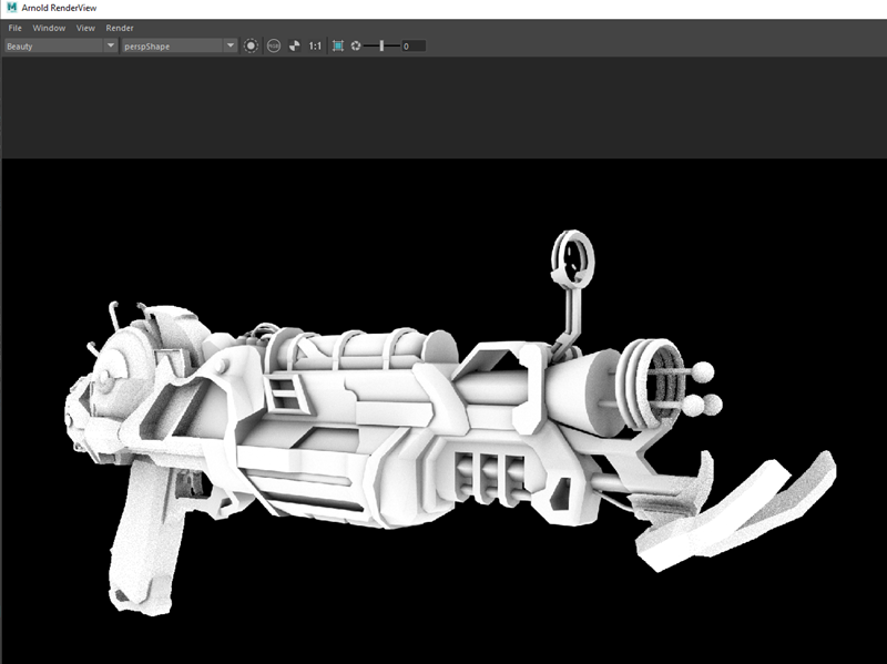
Then I rendered the ambient occlusion pass. This is the final result:
I am happy with how the ambient occlusion turned out because I feel as if there is good tonality and not too many areas that are too dark.
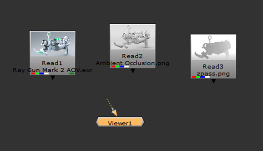
After I had exported all of the appropriate AOV’s, I created a new Nuke script. I created a project folder and saved my script file to the folder:
I then clicked “Script Directory”:
I saved all my renders within a sources folder for my project:

I imported the files into Nuke:
From here, I changed the directory of the read nodes to start with a “../”. This ensures that should I open the file on another computer, it will still be able to locate the source:

Once my project was setup correct, I followed this series of tutorials – https://www.youtube.com/watch?v=h25-ei9rtAs&list=PLs9xz23qLNJv2widQSXaxox9NAd_Plfl-&index=6&t=0s
This is what my final render pass looked like:

Having set up my pipes in this way it allowed me to alter the Z-depth, specularity/reflection, coat, ambient occlusion, and emission layers individually instead of all of these attributes being grouped into one render. I used the HUE shift to slightly increase the brightness, saturation and colouration of my asset, the Z-Defocus allowed me to create an illusion of depth by using the data gained from the Z-Pass to blur the back of the weapon making it seem slightly out of focus, the glow node allowed me to add slight highlights to the reflections on my asset as if the light was reflecting from them. All my nodes were named appropriately so that I could easily follow the pass and not get mixed up.

The goal of my beauty pass was to make my asset look a bit more life-like, vibrant and look more 3-D and I have managed to achieve that pretty well with my Beauty Pass, however, due to my asset being quite up-close I think that some areas are slightly too blurry at the front of my weapon.
This is where I had placed the focal point for the Z-Defocus node:
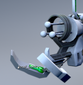
This was done because I wanted the focus to be around 2/5th’s from the front of the weapon. I adjusted the focus plain, size, depth of field, and maximum attributes to achieve as close to what I wanted as possible:
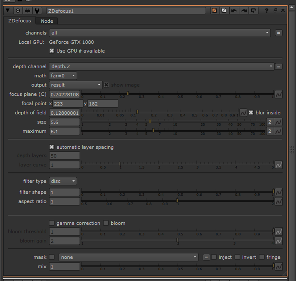
Should I carry out another beauty pass in the future I think I will practise more with using the defocus node to try and master this feature.
These are the settings that I used for the HueShift:
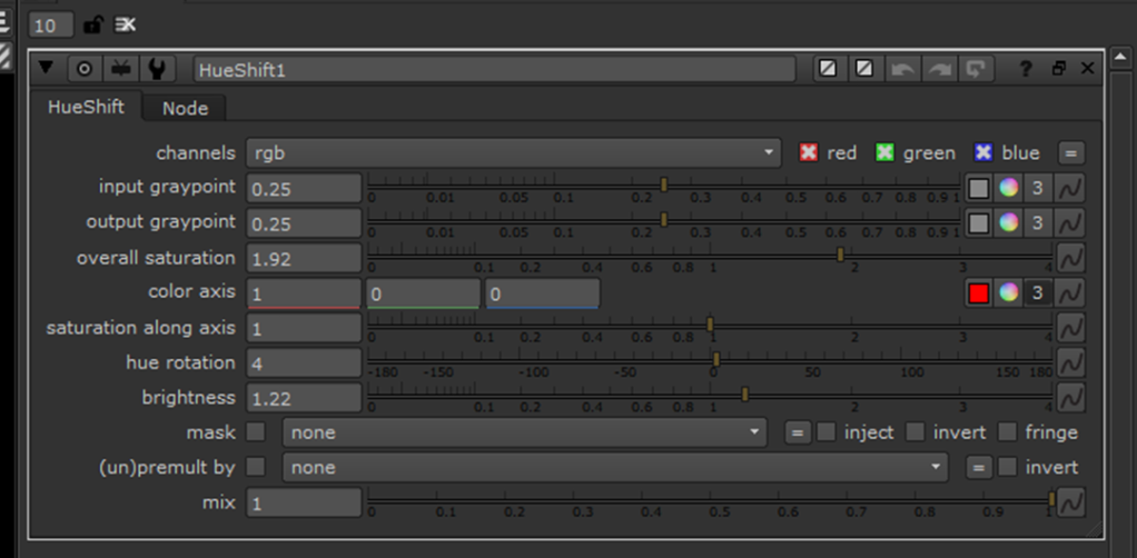
I only used the HueShift to minimally adjust the colour of my scene and make it a bit brighter/vibrant without over-doing the saturation.
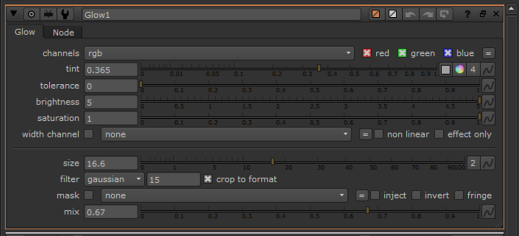
These are the settings that I used for the Glow:
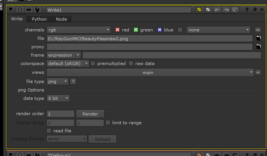
Once I was fairly happy with the beauty pass, I created a write node to render the pass and attached this before the viewer:

Within my “Write” properties I set the output to “PNG” 1920x1080p and made sure that the colourspace was set to “sRGB”:
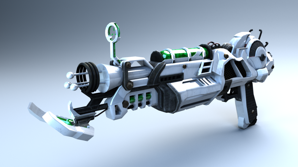
These are two different renders that I carried out:

In my own personal opinion, I prefer the first render. This render has greater reflectivity on the green glow and a slightly “grittier”, darker look; it looks more realistic than the second one, of which looks more like a toy gun. In the future, I think that I need to slightly better fine-tune the defocus and maybe position my asset and a sharper angle, however, that would be difficult with a thing weapon.
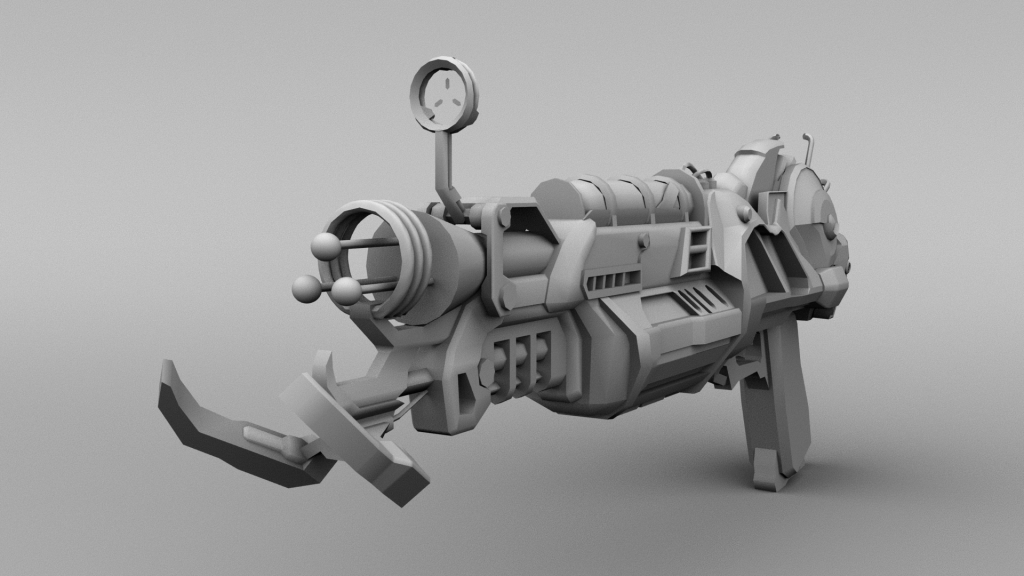
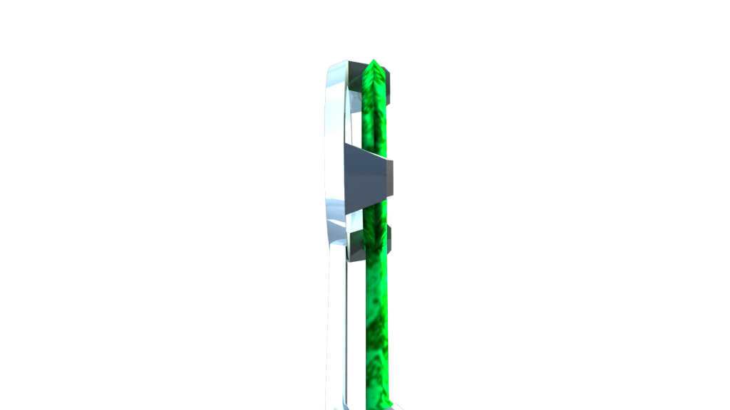
Here are the individual AOV’s for my asset scene:
Beauty:

Z-Pass:

Ambient Occlusion:

Coat:
Specular Direct:

Specular Indirect:

Diffuse:

Shadow Matte:
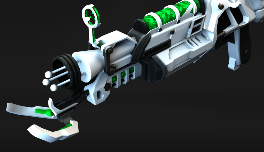
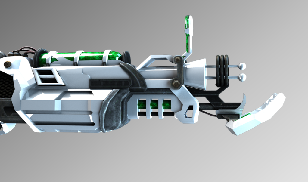
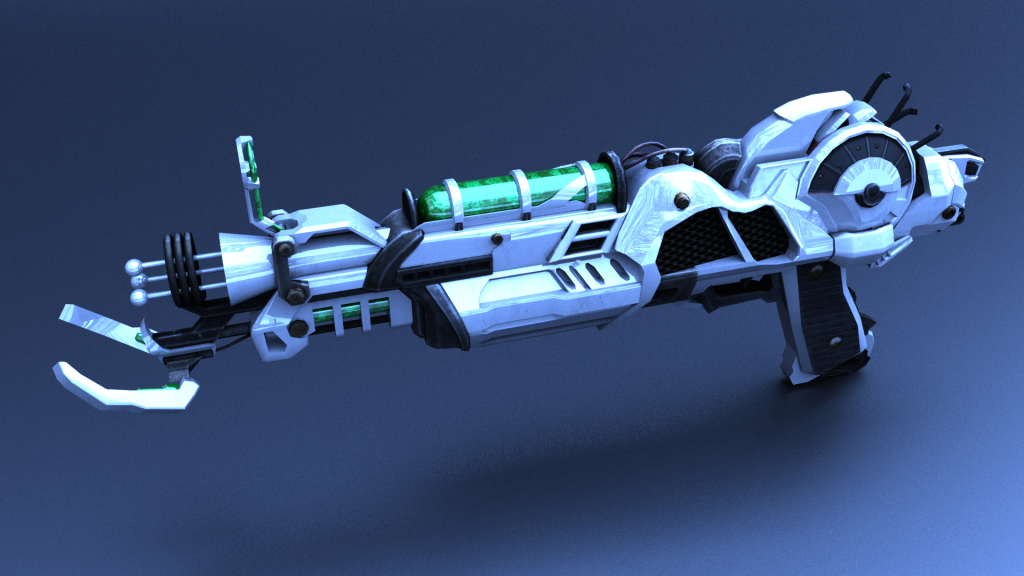
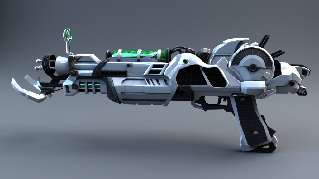
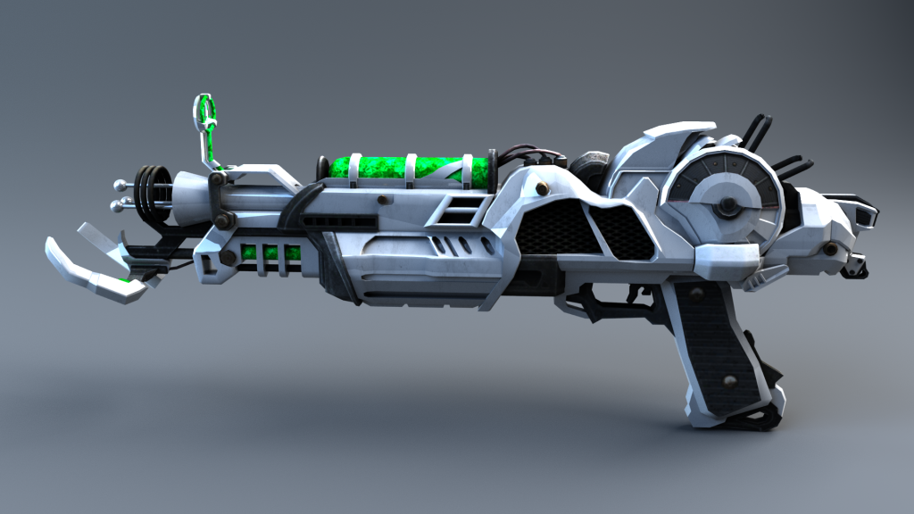
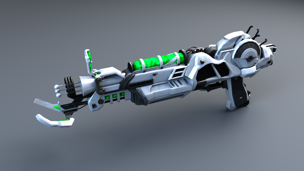
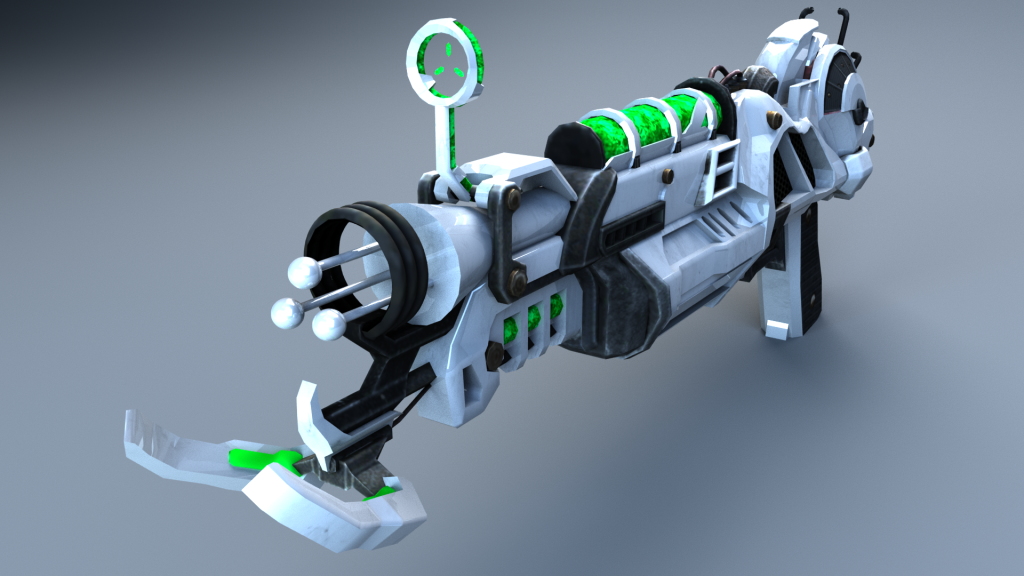
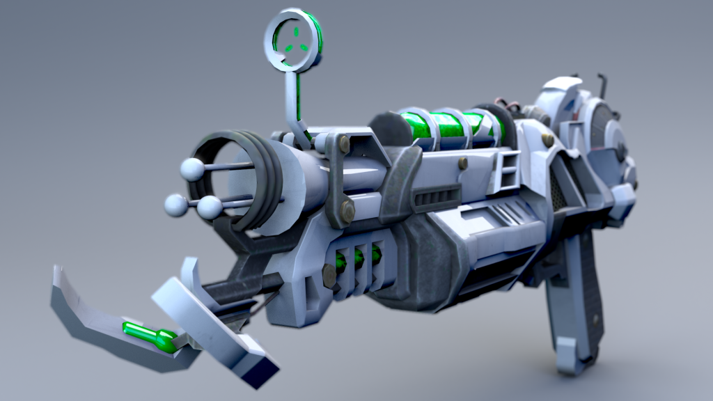
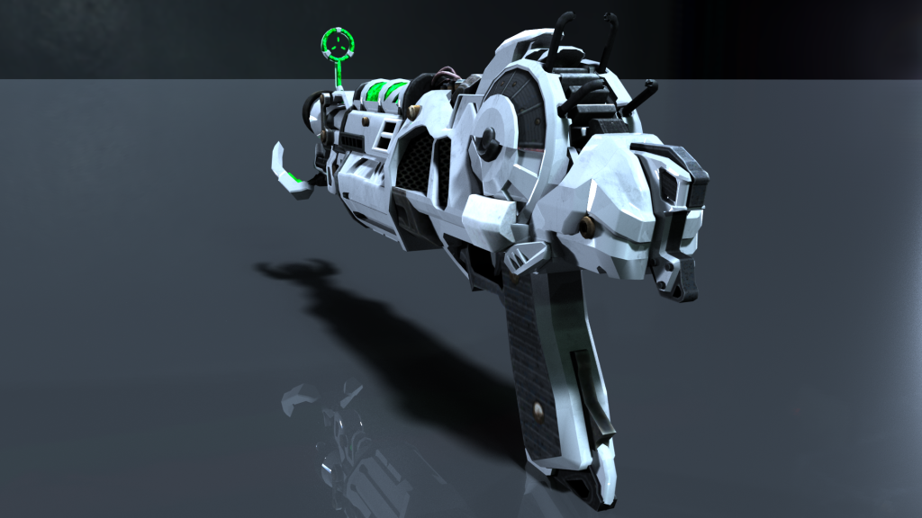
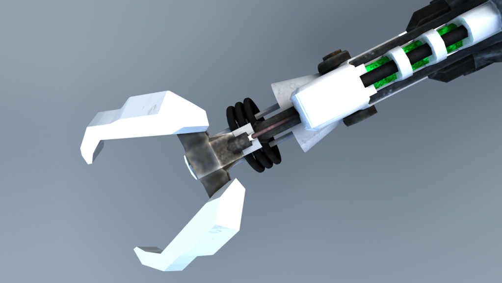
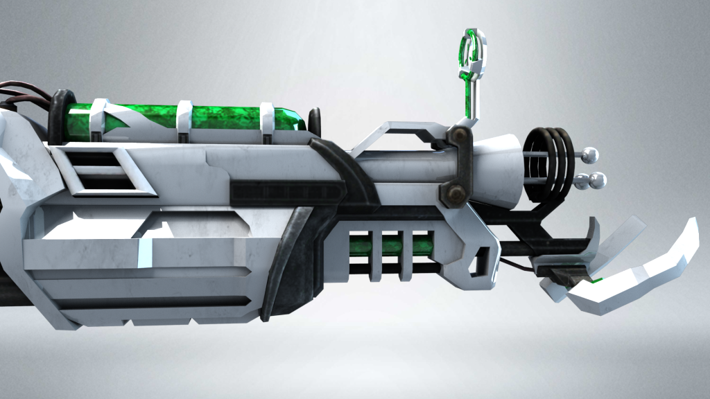
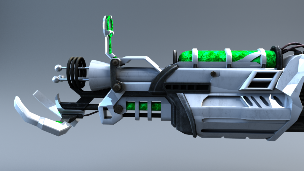
Final Renders:
These are all of the final renders that I carried out for my asset:
For these first renders I used this HRDI image for dome lighting – https://hdrihaven.com/hdri/?h=snowy_park_01

Renders:


I am happy with the results of these renders, apart from the reflections of the trees from the HDRI image, however, I love the cold/icy look that the HRDI encompassed. I increased the reflectivity of the backdrop for the last render to give a slight reflection of the asset. Despite me liking this look, I felt like the blue reflection took away the default colour scheme of the weapon so I decided to carry out some further renders that I prefer to the above.
The rest of the renders were using Arnold Area lights and an infinite backdrop:
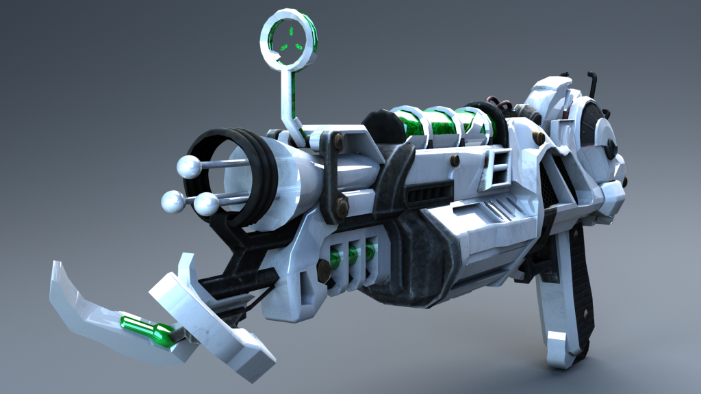

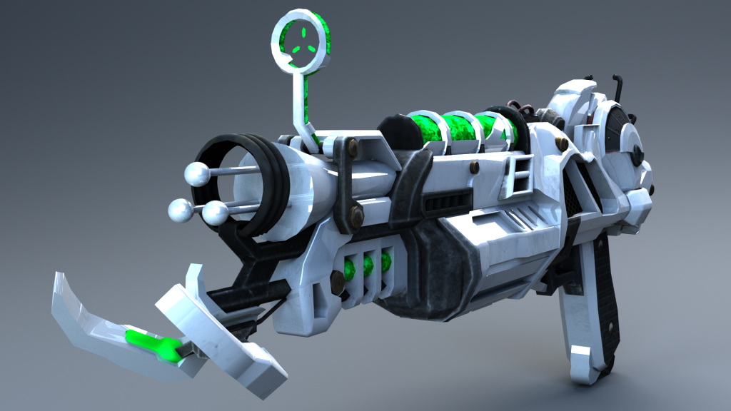

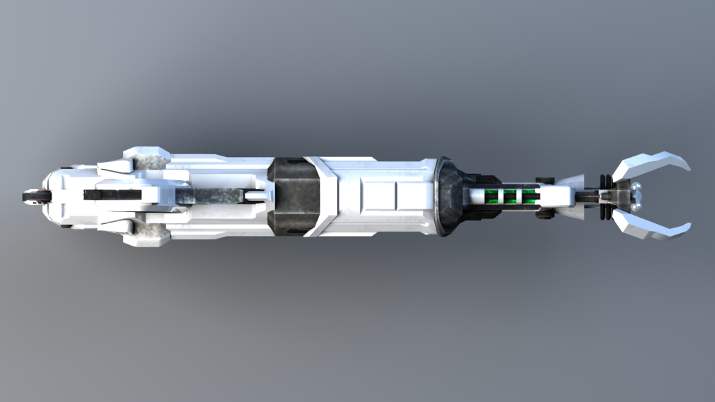
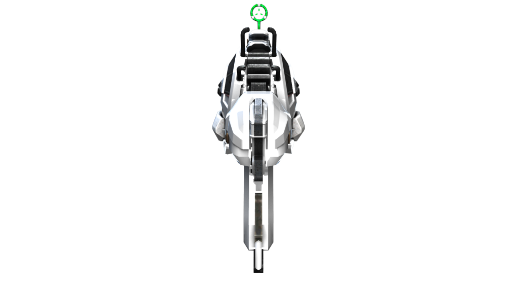
Top:

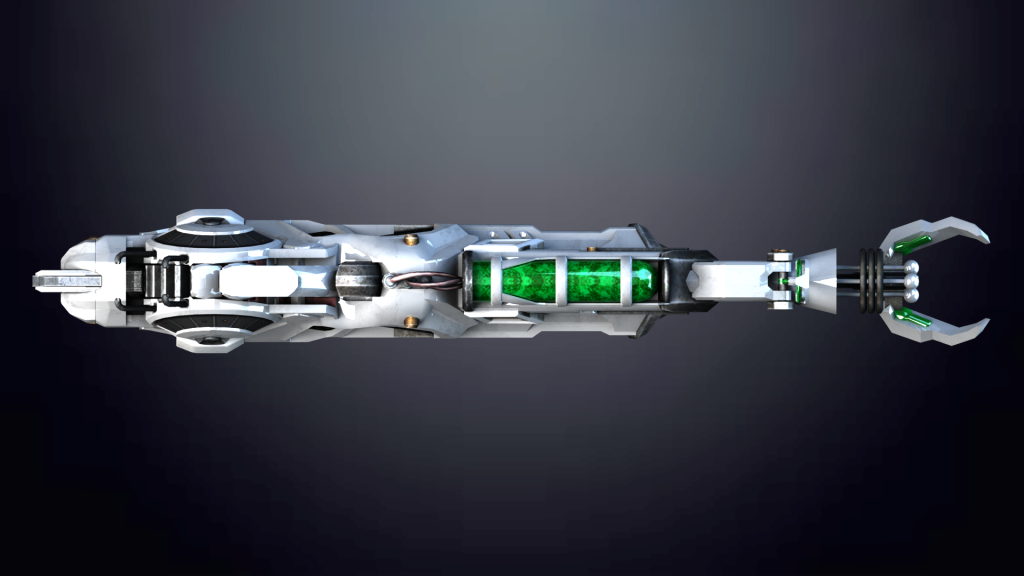

Underneath:


Ultimately, I am extremely happy with how my asset turned out and I think that it is a great first start. I managed to achieve the sleek, refined look that I wanted to make the weapon look more futurist. Some of the modelling techniques took a little while to master but having completed this asset I feel confident to take on similar projects in the future with better efficiency. I think that my asset could be somewhat improved with further attention to detail on the smoothness of the sides/top of my weapon, however, the weapon would most likely be used in a first-person shooter game where that wouldn’t be noticeable and it certainly wouldn’t be noticeable in a third-person shooter game. My favourite part of my asset is the black/white/green colour scheme, of which I feel really helps the weapons’ details stand out from one another and the green plasma blends perfectly. The textures could’ve been slightly higher quality, however, I got them from Black Ops 2 that released in 2012, so it’s understandable that they are a bit out-of-date. Despite this, it’s practically unnoticeable unless you’re quite close to the weapon, and once again no one would notice this in a video game. Furthermore, super-high-resolution textures would be a waste unnecessary memory that wouldn’t make much of a difference to the player.
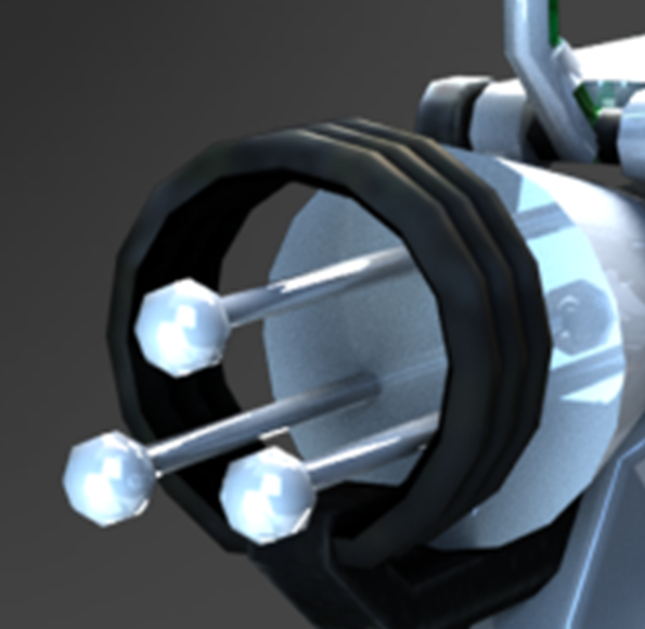
Detail Renders:
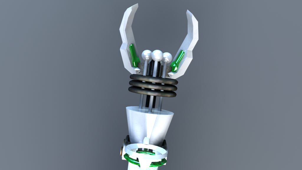


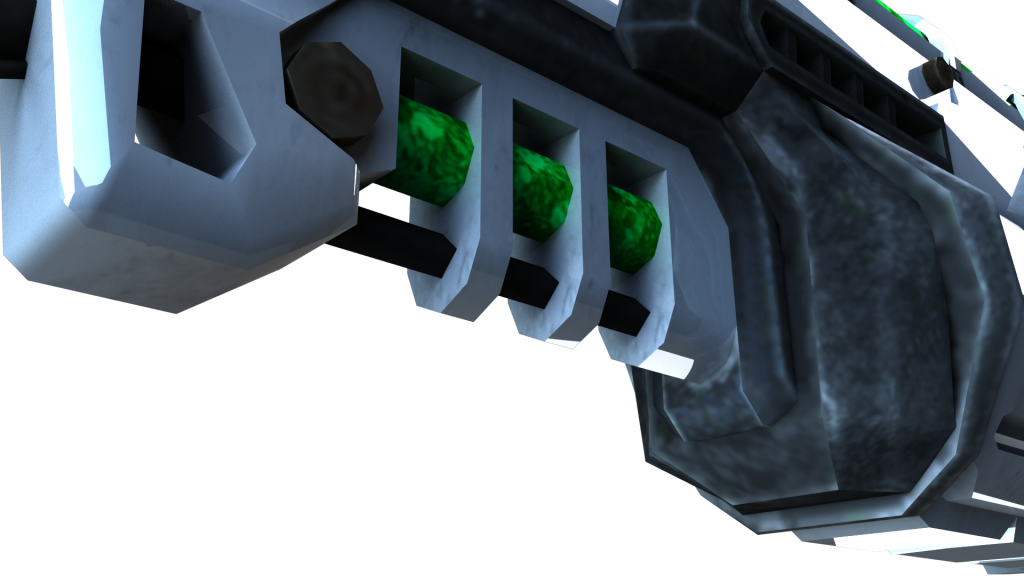
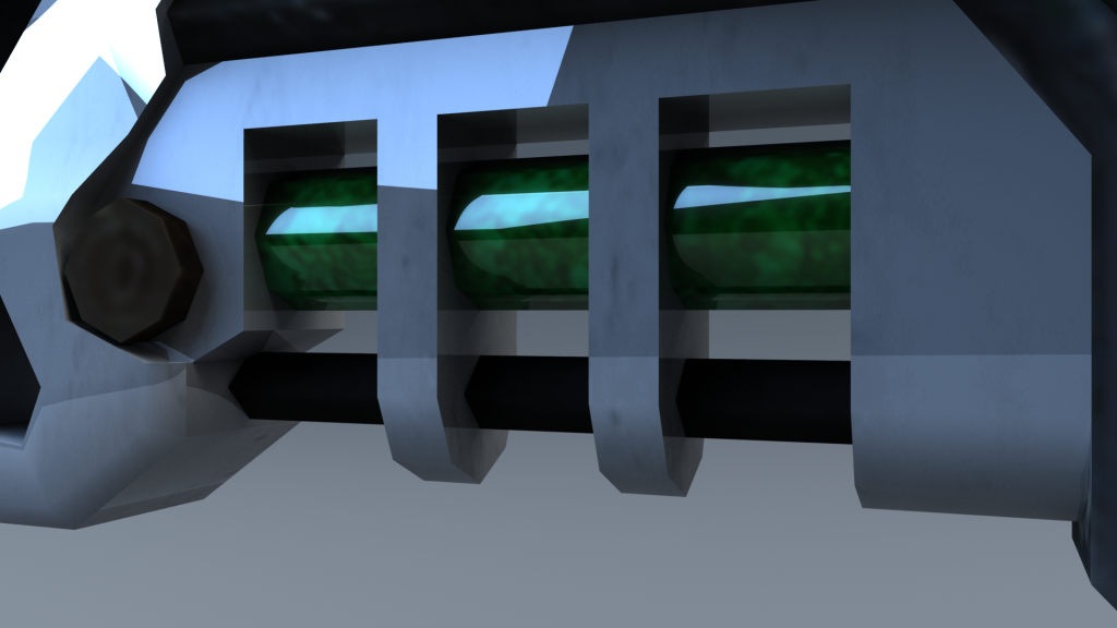

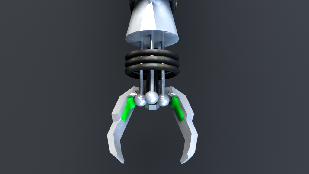
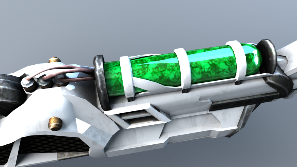
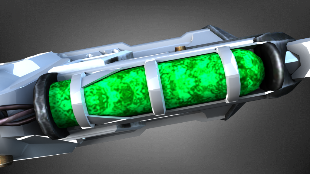


A critique of the fine detail of my asset is the number of polygons used, however, like I stated earlier the weapon would likely only be used in a video game where the player would never be able to get super close to the weapons in-game. Games also struggle with memory issues so they try and save as much space as they can where possible, so I think fine detail in this scenario would be an unnecessary waste of game memory because no one would actually see it. The detail renders also display some of the bump maps of the textures to give it a more 3D look.
To conclude: throughout the course of this module my 3D modelling skill-set within Maya has improved tremendously. I now have the knowledge to apply textures, understand UV unwrapping/editing, overcoming problems, building complex assets from simple shapes, and I overall understand the Maya interface a lot better to help streamline my work. I now know what to avoid when it comes to texturing, using low-resolution images, obvious repeating of textures where the sides don’t match, and more. I have a basic understanding of how bump maps work, however, I used a texture from online so I had little practice with creating my own. In my spare time, I shall further practice this and my other learned skills in Maya to better refine my techniques for future projects. This module also helped me have a better understanding of staging with the concept designs, proportions, and lighting. I think that I have greatly improved at understanding good/bad lighting setups with Maya, especially using Arnold, and using HRDI images. All of these new techniques can be applied in next years modules.
