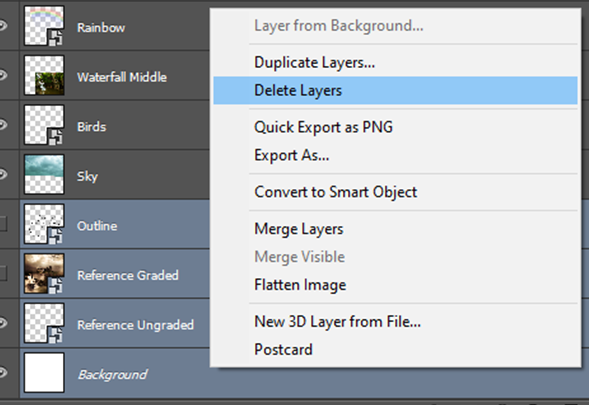
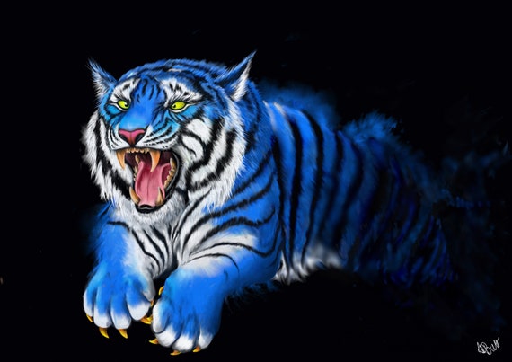
Today, I will be giving a brief review on the 2004 Godzilla movie. This is a reboot of Toho’s Godzilla franchise and is the 30th instalment of Godzilla. I will be looking at the film from primarily an Animation stance; exploring other areas of the movie where appropriate.
Godzilla emerging from the sea.
First things first: in terms of Godzilla himself, I felt like he was one of the best animated characters of the film, I mean, I should think so considering the entire movie is based around the prehistoric beast. They most likely modelled his character off of numerous cold blooded reptiles,
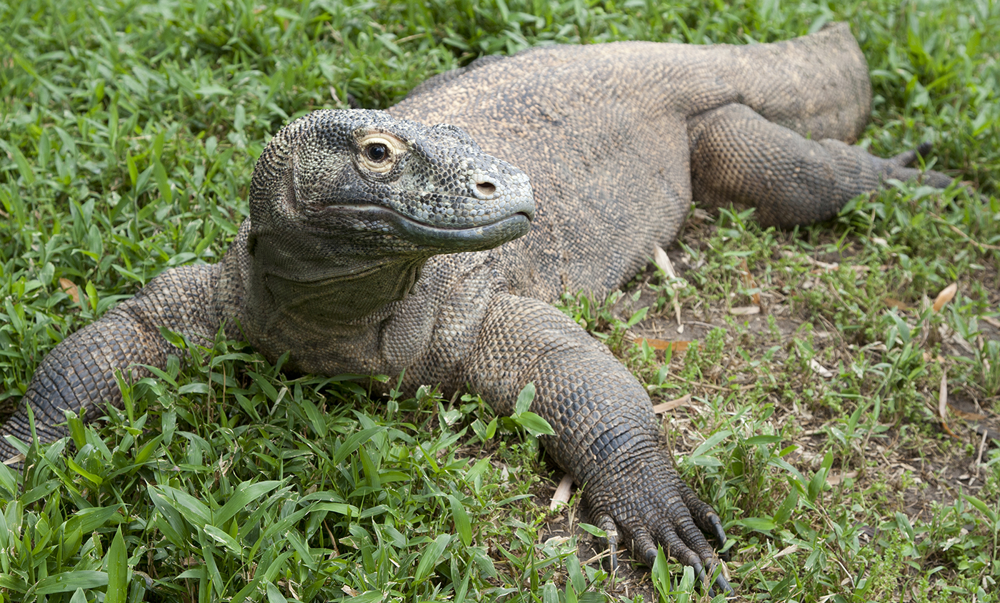
Komodo Dragon
such as lizards, crocodiles and dinosaur fossils. According to the special effects chief Jim Rygiel, Godzilla’s fighting style mechanics were based off of primarily bears and Komodo dragons to ensure that his aesthetic was as realistic as can be. In addition to this, they likely used CGI tracking to trace the exact movement of these animals to implement into Godzilla’s movement. This is ensure that Godzilla looks as life-like as can be, since they are the closest real-life animals to Godzilla himself. There were numerous moments within the movie where Godzilla emerged from under the ocean, you could see the water dripping off of its scales, and whenever its body would move up or shake, the water would too. The light would also reflect from the water which looked awesome.
Godzilla is colossal in size, because of this he carries an immense load of weight. In order to visualise the sheer weight of the creature to the audience, they made use of delayed movement: his legs would take a long time to walk through the cities, he would take a while to emerge fully from the water, his tail and roars were slow but magnificent etc. Although he’s moving fast (distance wise) in comparison to humans, he is not moving fast when retrospectively comparing his size to his surroundings. Another reason for this, is because Godzilla is the hero of the movie, defending the Earth against the two MUTOs – the antagonists. He is at at the top of the ecosystem and tries to keep the planet in balance. In his efforts to defend the Earth, he tries to cause as little destruction as possible. In doing so, he has to be more careful when walking through urban land, hence his slower movement. In comparison to the MUTO’s, of whom are a lot more destructive to human civilisation through their endeavours.
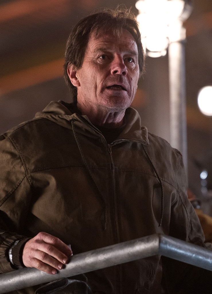
Example of Muto head looking like a robot
Speaking of MUTO’s, their design is quite different to that of Godzilla and I felt like it wasn’t as authentic. With Godzilla, despite being science fiction, I could picture him being something that could actually exist. His design is close enough to that of a dinosaur or a Komodo dragon to where he could theoretically be reality. However, in terms of the MUTO’s, their outer-body seemed way too robotic, especially their faces. Their eyes look like IED lights and they’re practically un-textured. Their skin is super smooth which gives it a “plastic/metal” aesthetic. Besides the fact that its design features way too many flat surfaces at sharp angles. The MUTO’s design is too symmetrical/unnatural and resemble that of a man made structure. Despite the fact that that is technically true, the audience should feel as if anything in the movie could actually be reality. If in the movie these giant creatures were actually the product of technology going too far, à la Terminator, then I wouldn’t have been a problem. The issue is that they don’t look at all real. Their design and movement seemed to be a cross between that of a bat/bird, a pterodactyl, and a praying mantis. I felt as if the movement in that respect was decently integrated to a degree. The flying and landing of the creatures seemed to be look fairly natural. However, their walking was a bit too clunky. Their front legs somewhat resembled a praying mantis, but they were able to manoeuvre way too easily. At their magnitude, they should’ve found it a lot more difficult to walk and fly. It seemed as if I was just watching a normal sized bat/bird fly that was then green-screened over a city. They did a great job with making Godzilla’s movement speed to be realistic, but they lacked this in terms of the MUTO’s. Their steps also felt robot like at times.
Here you can see just how man-made the design looks.
Furthermore, this is not animation related, but from a storyline perspective Godzilla is structured well but a lot of the characters are poorly developed. Godzilla is only given around 10 minutes of screen time from a 2 hour movie, even though he is what the movie is based off of – https://www.youtube.com/watch?v=AkcfB3z0_-0 The MUTO’s eggs hatching are given way more attention throughout the film, when most audiences wanted to see more Godzilla action, of which was saved for the final fight scene – https://www.youtube.com/watch?v=b4x3PHENK_A
Despite this, the structure follows a decent format of beginning, middle and end. For example: the opening gives a glimpse of Godzilla from 1954. This allows the audience to gauge the size of the creature and gives them something to be excited for later on in the film. It then showcases the death of Sandra, Joe Brody’s wife. This is a great introduction to the movie because it sets the tone for the following 2 hours. She died as a result of the MUTO’s spores at a Nuclear Power Plant in Japan. This sets them up as being the “bad monsters” of the film. It also gives motive to Joe Brody to research and obsess over the incident; amplified by the fact that he felt responsible for sending her down to the reactor. The movie then skips forward 15 years to seeing Joe Brody’s son having to collect his dad from being apprehended by the police for trespassing and the plot moves from there… Bryan Cranston, the actor who portrayed Joe Brody, had by far the most solid performance of the film. A lot of the other characters felt void and emotionless.
With Godzilla being an action movie, the audio, specifically the soundtrack was an integral part to the films entertainment, emotion and overall carried the film from start to finish. Whenever there would imminent danger, the music score would start to become increasingly dark/eery to build up suspense. Whenever there is danger / action on screen, the sound track would be very intense and dramatic. Everything would be coincided and on beat with what is being presented on screen to fit the mood. Without the music score, the film would have nowhere near the same impact and entertainment value. It gives the scenes life.
In conclusion, the first 20 minutes of Godzilla are probably the best in terms of acting and engagement, whilst it fizzles off and becomes mundane towards the middle through to the end of the film, where we finally get to see the anticipated final battle between Godzilla and the MUTO’s. I’d give it a 6.5 out of 10.
This is the first post on my blog, be sure to stick around to see more animated related posts.
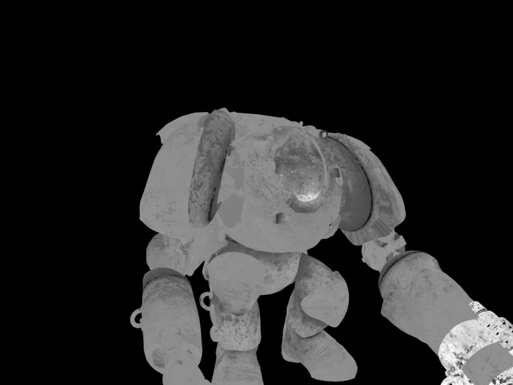
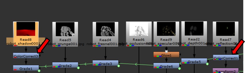
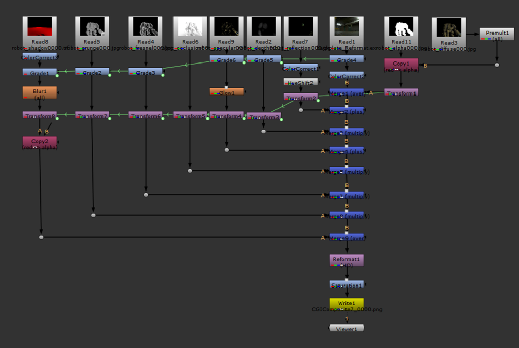
The first task that we had to complete for component 2 was to better enhance our understanding of using a multi-pass composting workflow for CGI scenes in Nuke.
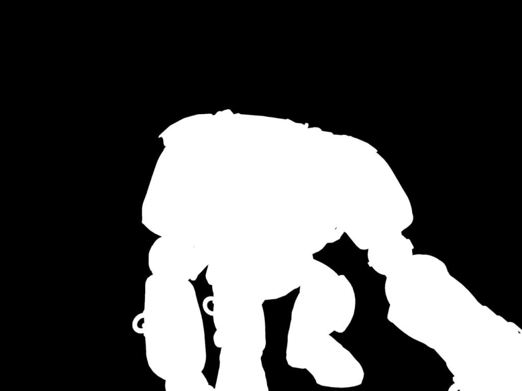
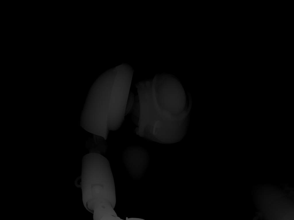
We were provided with the following channels for a scene featuring a robot:
Alpha:
Depth:
Diffusion:
Fresnel:
Grunge:
Ambient Occlusion:
Reflection:
Shadow:
Specularity:
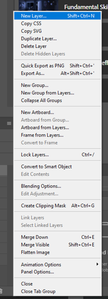
The beauty of a successful CGI composite is the ability to alter each separate part of the scene to best suit your visions: colour correction, brightness, reflective-ness, shadow depth etc. This means that I’m able to alter the look of the reflection, shadow etc. individually without effecting the other AOV’s, as well as alter the robot separately from the backdrop. Prior to completing this task, I had already carried out a Beauty Render Pass for my asset within the 3D Graphics module, so I already had a fairy decent understanding of how to execute such a task.
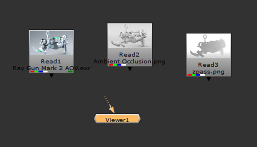
The first thing that I did was I opened Nuke and dragged in all of the source media:
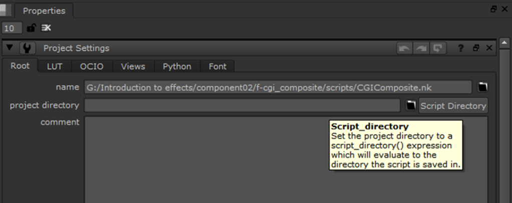
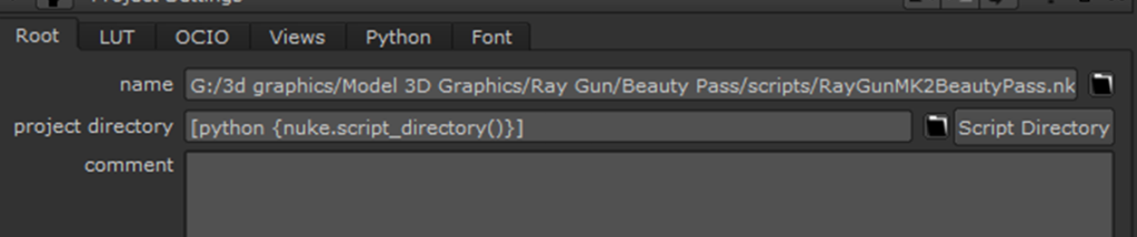
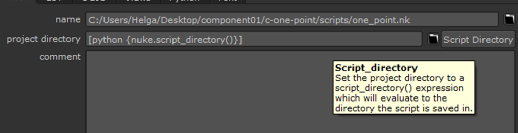
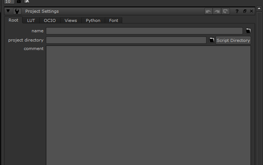
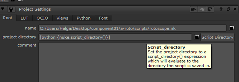
After this, I saved my script file to the project folder:
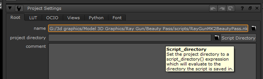
Then I clicked “Script Directory” in the project settings:
From here, I changed the directory of the read nodes to start with a “../”. This ensures that should I open the file on another computer, it will still be able to locate the source:
Once this was setup, I created a bunch of merge nodes:
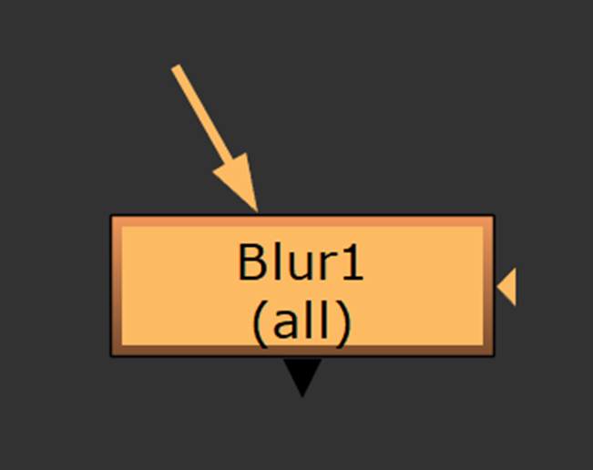
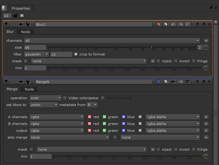
I setup my passes as so:
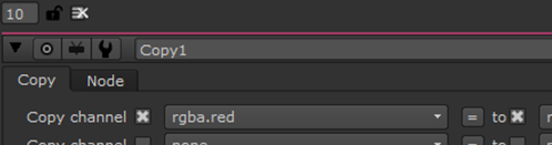
Over for the alpha/diffuse channels, plus for Reflection, multiply for Depth, plus for Specularity, multiply for Ambient Occlusion/Fresnel/Grunge, and finally over for the Robot’s Shadow.
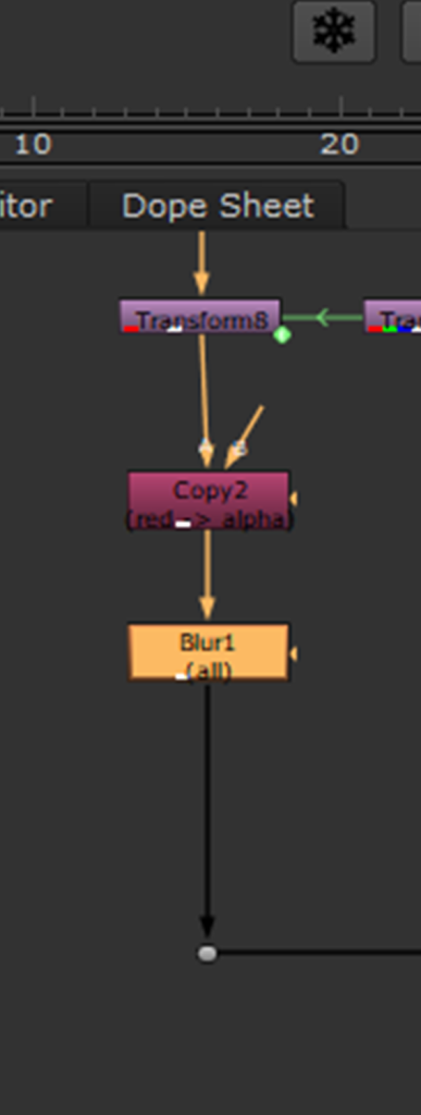
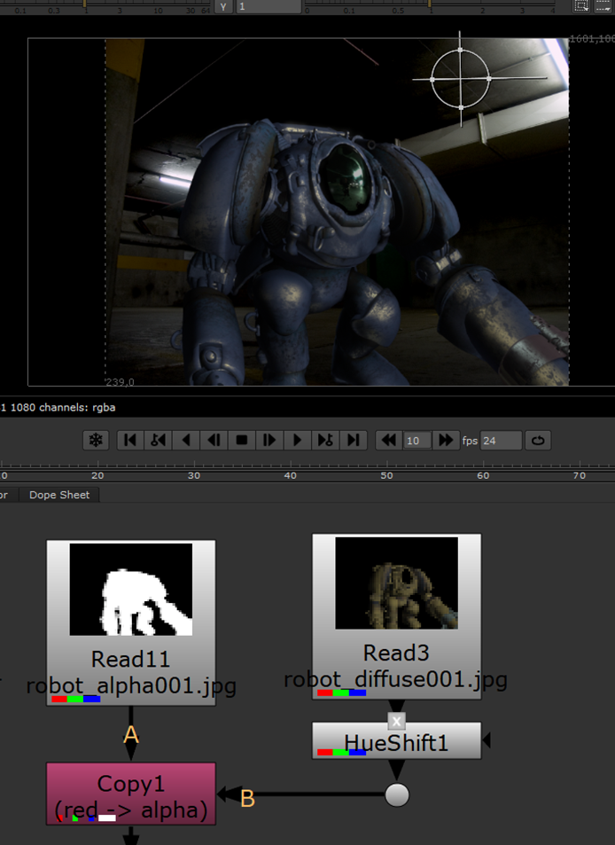
I also attached a rgba.red copy node to the shadow going through the A pipe, as well as another one for the alpha channel being “A”, over the “B” channel being diffuse:
By default, nothing was visible:
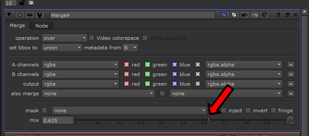
To fix this, I manually adjusted the mix for each of the merge nodes that effects the strength of each of the passes according to my preference:
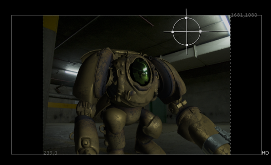
This is what my render pass currently looked like within the viewer:
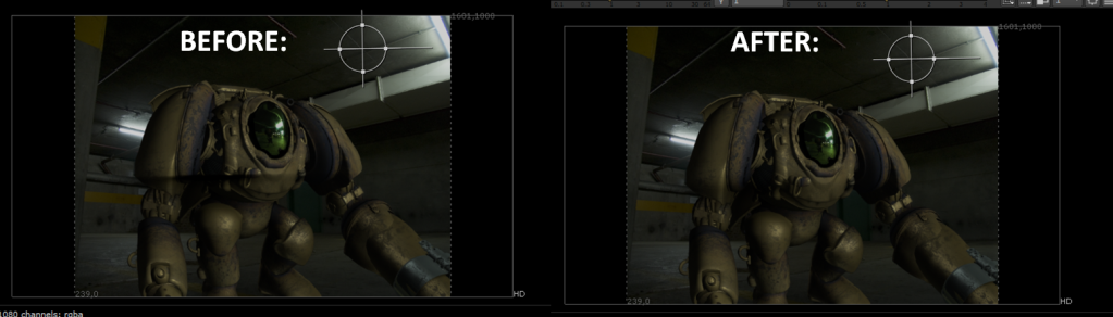
Obviously, there was a lot of work needed to do in order to complete the CGI Composite and blend the robot into the background whilst making the scene come to life through various adjustments. However, as it stood, I liked the current look and I didn’t want it to be too reflective so it looks a little washed out.
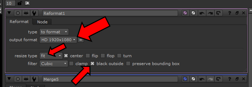
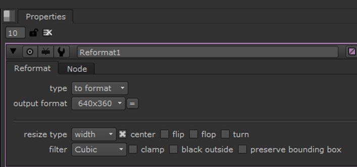
The first thing that I did was I added a reformat node right before the viewer and set it to 1920x1080p HD and set the resize type to “fit” and enabled “black outside” so that the image sequences wouldn’t stretch to fit the dimensions:
This was the result:
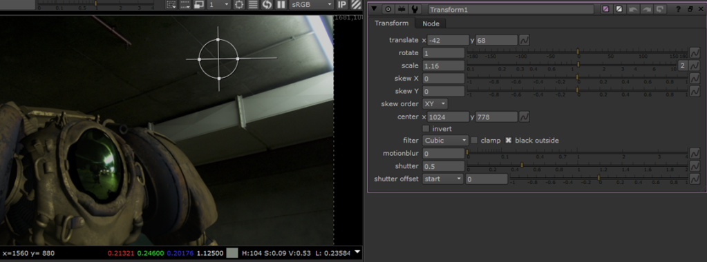
After correctly adjusting the format, I then needed to slightly adjust the position of the robot to make it look more realistic in the scene. To do this, I created a transform node and attached it to the “A” output from the copy node:
Using the transform tool I translated the position and slightly increased the scale:
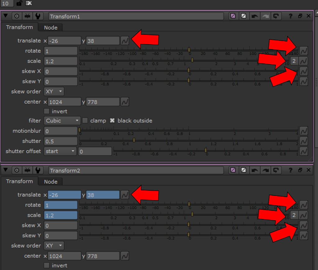
However, this only affected the alpha and diffuse channels so I created a bunch of other transform node and attached them to all of the other AOV pipes.
From here, I held down “Ctrl” and dragged the translate, rotate and scale properties from Rracker1 to Tracker2:
This created a green pipe linking the two:
I repeated this until all of the transform nodes properties were linked and the all of the robot’s attributes changed identically:
Result:
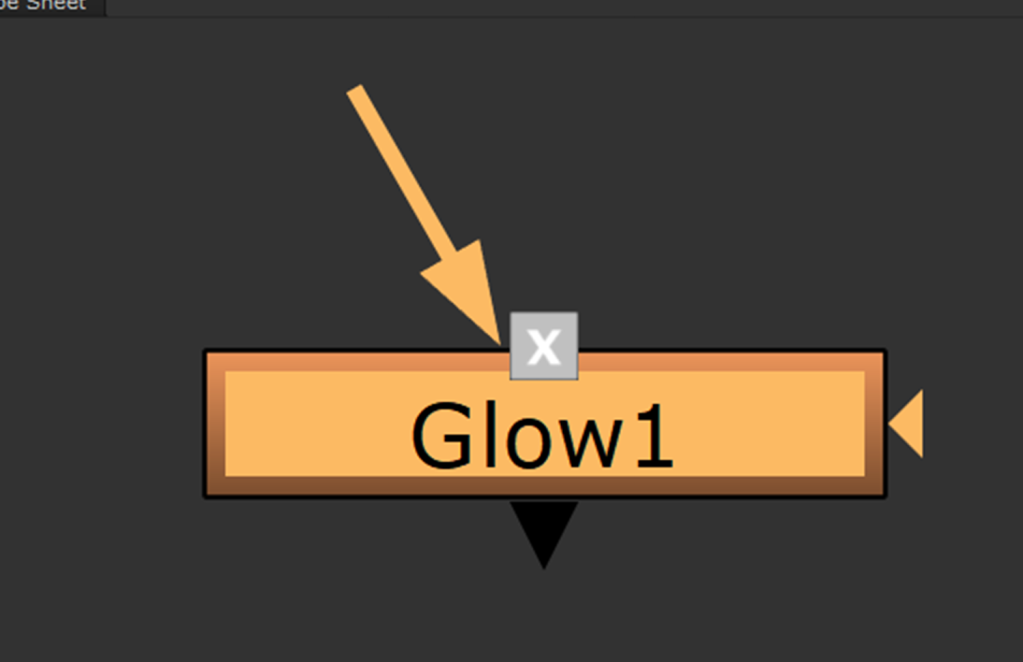
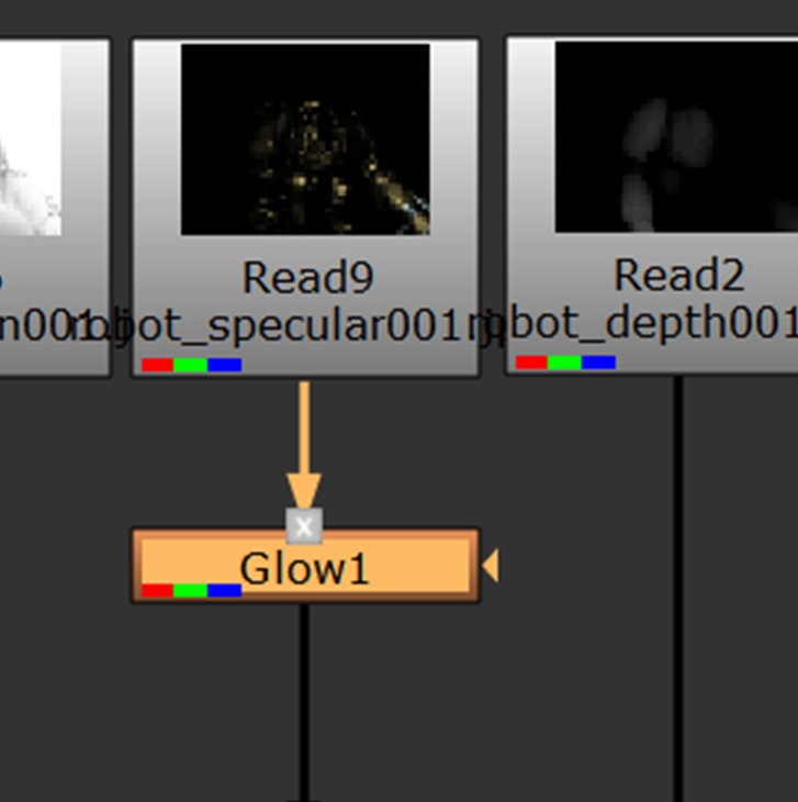
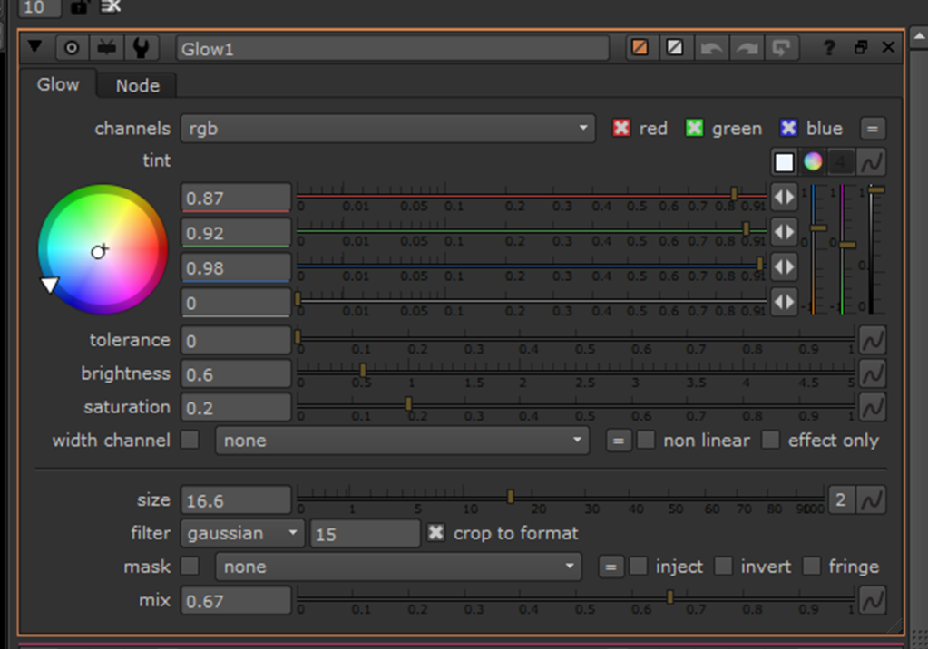
After this, it was time to adjust the colouration and “look” of the scene. First of all, I applied a glow node to the specular pass and adjusted the attributes:
This was done to make the “shiny-ness” of the robot blend in more.
To continue, I added a blur to the robot’s shadow to make its edges not so noticeable. I turned the mix for the merge down really low so it only created a slight cast over the bottom of the image to give depth:
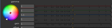
Once this was complete, I then added some grade, colour correct and hue correct nodes.
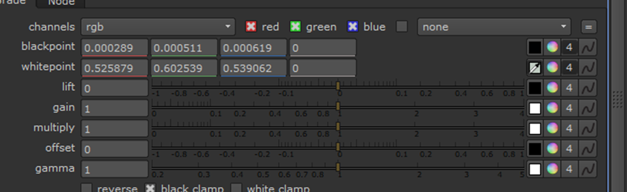
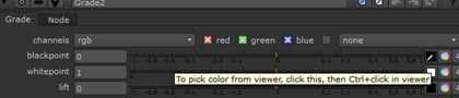
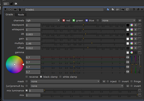
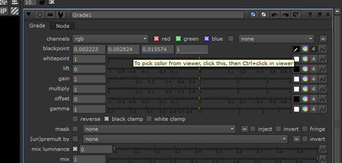
Firstly, I added a grade and colour correct node to the background and adjusted the attributes to darken image. The grade tools allowed me to select the black/white points from the image using the eyedrop to match up the two subjects, as well as gain, lift, offset etc.:
Furthermore, I added a bunch more grade nodes for the different passes and held down “Ctrl” and dragged the white/blackpoint properties from the background grade and linked them all together:
This created a green pipe linking them all:
After linking the black/white-points I went though each of the grade attributes and slightly adjusted the other attributes.
Next, I added a colour correct to the reflection and shadow and adjusted to better match the scene:
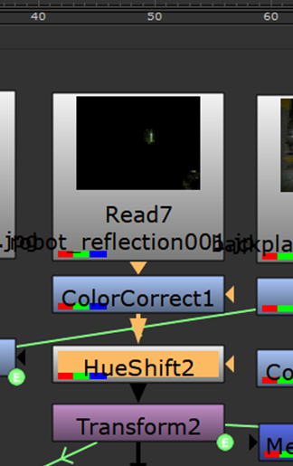
In addition, I added a hue shift to the diffuse and adjusted the attributes to make the robot blue:
Despite me liking this look, somewhat, I didn’t feel as if the blue fit the scene and made the robot look a little bit “plastic”.
Instead, I swapped the HueShift for a Red > Alpha premult:
Result:
This darkened the robot a lot, however, I felt as if its tonality better matched the background and made the robot look more metalic:
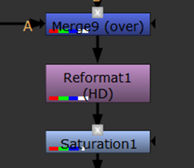
To help touch up the scene, I then applied a colour correct to the Ambient Occlusion and the background:
After, I added a HueShift to the reflection to slightly adjust the colour/brightness:
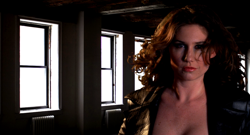
As it stood, the robot definitely matched the colour of the background. I went for quite a dark and gritty style to make the robot look scarier, as if it’s hiding in the shadows.
For a finishing touch, I slightly increased the saturation:
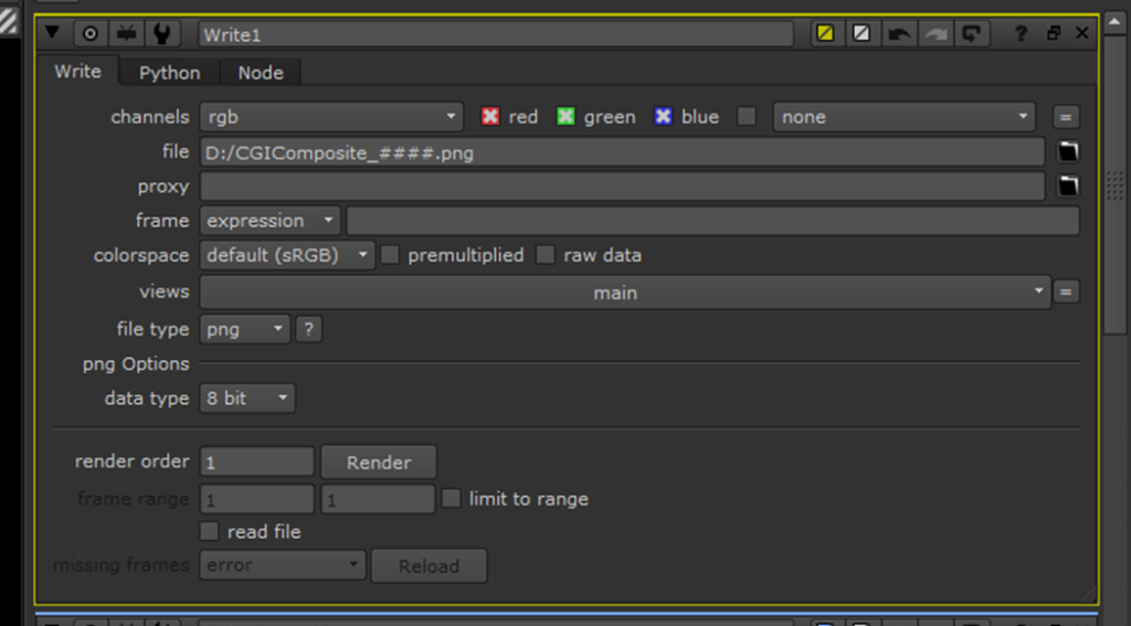
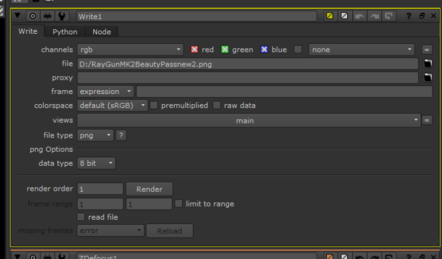
To conclude, I created a “Write” node and positioned it above the viewer. I adjusted the properties to be a 16-bit PNG output image sequence.
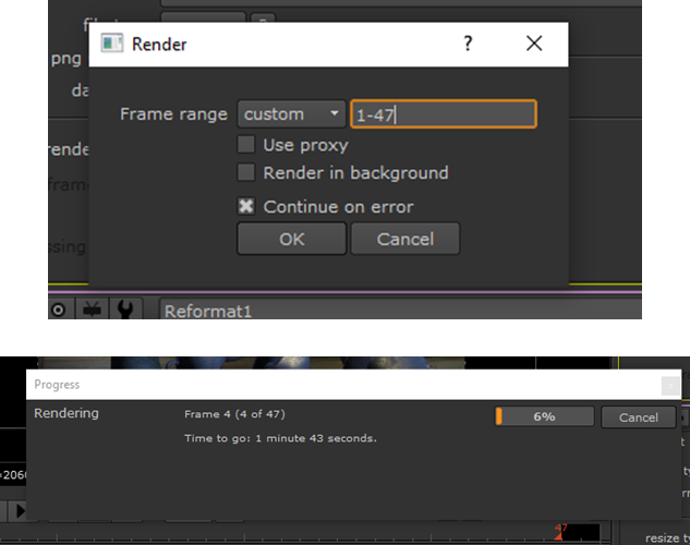
Finally, I rendered my file making sure all of the frames were in range:
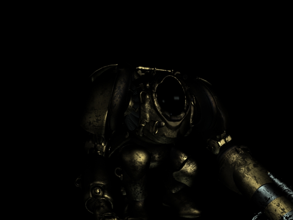
This is what my final render pass looked like:
Render:
Ultimately, I am quite happy with how this final composite turned out. The robot matches the colouration of the background and the glow isn’t too strong. The robot looks like it belongs in the scene and that is the main achievement. Despite this, the scene is definitely quite dark, and some people may not like that, but I guess it depends on what film this scene would be featured in. Should it be a horror, the dark, metallic, ambient look of the robot would fit perfectly.
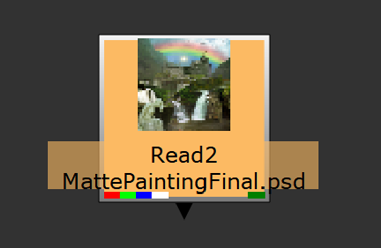
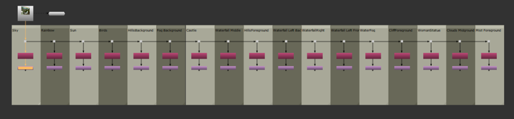
2.5D Matte Painting:
The second task for component 2 was to perform a Matte Painting.
“A matte painting is a painted representation of a landscape, set, or distant location thatallows filmmakers to create the illusion of an environment that is not present at the filming location” – Wikipedia
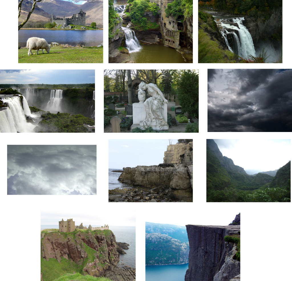
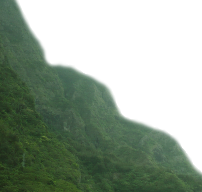
To carry out the matte painting we were provided with the following source images:
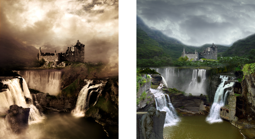
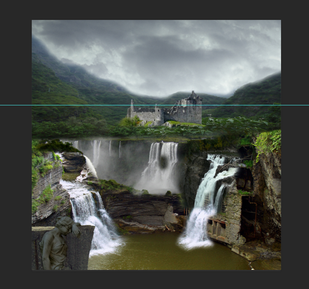
The goal was to combine parts of these images in Photoshop to create a “Matte Painting” similar to the below references:
To begin, I created a new document in Photoshop and set the width/height to 4000, the resolution to 72, 16 Bit RGB Colour:
I saved the file within my component 2 folder to make it easier to access:
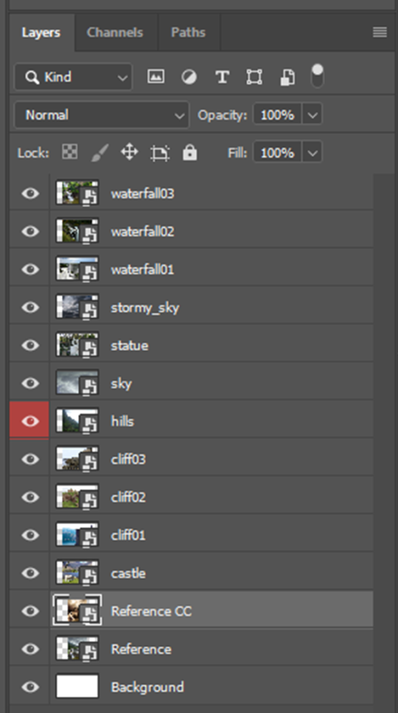
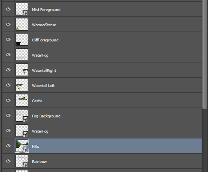
I began by creating a new layer and imported all of the source images as separate layers:
I gave each layer a name to easily identify:
By having separate layers it means that I’m able to alter each aspect individually without effecting the other layers by using the eye to turn layers on and off:
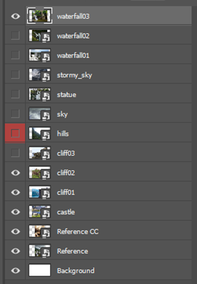
I made only the reference image visible and dragged out a ruler guide (View>Rulers) and placed it on the horizontal line:
I then created a layer above it called “Outline” and used the brush tool to trace a fine-line sketch over the key details of the reference image:
I set the brush to not be too thick but clearly visible:
This would later help me position the other layers.
The outline doesn’t have to be that accurate because it’s just a sketch and is not meant to be an exact outline.
Whilst working, I had to ensure that I was following a non-destructive workflow, so that should I make any changes that I don’t like, I’m easily able to go back to the original. One process that aided this workflow was by converting the layers into smart images:
“Smart Objects are layers that contain image data from raster or vector images, such as Photoshop or Illustrator files. Smart Objects preserve an image’s source content with all its original characteristics, enabling you to perform non-destructive editing to the layer.” – Adobe
It’s symbolised by this icon on the layer:
The second non-destructive technique that I used was the use of layer masks to remove unwanted areas. This can be activated using this button:
The brush tool helped me a lot to fine tune edges:
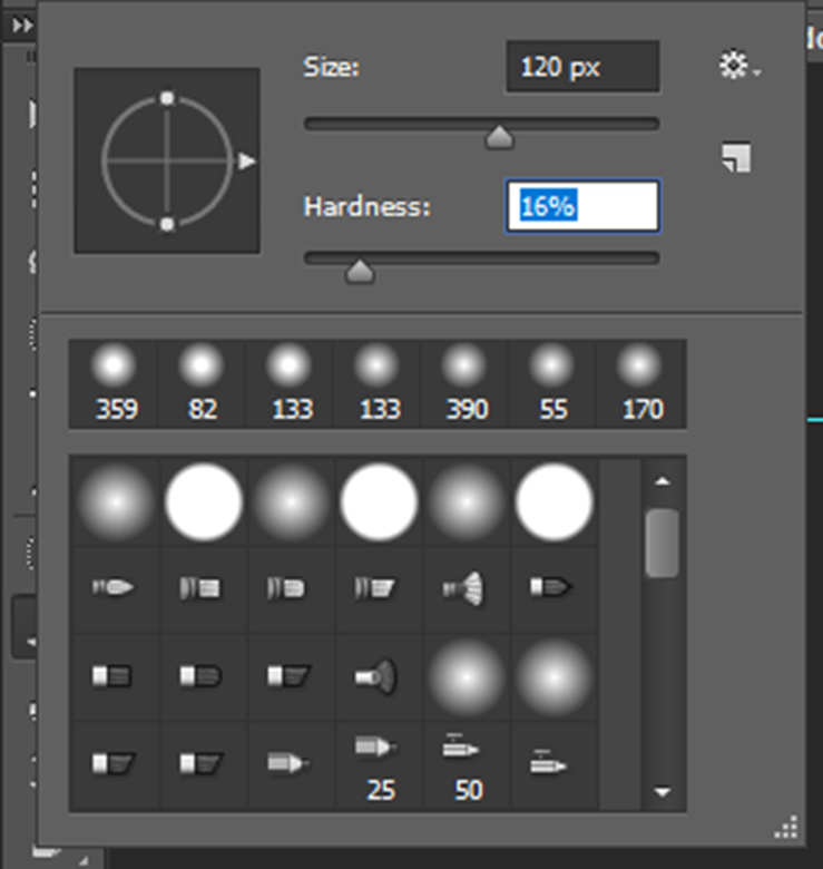
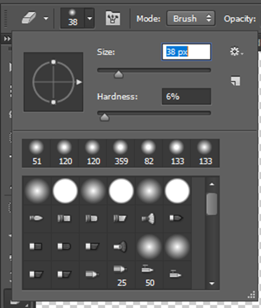
Often, I found myself using a medium size with low hardness, and a lower size the closer to the fine detail that I was:
–Via the provided tutorial
The clone tool was another useful tool to cleanup or remove unwanted sections by holding an area to sample and then releasing to paint.
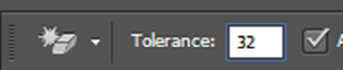
To remove large, unwanted sections from layers, I used the magic eraser tool. This erases all space nearby of a similar colour tone
The tolerance levels can be adjusted depending on how far back you want to go. It’s recommended to not go too high as you’ll likely lose fine detail:
Here, I used the tool on the sky:
To cleanup the rest of the image I used the standard eraser tool:
For the general area I used a fairly high brush size with 20% hardness:
Closer to the castle I used a smaller brush size and a small brush hardness to soften the edges and not remove too much detail:
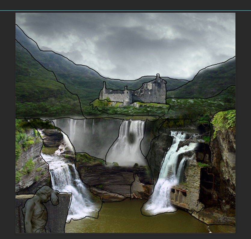
Once the castle was separated from its background, I could move it into the general area to place it, as defined by the reference outlines:
Transform tools were useful to use.
I could easily access the control at all times by enabling “Shadow Transform Controls”:
Alternatively, I could go into the edit settings tab:
Being able to flip the layers was a handy tool.
If I just wanted to target a specific area of a layer, I’d use the rectangle marque tool:
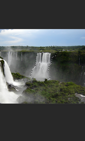
I commonly used the quick selection tool to select objects that were in contrast to their background:
This tool is very easy to execute and saved me a bunch of time as it only takes a matter of seconds seconds.
Once I highlighted an area that I wanted to separate from the background a created a new layer mask:
This created a black/white alpha layer mask:
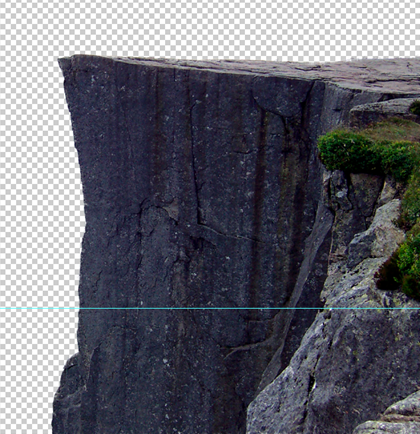
I then dragged the cliff to the appropriate area, as defined by the reference outlines:
The lasso selection is another good form of selection, however, it’s a lot more tedious that the prior quick selection tools and is better used for more refined detail. I didn’t end up using it that much:
For the most part, I mainly used the brush, as I found that it was the best choice for detail and refinement, but the others would good for time.
Using Black/White colours I was able to hide unwanted areas by using a vector mask:
This is once again very useful for a non-destructive workflow.
I rinse and repeated all of these techniques until I had formed a similar looking landscape to the reference and was ready to colour correct.
Colour Correction:
Once my landscape was bashed together, it was time to colour correct the scene to make it look like all of the images were from the same source.
I used adjustment layers for colour correction because I was following a non-destructive workflow. By doing this, it means that the colour correct changes are a separate layer to the source, so I am easily able to go back to the original and can hide/un-hide the adjustment layer to see how it affects the image:
–Via the provided tutorial
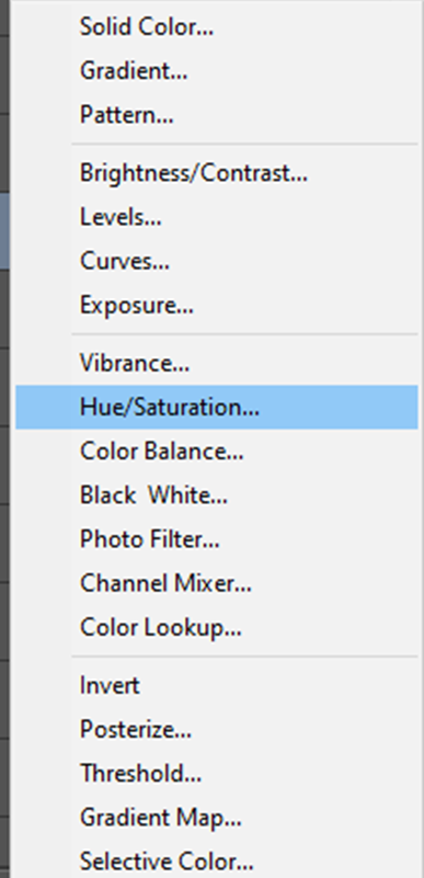
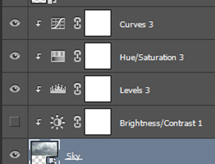
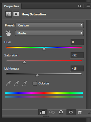
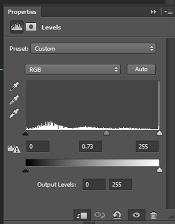
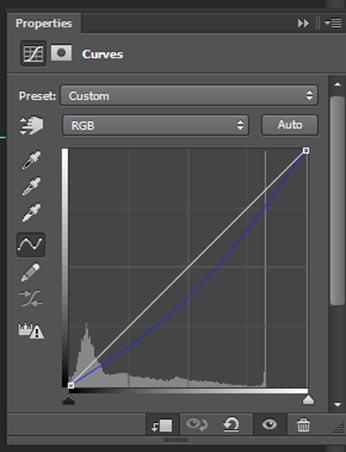
The adjustment layers that I primarily used were Hue/Saturation, Curves, Levels and Brightness/Contrast:
This applies it to the below layer:
I adjusted the properties of all of the layers until they looked similar to each other. For some layers I decreased the saturation, for some, I increased the saturation:
I brightened/darkened up parts of the layers by moving the markers:
I slightly adjusted the RGB curves, or just the red/blue curves (in some cases), to adjust the colouration and increase/decrease a certain colour found within the layer:
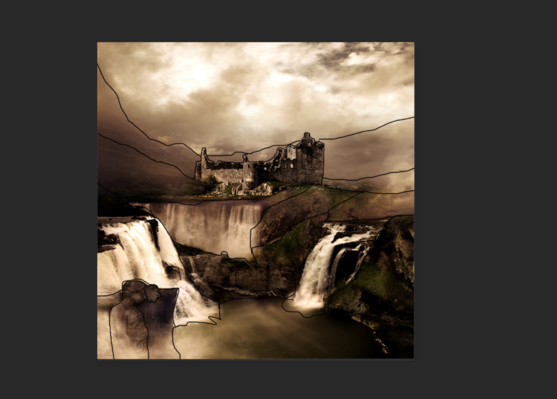
This was the result of the colour correct changes:
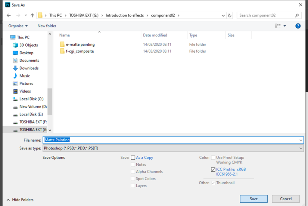
Once the Photoshop work was more-or-less complete, I had to prepare the file for Nuke.
I saved the Photoshop file as “final version” – this ensures that I’m able to revert back to the editable version of my work should I make a mistake or want to change something in the future.
I followed this provided video tutorial:
First of all, I deleted all of the layers that I did not need (the background, references, and outline):
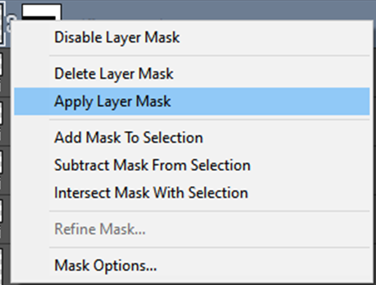
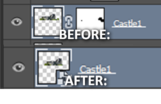
For images with layer masks, I clicked “Apply Layer Mask” to bake the alpha plate onto the layer:
After this, I merged the adjustment layers together with the base layer:
I went through and did this for all of my layers to minimise them as best as possible:
For layers they were around the same depth in the landscape, I merged the layers together:
My PSD File was now flattened and ready to take into Nuke. I had the backup of the non-flattened versions should I ever need to go back.
Nuke:
Firstly, I saved my Matte Painting script file to the project folder:
Then I clicked “Script Directory” in the project settings:
Once the project file was setup, I imported the Photoshop file:
From here, I changed the directory of the read nodes to start with a “../”. This ensures that should I open the file on another computer, it will still be able to locate the source:
I set the dimensions to be 4000×4000 (4K) (as was set within Photoshop). I did plan on changing the output to 1080p HD later, but it was beneficial to work at full resolution within Nuke:
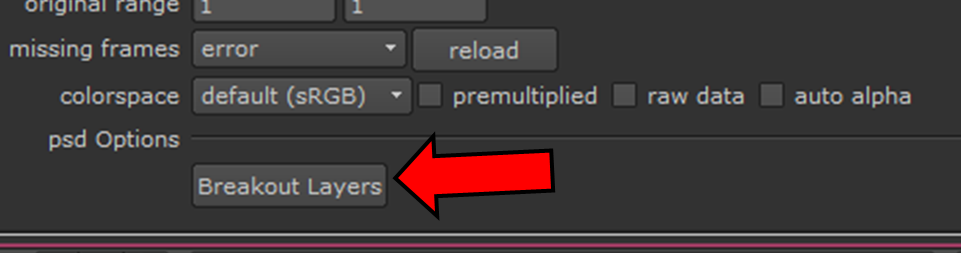
Within the read settings I clicked on Breakout Layers:
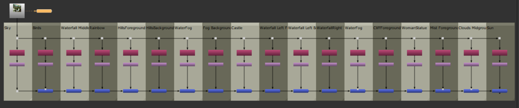
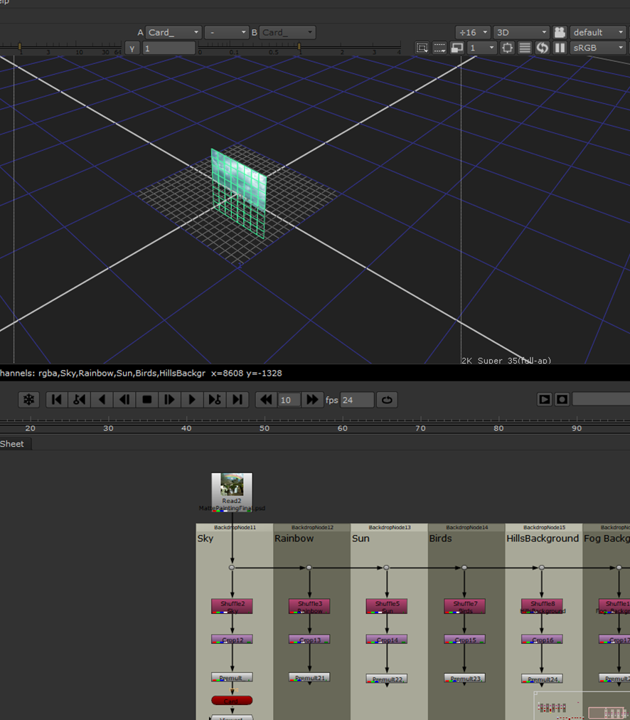
This separated all of the layers that I worked on within Photoshop from each other. Each of these was connected with a merge node to create a 2D version of the image:
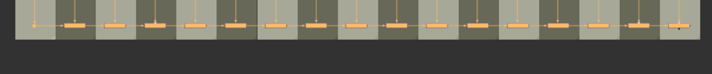
I deleted all of the merge nodes to begin to work within 3D:
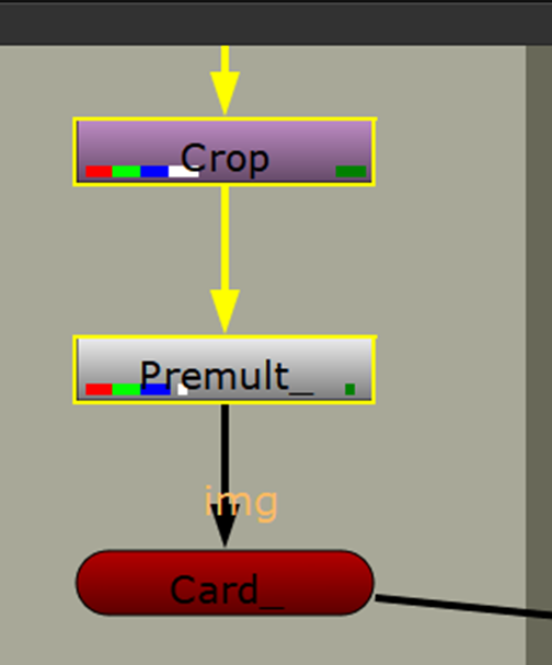
I created a Premult node:
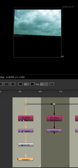
I attached the Premult to the first crop, the alpha channel is baked into the layer so the crop is applied. This creates a 2D version of the layer within the viewer:
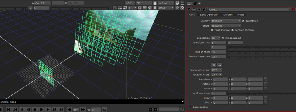
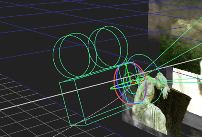
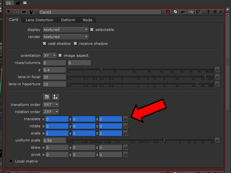
After this, I created a card node:
The card lens allows the layer to be viewed in the 3D mode by projecting it onto the card. Initially, it sits at world space zero:
I created a card node for every layer:
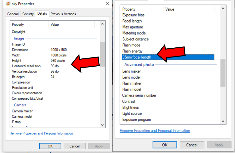
To help me position my cards I had to take a look at the source data from the original images:
Specifically, I had to find the data on the focal range and aperture.
–Via the provided tutorial
Here are the attributes of the sky:
Here are the attributes of the statue:
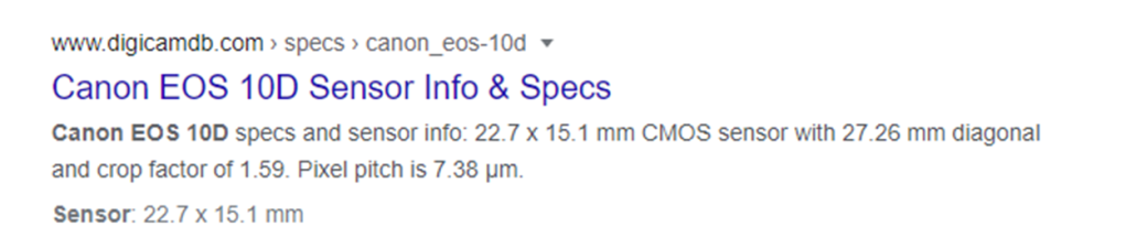
From this, I found that the camera used was a Canon EOS 10D and the focal length was 35mm. However, for our matte painting, we will also need to know the horizontal and vertical aperture and, for this, we need to know the sensor size of this camera.
A quick google search of the camera model allowed me to find out this information:
-Via Canon
I went though all of the original images to find out each of their information and inputted all of the available data into the cards. Unfortunately, some of the source images were missing specific bits of data so I had to interpolate their attributes based on the layers that were ordered close to it:
To transform the cards I also used the gizmo the translate and rotate by holding down “CTRL”:
Double clicking on the card’s nodes allowed me to see their position on the 3D graph:
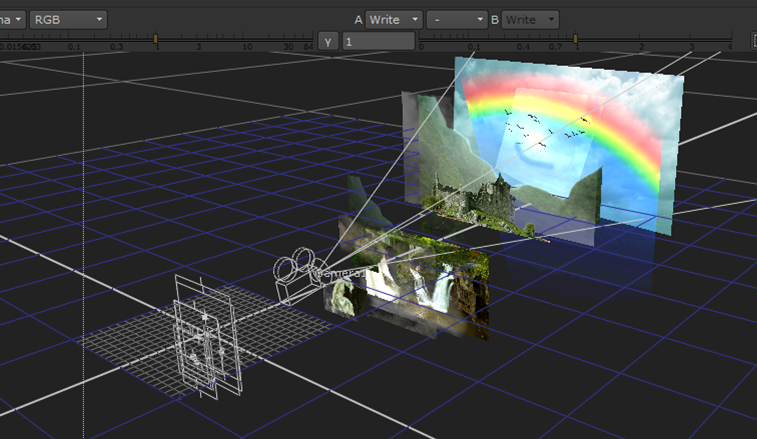
Through trial and error I managed to position all of the cards into a position that I liked and didn’t create any gaps or overlay between the layers.
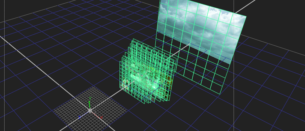
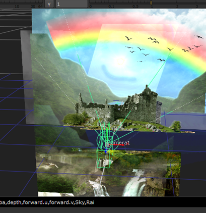
After the 3D scene was setup, I created a basic camera setup by adding a Scene, Scanline Renderer and Camera node connected to each of the cards:
This allowed me to view the 3D scene within the 2D perspective:
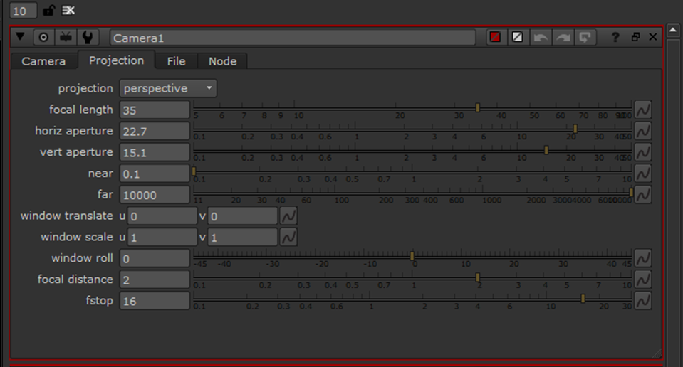
Using the camera data from the source images, I adjusted the camera’s attributes:
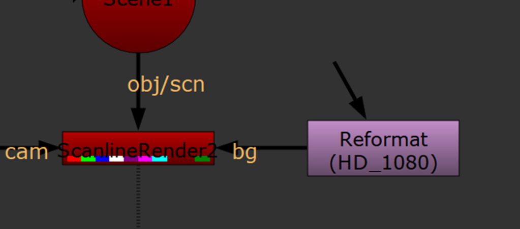
Now, it was time to add a Reformat node because 4000×4000 was too high for my final render. Also, it is not a traditionally used format for videos:
I set the output format to “1920×1080” and attached it to the Scanline Renderer via the BG pipe:
This reformatted the 2D perspective:
At last, it was time to animate the camera. I set a key-frame for the camera at frame 1:
Using the gizmo I adjusted the position of the camera:
I found it useful to switch between the 3D/2D viewer often to see how the changes that I make in 3D effect the 2D outcome.
Next, I set a keyframe at 100:
Using the gizmo I once again translated the camera to a position that I liked closer to the castle:
Once again, I was able to rotate the camera’s perspective by holding down “CTRL”:
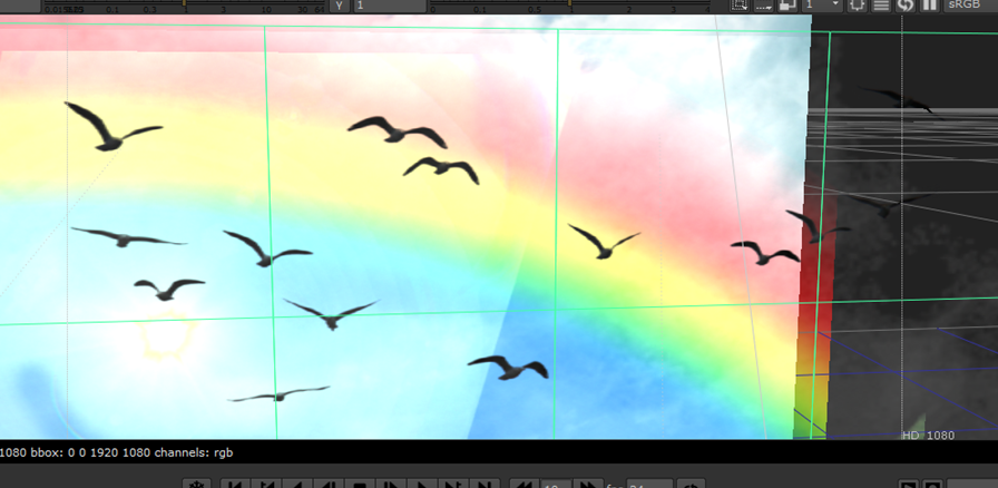
After the camera was animated, I then wanted a dynamic element for my scene, so I decided to animate the birds flying in the sky:
I set a keyframe at frame 0 and midway at frame 48 right before the birds appeared on the video.
I extended the max frame length to 120 and set a keyframe for the bird’s card and translated them across the screen to mimic “flying”:
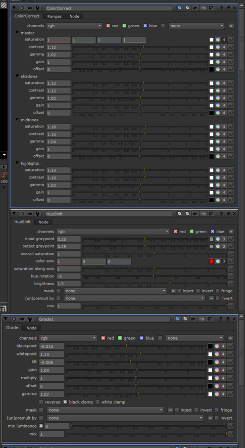
Once this was done, it was time to add some slight colour correction to finalise my project. I added a HueShift, ColourCorrect, and Grade node right before the viewer:
I adjusted the attributes as so:
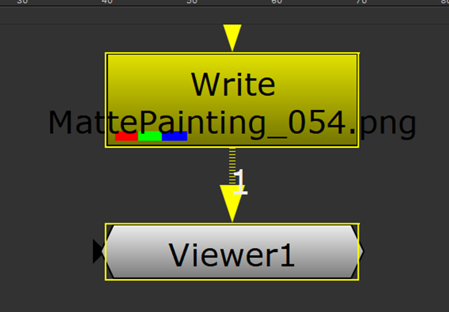
Once I was happy with my animated matte painting, I created a “Write” node and positioned it above the viewer. I adjusted the properties to be a 16-bit PNG output image sequence.
This is what my final nuke pass looked like:
Here is my final render:
Overall, I am fairly happy with the outcome of this task. I definitely underestimated the workflow, and should I take on a similar project in the future, I think I’ll be a lot faster and efficient. There are some minor inconsistencies in my Photoshop work but this’ll only get better overtime with practise. There were also some discrepancies in Nuke. Despite this, I like the look of the final product and think that it’s a great first attempt.
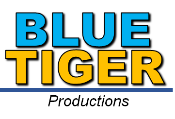
For our first task of component 2 we had to design a logo for a freelance business, focused upon a specific area of media production (Animation, VFX, Post Production or Advertising). I decided to make a logo for a film company called “Blue Tiger Productions”.
I decided to research into popular, well-known company logos:
Through research, I realised that different company types tend to have different approaches to logos. For example, fast-food chain logos tend to be more vibrant and features lots of yellow and red with some blue. Yellow and red attract children more
“Children tend to be attracted to the bright block colors of the color wheel rather than pastels or muted blends. Primary colors red, yellow and blue, and secondary colors green, orange and purple, are more appealing than light shades of pink and beige or neutral shades of gray and brown.” – Sciencing.com
Before beginning to design my logo, I needed to understand what truly makes for a good logo.
“A good logo is distinctive, appropriate, practical, graphic and simple in form, and it conveys the owner’s intended message. A concept or “meaning” is usually behind an effective logo, and it communicates the intended message. … A great logo essentially boils down to two things: great concept and great execution” – Smashingmagazine.com
Good logos are ones that are memorable/easily recognisable, simple and appropriate
I began to watch various different YouTube videos and articles to better my understanding, such as the ones featured below:
One thing that stood out to me is that logos are not supposed to be overly complex, and often the best logos are the simple but effective ones.
This shows how Apple’s logo has progressed over time to now be a simple silhouette of a bitten apply:
The first logo looks more like artwork and isn’t very memorable. The second is very simply but very memorable.
Despite this, when dealing with film companies, the logo is mostly remembered by the title card at the start of the film and the associating sounds/music that accompanies it. As well as how the logo is animated.
Contrary to other business professions, popular film production company’s logos tend to be a lot more cluttered and complex than other fields, mostly due to the fact that they are presented within title cards with a lot more going on than the average logo. There is also less of a need for them to “brainwash” their audience, like say, McDonald’s marketing does for children to get repeat sales.
The popular colours used for film production companies are yellow, blue and black.
Now, it was finally time to design my logo. I looked up online for popular logo colour schemes and found this Navy and Orange scheme that I quite like from Tailorbrands.com
The blue/orange colour scheme matches the company name of “Blue (blue) Tiger (orange)”:
I decided to go for a brighter blue/orange so that the text would stand out more.
It was time to choose a font so I tested the water with a bunch of different fonts to see what they would look like. I decided to have the logo be in all CAPS, as most other film company logos are.
The font that I ended up choosing was Arial Black.
Then, I tested having a tiger pattern applied to the text:
I didn’t like this look as it looked out-of-date and not simple like logos are supposed to be. It isn’t a very “clean” look.
Instead, I opted for just having plain blue/orange for the text and added an outline/drop shadow. In addition, I added a line with simple, italic, black text stating “Productions” underneath.
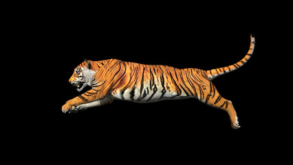
I figured that the logo needed something extra to it, such as a mascot.
Pixar has the lamp:
Metro Goldwyn Mayer has the lion:
Since the company name is “Blue Tiger”, it would make sense to have a blue tiger as the company mascot.
Due to my logo just being text and a line, I figured that the only logical place for a figure would be above the text, not behind or elsewhere. I felt as if it also needed to be thin so as to not take up much space.
I realised that the most appropriate position for the tiger to be within was mid-jump so I began to look up references of tiger’s jumping:
This is the simple design that I came up with:
I kept the tiger design simple with no distinct features. Obviously, this was done since it is a logo and not supposed to be over-complicated.
After asking some friends for advice, they advised me to make the logo simpler, as not many modern logos have outlines or drop-shadows. This style is out-of-date:
I much prefer this simpler aethetic.
After this, I tested a couple other colour schemes but ultimately didn’t like them, especially the stripes:
Next, I tested a few different similar colour variations:
To conclude, I simplified my logo and made it smaller because I felt as if it was too large.
This is one colour variation:
Final logo design:
For my final design, I reverted back to the Navy and Orange scheme from earlier. I feel as if this looks “cleaner” and more professional that the brighter colouration, although technically both colour schemes could be used in different appropriate scenarios.
Overall, I am happy with how this logo turned out and I think that it’s a good first attempt and definitely looks somewhat professional. It’s managed to achieve the art of simplicity, however, I think that it could look more memorable and it does retain a slightly dated look.
Character Design:
For the second task of component 2, we had to design concept art for a character featured in a film, game, or advert.
Before I began thinking of a design, I chose to design a character for a film.
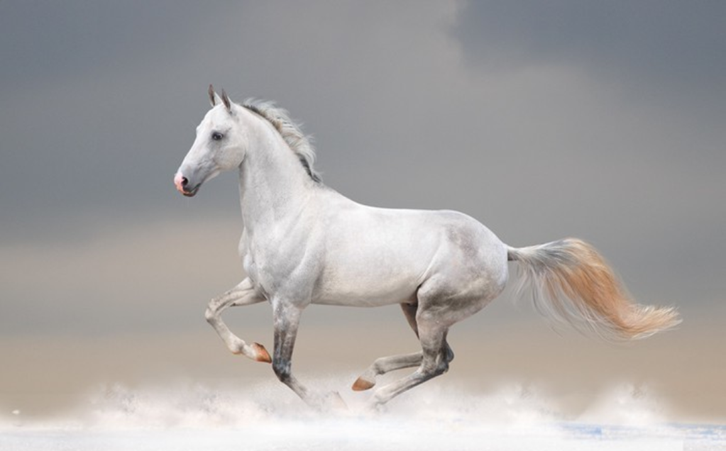
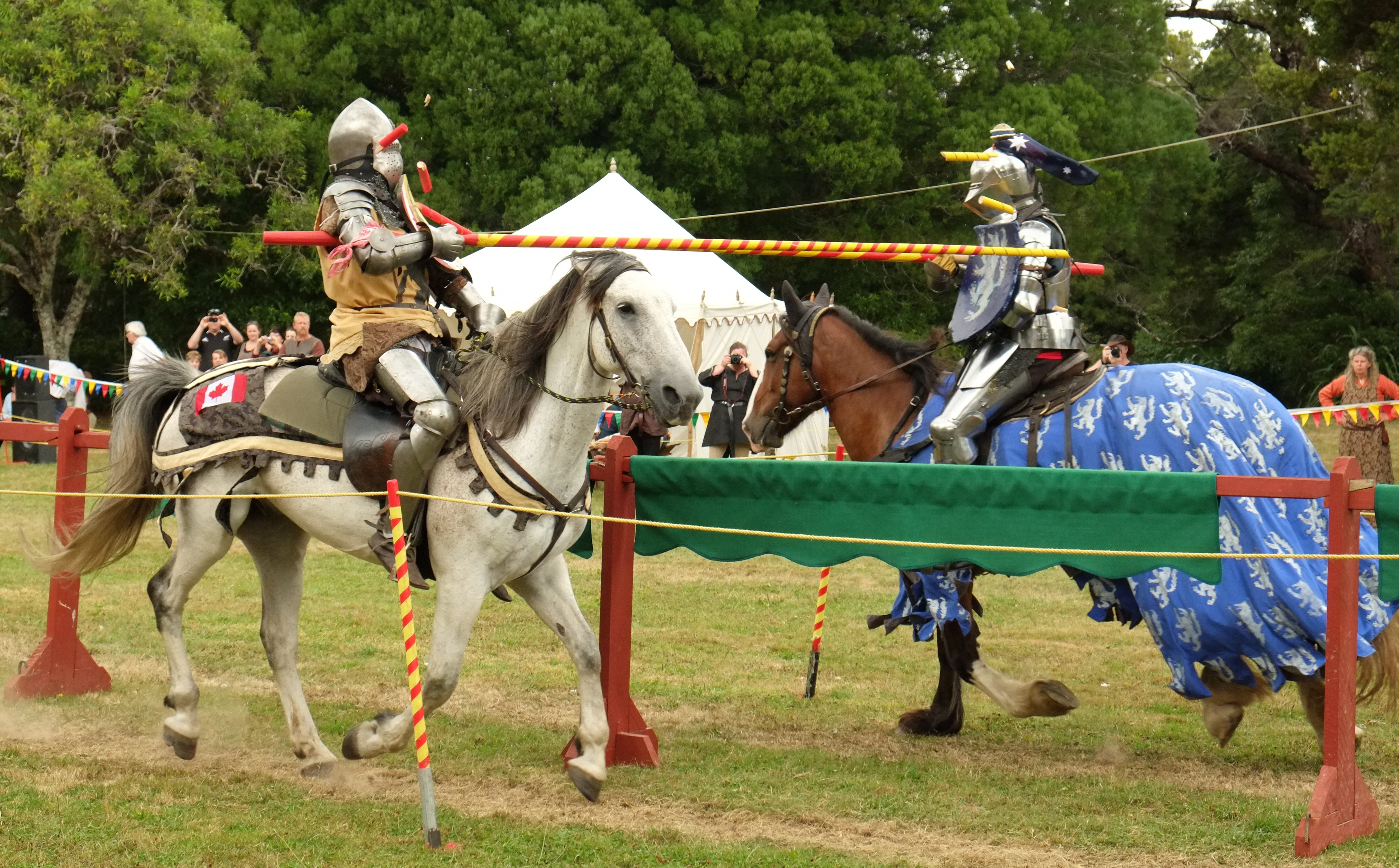
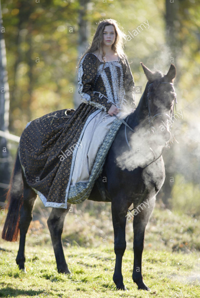
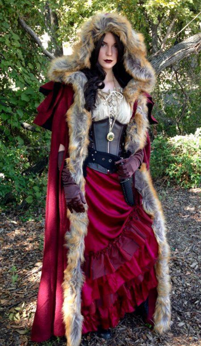
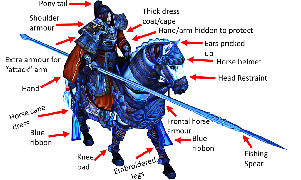
I decided that I wanted my design to be for a medieval drama, specifically a strong dominant female character riding on a horse.
In order to achieve this, I’d have to get an idea for what sort of character she would be: her roles in the story, her morals, goals etc.
I researched into various videos on how to create a compelling character creation in film:
I also read various articles about what makes a good character design:
From here, I researched into various different character concept designs for inspiration:
Specifically, I honed into medieval character concept art, since that’s specifically what I was looking to replicate in my own way:
One thing to note is that judging from the majority of these designs is that the quite dark/gloomy tone of the medieval era is seen to be is reflected in the art-style, of which mainly consists of dull shades of browns, greys, blacks and silvers. However, the female outfits all seem to be more colourful than the males with a lot more reds.
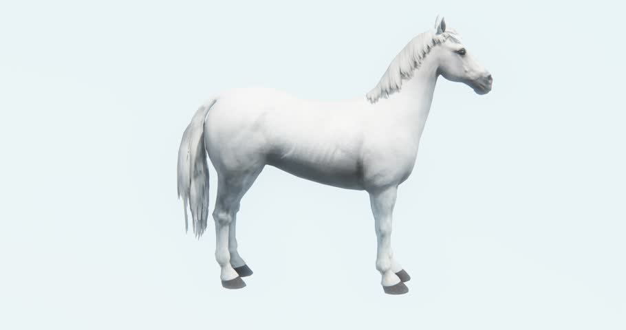
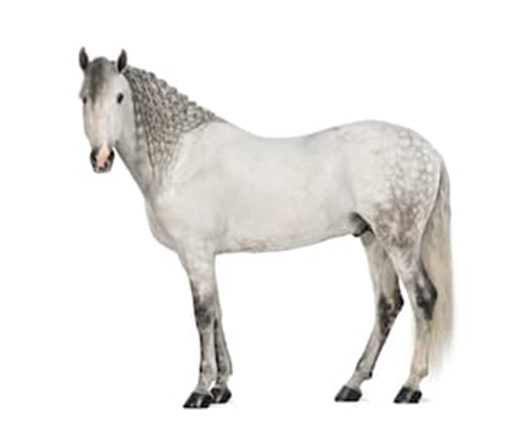
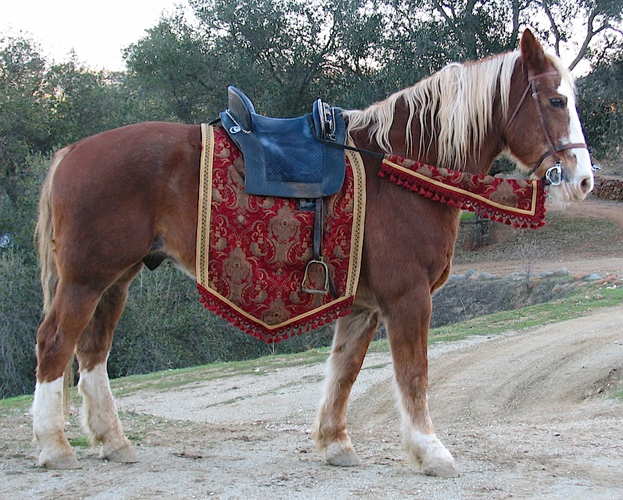
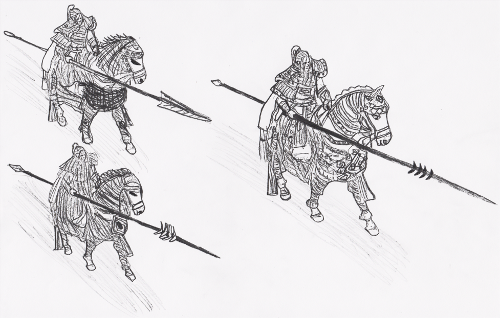
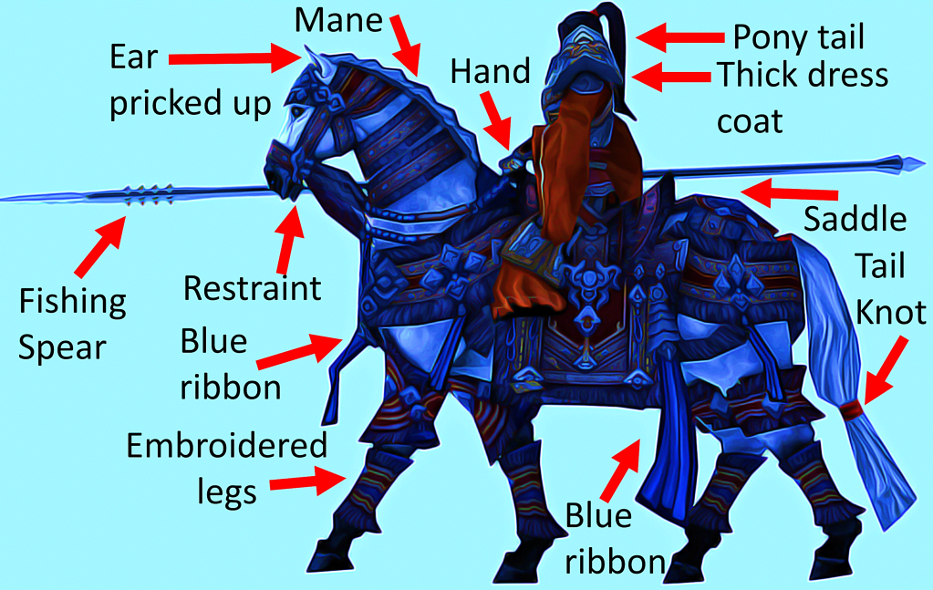
Moving on, I began to collect a bunch of references for side/front/angled views of horses that would later help me when it came to the proportions of my concept art. I also collected a bunch of references of jousting because I wanted the girl to wield a spear-like weapon to make her seem like a more powerful threat. Also, I researched into a bunch of different feminine clothing and patterns from the era.
References:
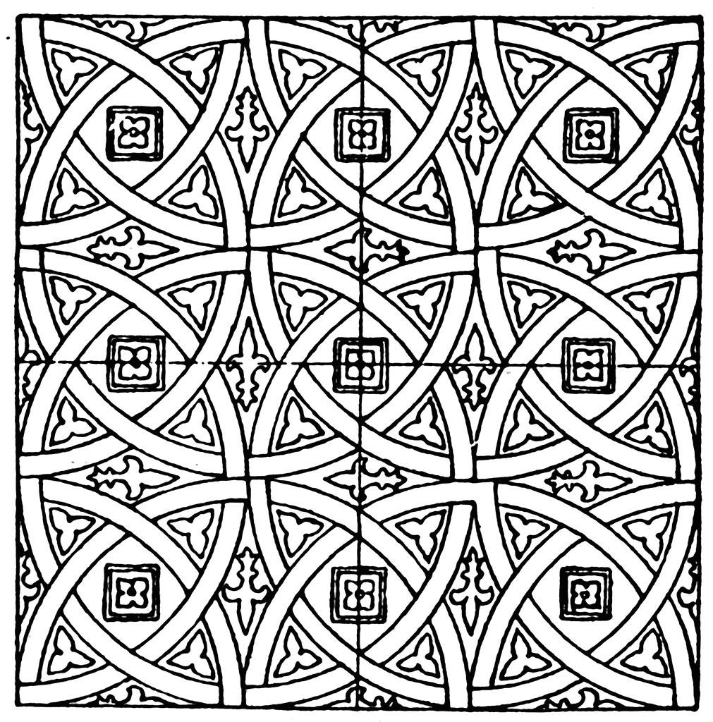
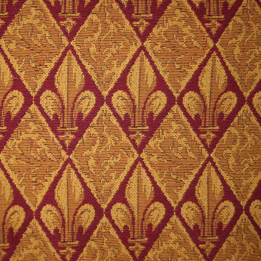
I also collected a bunch of references of different medieval patterns that would help me design the embroidery of the woman’s/horse’s clothes:
Fishing spear references:
Saddle references:
To further aid me, I also collated references for the anatomy of a horse and woman:
To help create a good design certain antimony parts can be exaggerated or highlighted depending on the genre, purpose and what you want to convey to the audience.
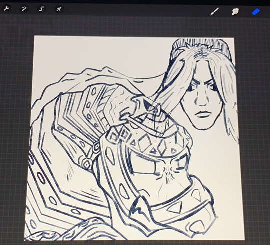
After looking into these references, I began to concept a few different rough variations of what would ultimately be my final design.
Iterative concept designs:
Side view:
Front view:
Action:
I designed the horse to not be moving that fast, of which is why the character isn’t leaning that far forward.
Up-close detail:
For this up-close shot I went for a more demonic cartoon-esk design, especially for the horse. It was a little difficult to get the dimensions right but I think it turned out okay.
I went for super wacky colours for this and it doesn’t look right at all and the horse ended up looking like a dragon so I didn’t continue further with this up-close perspective.
As stated earlier, generally, most movies use browns, greys and reds for female characters during the medieval era. To help me decide on my final design’s colour scheme I looked online for popular mediaval colour schemes:
During the design process, I altered between various different patterns and aesthetics. I also played around with making the horse’s eyes look demonic. Ultimately, I preferred the more complex patterns from the third iterations and so I decided to integrate them with a more refined, neater aesthetic for my final designs. I decided to use the spearhead that resembles a fishing speer, as opposed to the other rough designs.
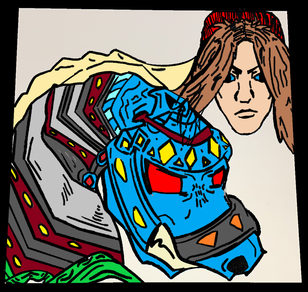
Using Krita and Photoshop I then worked on my finished designs based off of my iterative sketches.
These are my finished coloured designs:
Side:
Front:
Action:
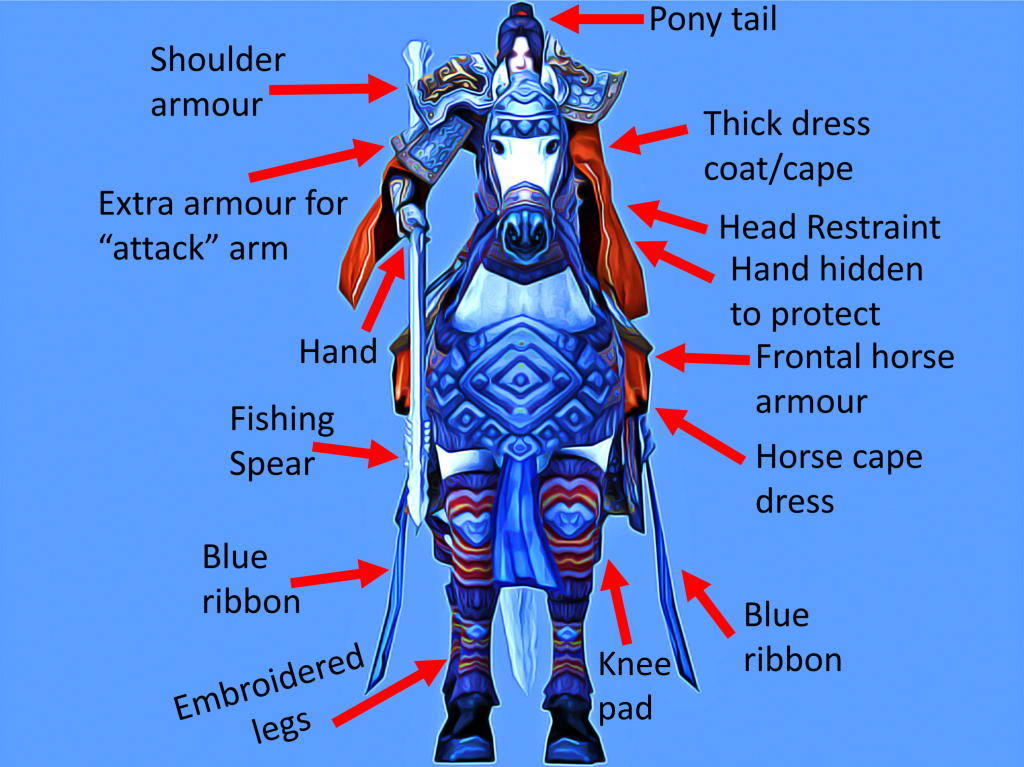
To conclude, I am very happy with the finished product and think that it fits the era well. The embroidery is quite detailed and looks realistic. It was important for me to base the design on realism due to the genre and setting of the film. The proportions are perfect, especially for the horse, and I’m particularity proud of how accurate the horse’s head turned out to be. The character looks fierce and is layered with lots of clothes, some armour to protect her, and can definitely put up a fight.
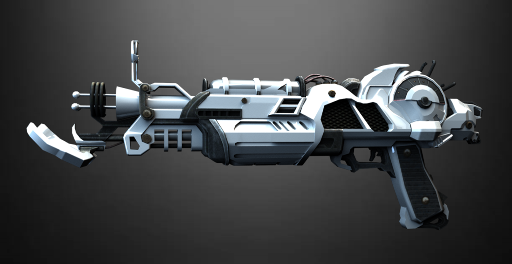
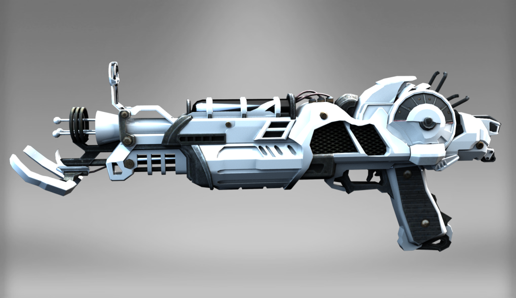
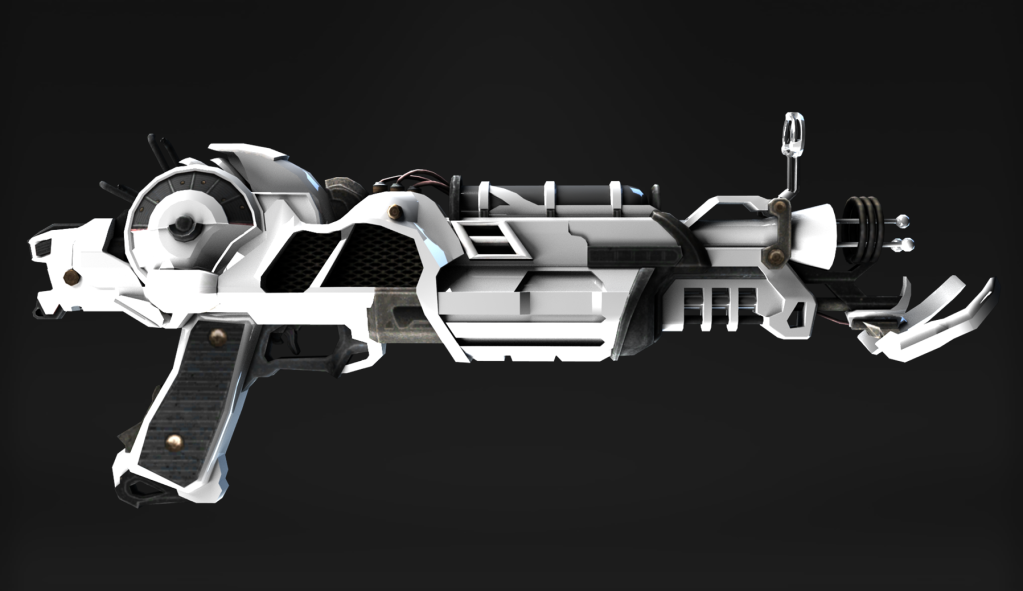
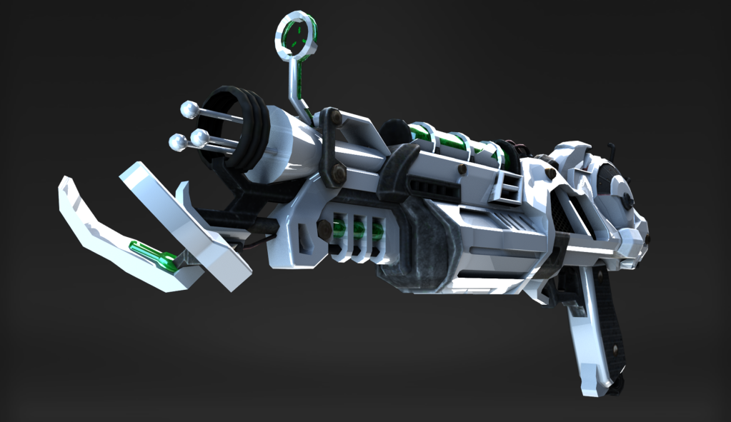
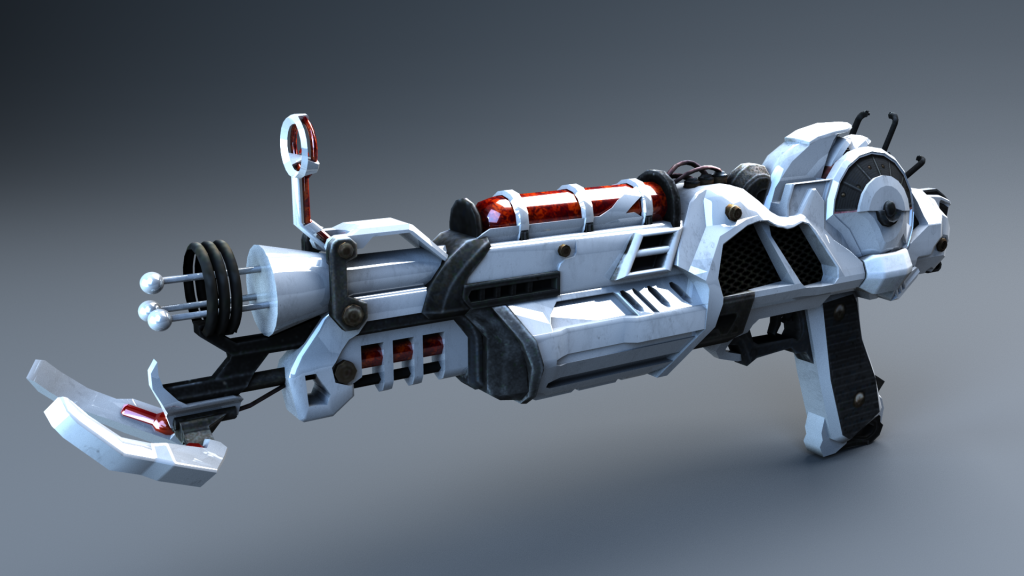
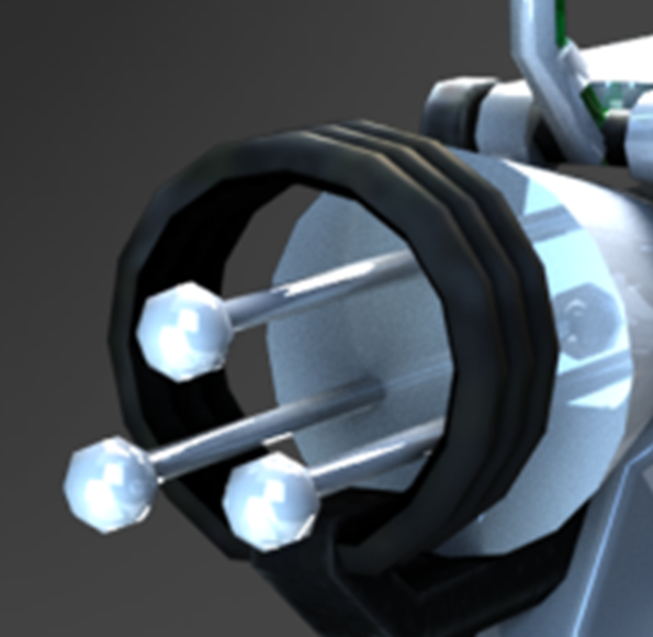
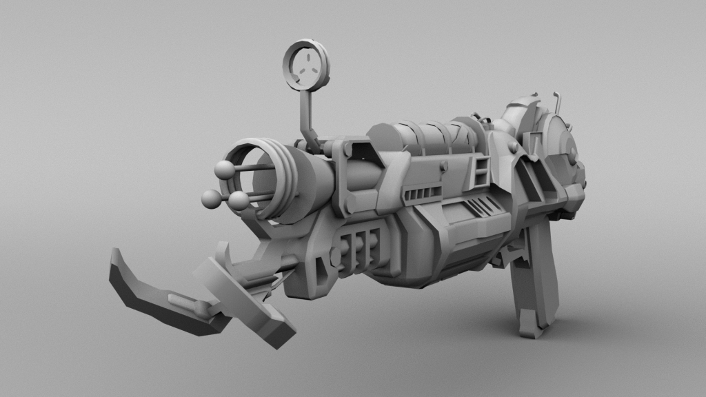
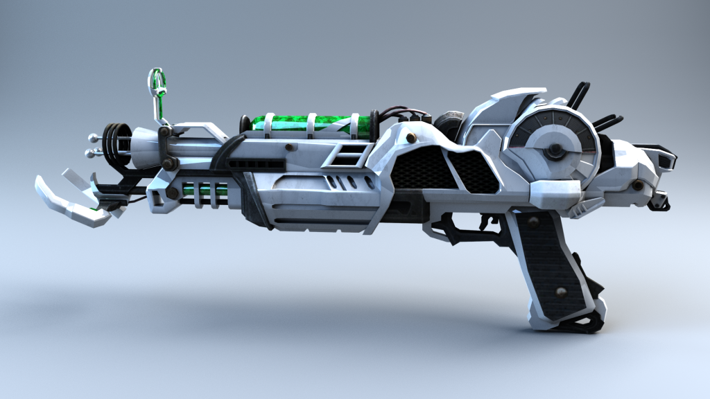
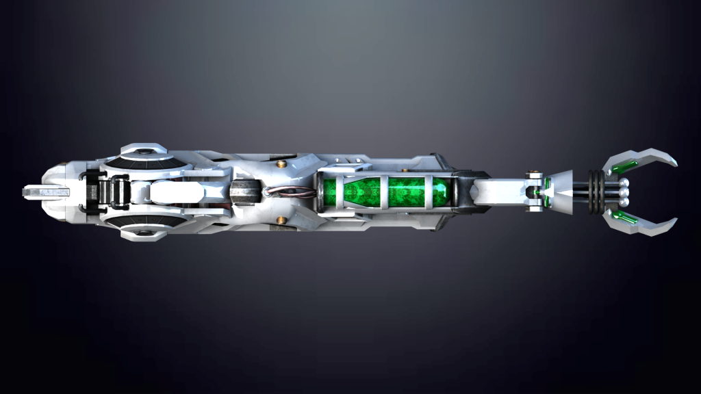
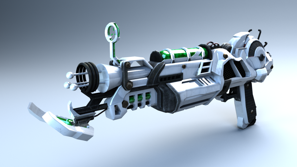
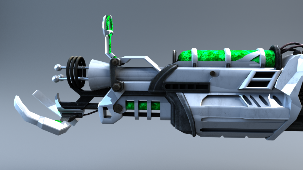
Within component 1 I managed to make good progress with modelling a Ray Gun Mark 2 from Call of Duty Zombies. This weapon is a fictional “futuristic” wonder-weapon designed to fight off against the undead hoards.
From Wikipedia: “The Ray Gun Mark II is a wonder weapon that was released alongside the Zombies map, Buried, and is featured in all Zombies maps in Call of Duty: Black Ops II, in Call of Duty: Black Ops III in all the remastered maps featured in the Zombies Chronicles map pack, and in Call of Duty: Black Ops 4 in Zombies and Blackout. It is the successor and the evolution of the Ray Gun, although, unlike its predecessor, the Ray Gun Mark II fires in three-round bursts with no splash damage. It also has a very high penetration ability, capable of killing many zombies with one burst. Its successor is the GKZ-45 Mk3.“
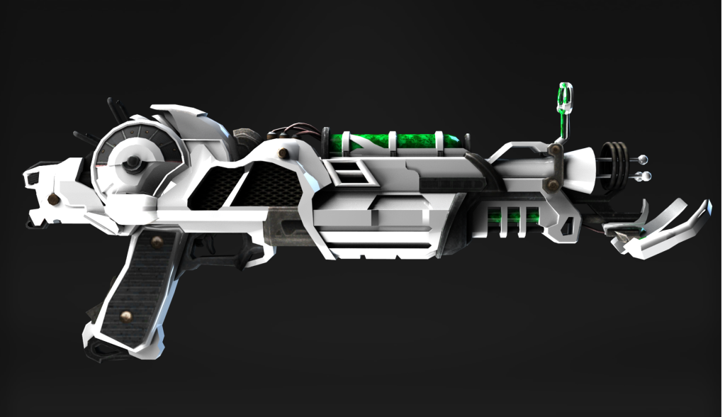
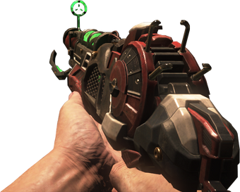
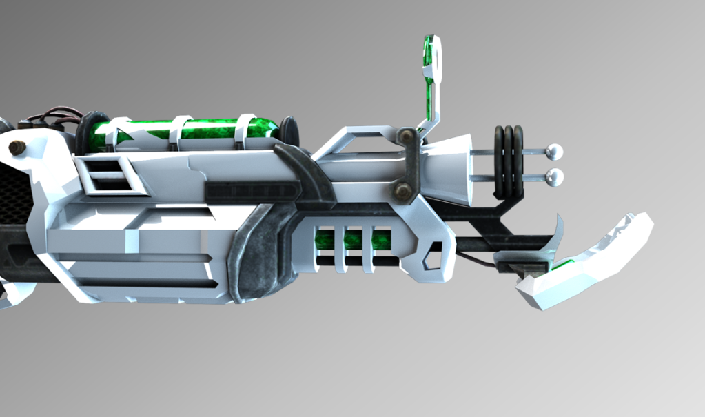
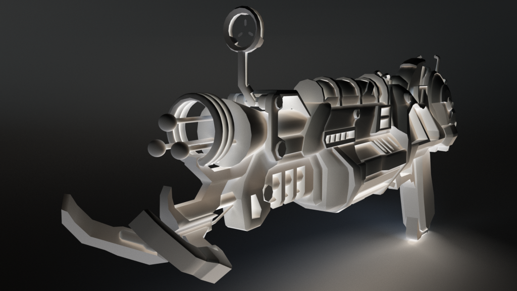
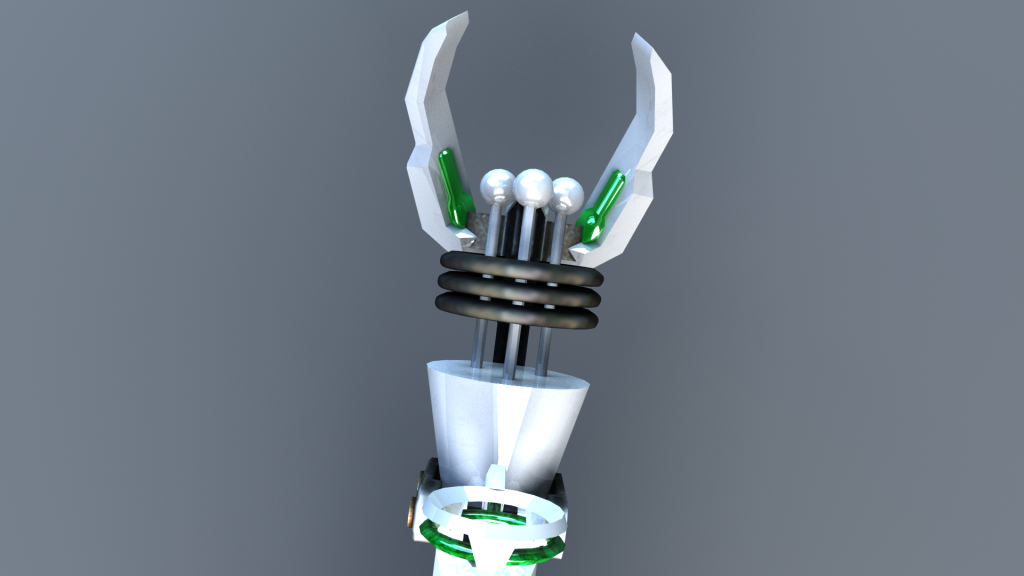
Here is what the gun looks like that I used for inspiation:
Within component 1 I had pretty much completed my asset besides some further adjustments that I needed to make.
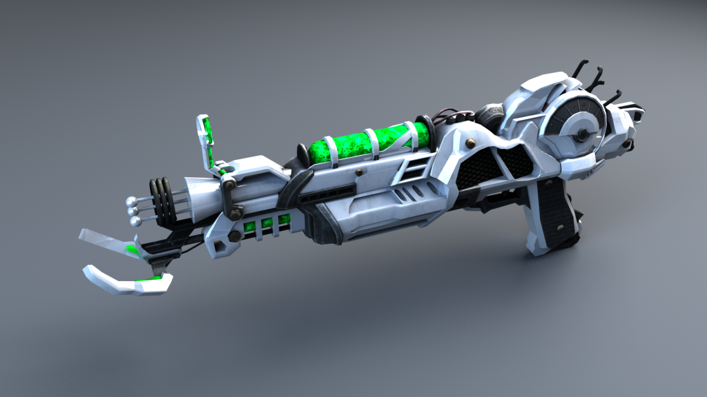
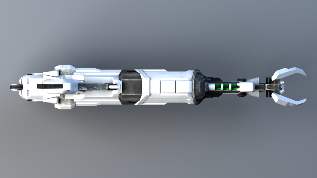
Here are my *non-final* final renders from component 1:
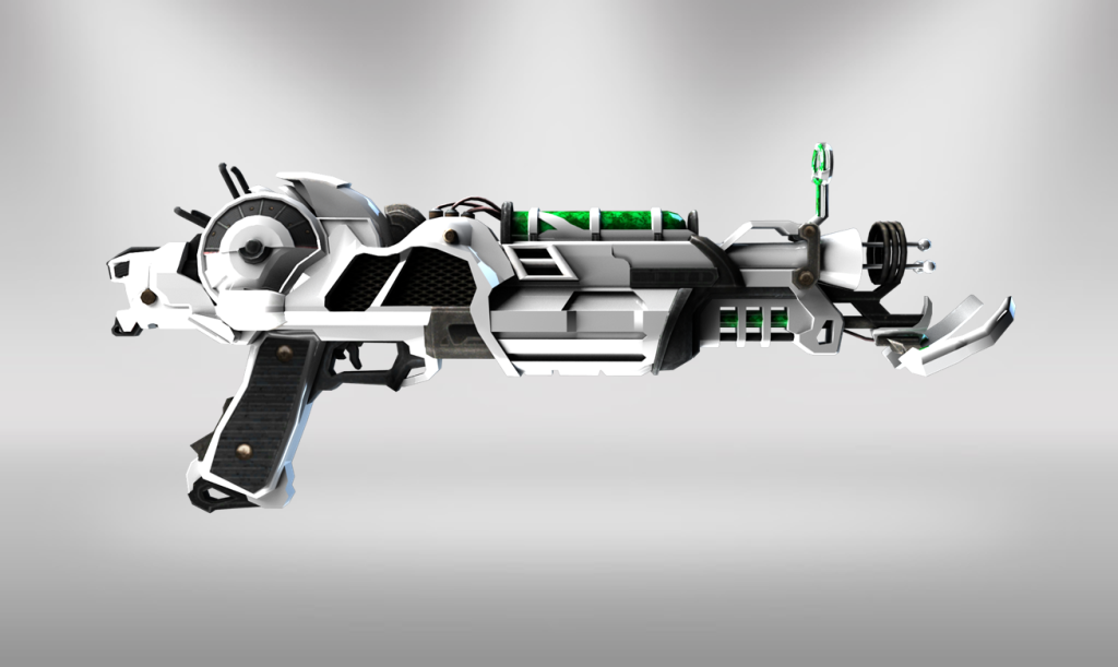
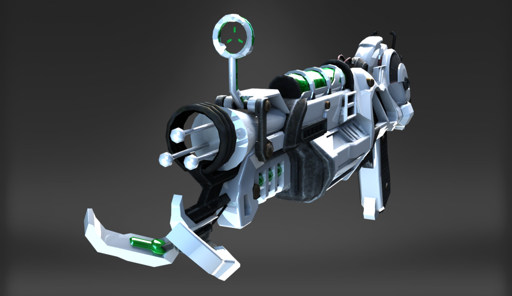
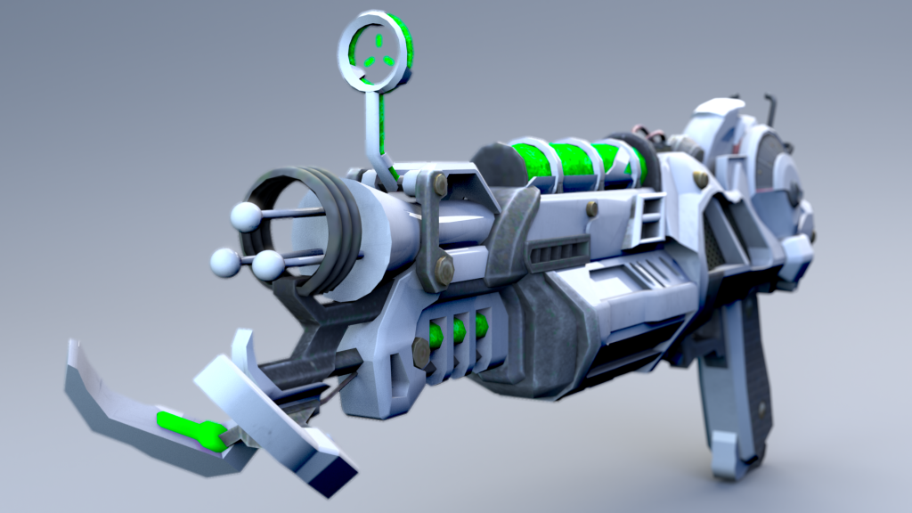
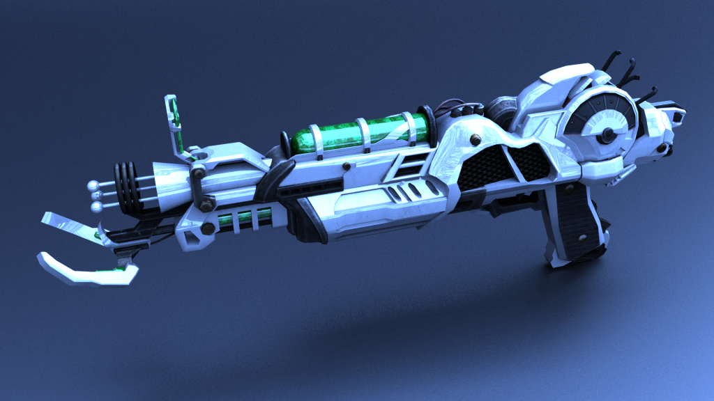
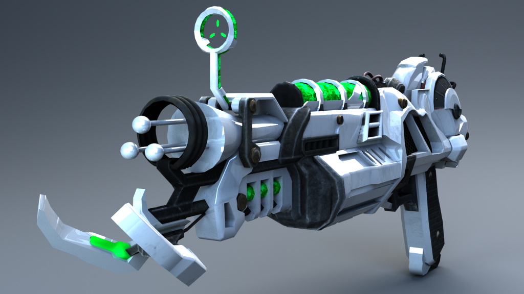
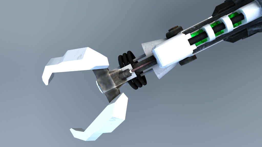
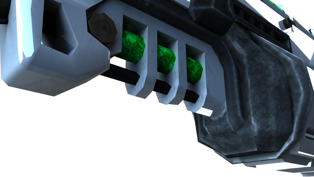
With green ammo/optic glow:
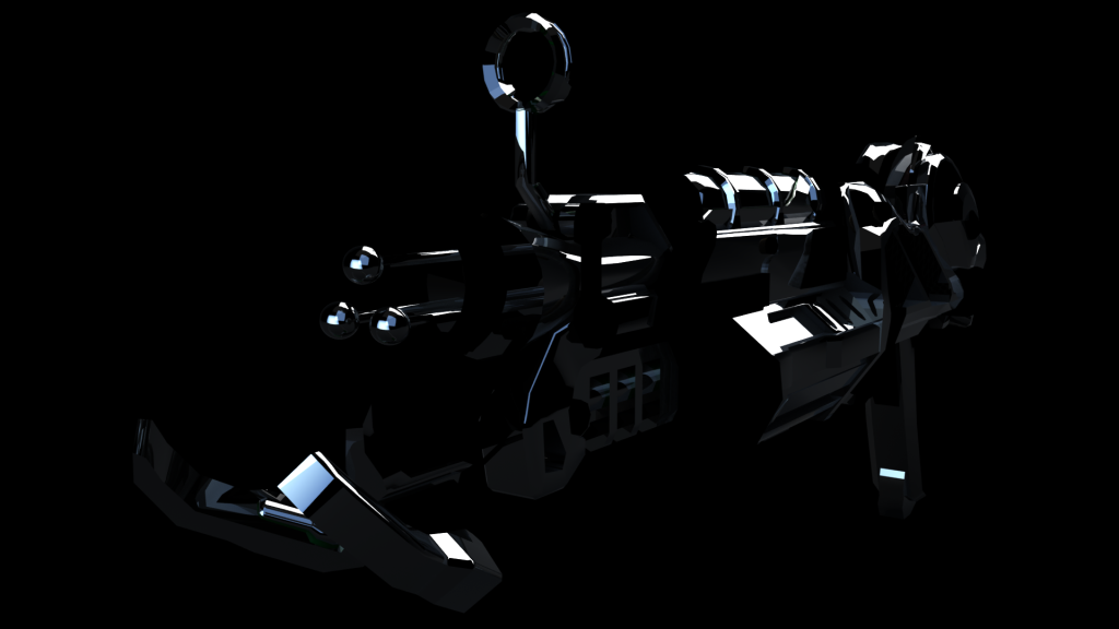
These following renders were using the “Lambert” surface shader, as apposed to the “Phong” surface shader:
I found applying the textures and UV unwrapping to be pretty straight forward within component 1 and didn’t struggle at all in that regard.
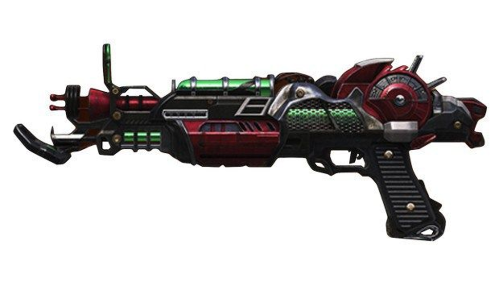
Similarly, I used this red texture instead of the green one from Call of Duty Black Ops 2 to see what it would look like:
However, I preferred the green to red, as the red looked like blood was flowing through the weapons. This looked cool but I felt like the green made the weapon look more “alien”.
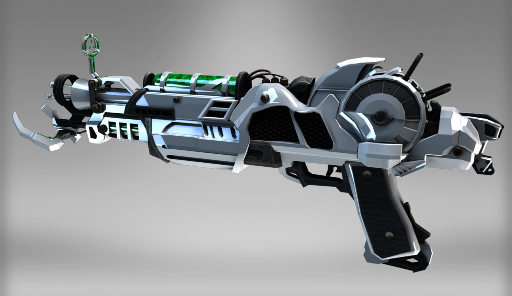
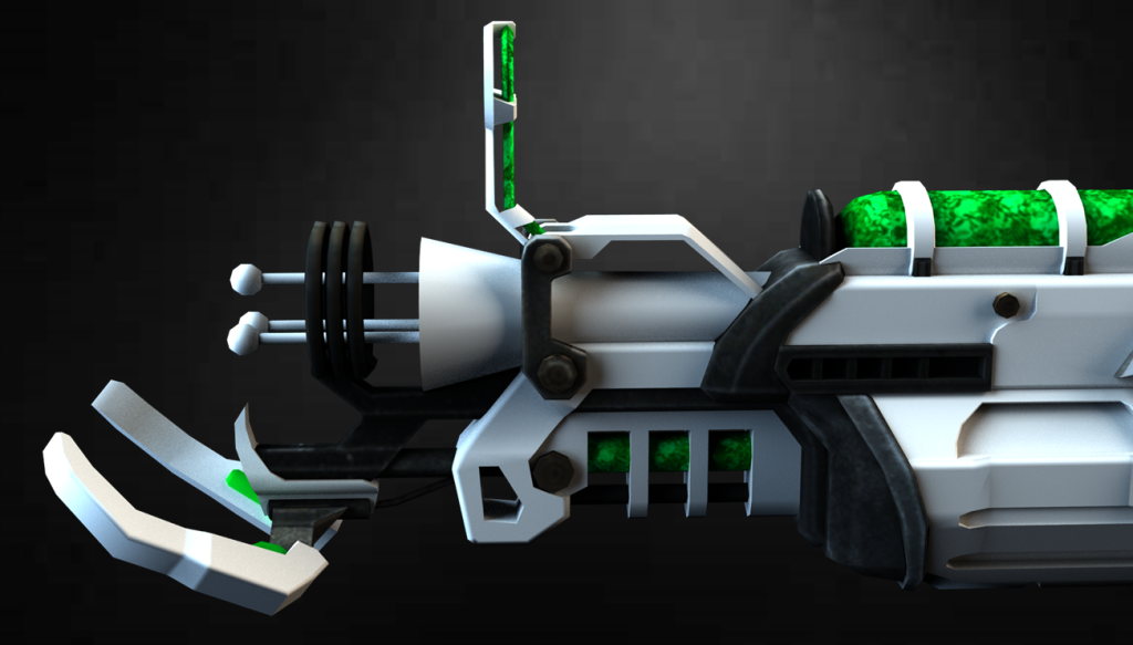
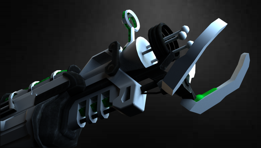
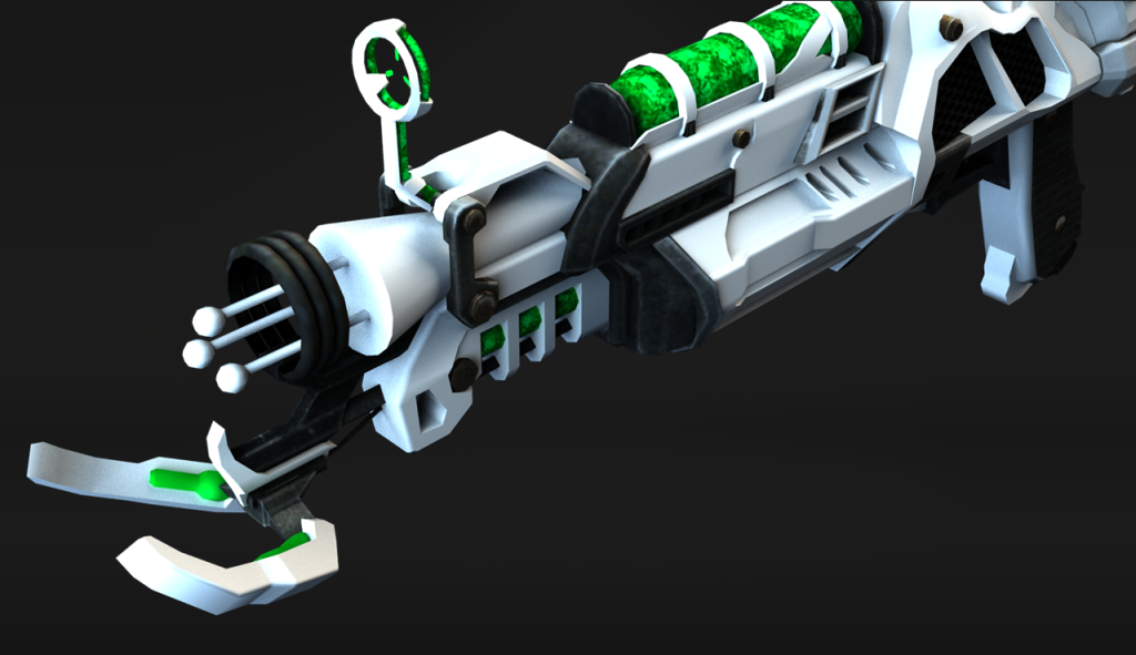
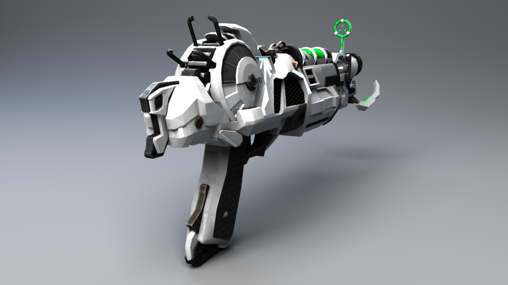
During component 1, I tested the water with various different alternate colour schemes (such as pink and blue) but I ended up settling with a contrast between black and white, as I felt like it made the weapon stand out and look really sleek. It also retained a very “futuristic look” and made it look more unique compared to the design that I was basing it off of. The Ray Gun Mark 2 is supposed to be a very powerful weapon so it should look a lot more advanced than modern technology and a lot of technology is already utilising this “trendy” look too:
Furthermore, most websites and furniture are taking on this colour scheme trend too – I think that it is popular due to simplicity and the fact that it’s not over-cluttered with a bunch of different colours.
Most futuristic concept designs use this colour scheme too:
I took big inspiration from this in choosing the colour scheme of my weapon. It is why I also used the Phong material for my asset so that it would have high reflectivity and look polished/refined like the above examples showcased.
I wanted to ensure that it stood apart from its inspiration and wasn’t just a direct re-creation, at least in terms of its aesthetic, and the black/white camo made it look very different to its red counterpart.
Feedback:
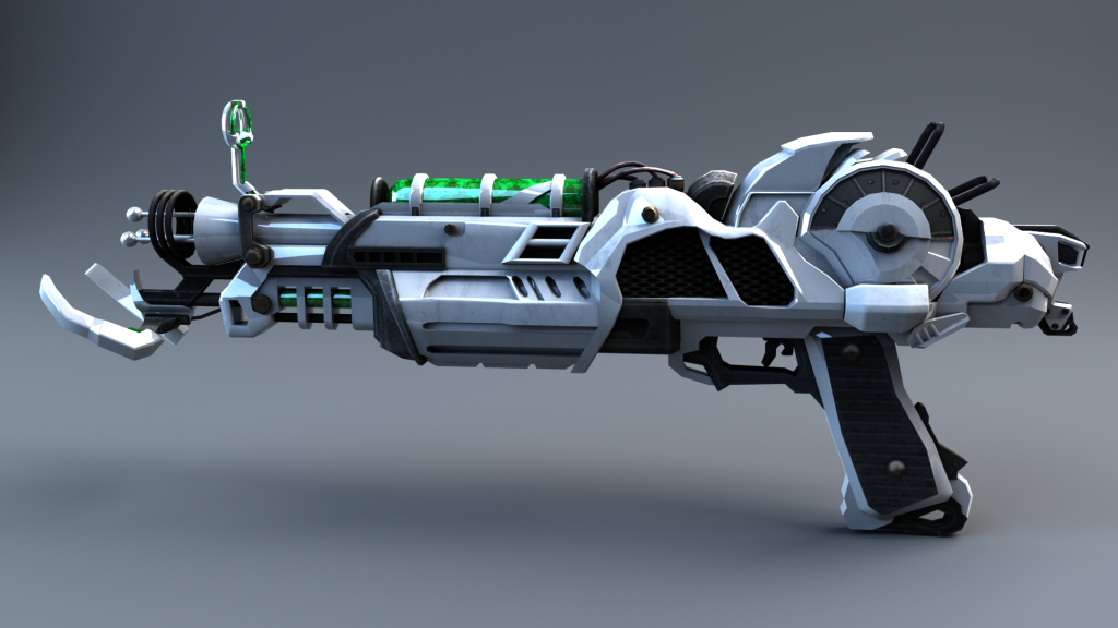
For component 1, I was given feedback from my tutor on how to improve the topology of the front of my weapon. As you can see, the front of the weapon is very jagged and so I needed to smooth it:
In order to improve the topology, I simply used the smooth tool to create more subdivisions.
Here is the result:
Overall, I am much happier with the look of the weapon and it massively helps improve the sleek/clean look that I was going for:
The next piece of feedback that I was given from my tutor was to give more detailed reasonings for the choices of my references used to help me model my weapon.
Here are the reference images that I used:
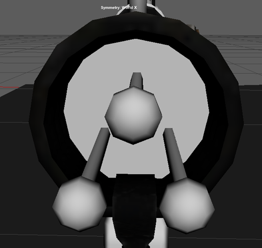
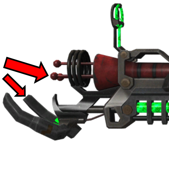
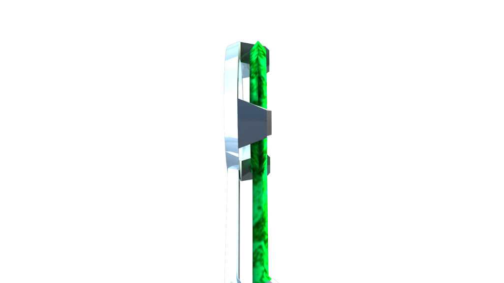
First of all, I used this side shot of the Ray Gun Mark 2. I used this because it gave a perfectly perpendicular view of the side of the weapon that allowed me to easily base my model off of and distinguish the shapes.
Contrastingly, when hunting for reference images online, I found this side shot of the Ray Gun Mark 2, however, if I would’ve used this as a reference image instead, it would’ve made it more difficult to model. This is because it is on an ever so slight angle and that is why at the front of the weapon you can see the back node and prong, despite them being directly behind the front node and prong, so should not be visible at a right angle.
Should I have started modelling my weapon with the above reference, my dimensions/proportions would’ve been slightly off.
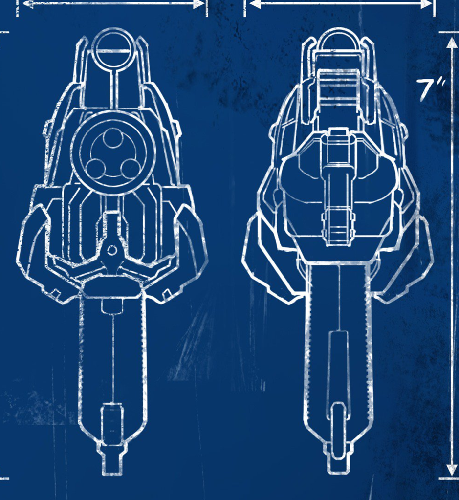
The next reference that I used was a front and back perspective of the weapon. Specifically, I found a blueprint of the weapon that outlined the features of the weapon quite distinctly in bold white. This made it much easier to model as I could clearly see where each part was.
However, despite this benefit of using these images for reference, there were some minor bits of detail missing. To aid me, I used this render of the gun simply for clarity on some fine details for the weapon. I didn’t directly import this image into Maya but rather just glanced at every now-and-again whilst modelling to make sure that I wasn’t not missing out on any key details:
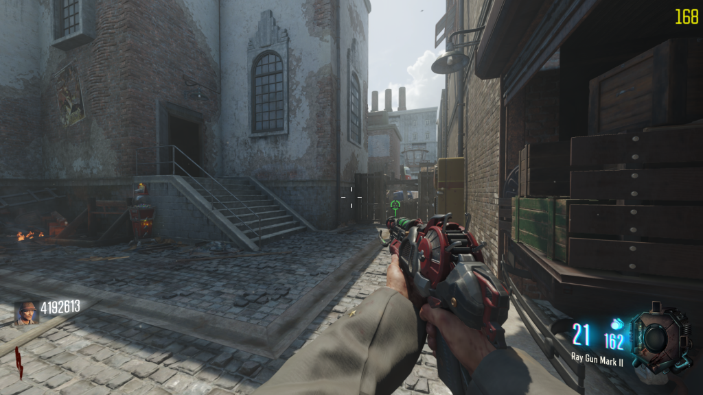
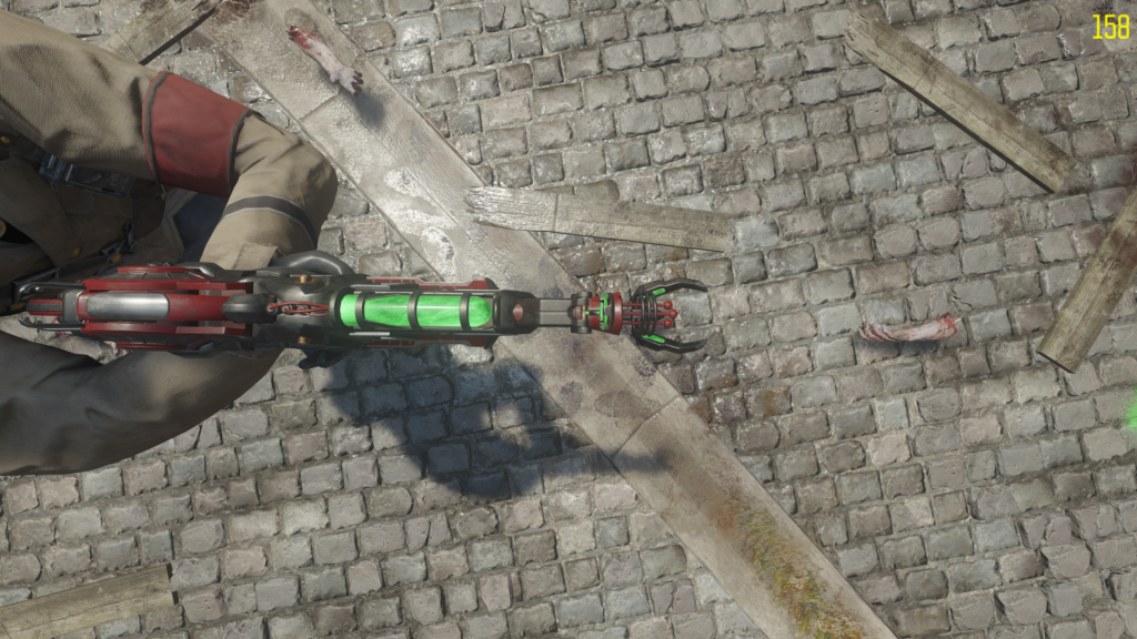
Unfortunately, I couldn’t find any images online that showcased a top-down or bottom-up view of the weapon, and so I played the game myself to obtain the weapon. After which, I then went into the games’ theatre mode to take screenshots of those perspectives myself:
These helped me a lot when it came to modelling the top and bottom of my asset, although I did pretty much have it finished just based off of the side view of the gun.
This is what it looked like in Maya once I had imported my reference images:
That was all of the constructive feedback that I received for component 1, however, I was still not entirely happy with the outcome of my asset. I think that I did exceptionally well with modelling my asset from simple shapes to create a much more complex one, and I love the colour scheme that I chose, but it still needed some finishing touches.
I felt as if my weapon looked a bit “too clean”. This is because I was not using a texture file for the white surface of my weapon and had it set to plain white. Although it made the weapon look super clean, it looked as if it was straight out of a factory and had never been used before. I wanted the white to have some slight smudges on it and variation in its tonality.
After coming to this conclusion, I began to search online for appropriate textures for my asset and I ended up finding this image that I felt worked quite nicely:
The only issue with this texture is that it wasn’t large enough for my weapon, so when I would apply the texture onto my asset, it would stretch and look distorted/low quality.
In Photoshop, I slightly increased the contrast of the texture and duplicated/repeated it to look as so:
I repeated the image so that it would align perfectly and there would be no standout repeating of the texture when it came to applying it to my asset.
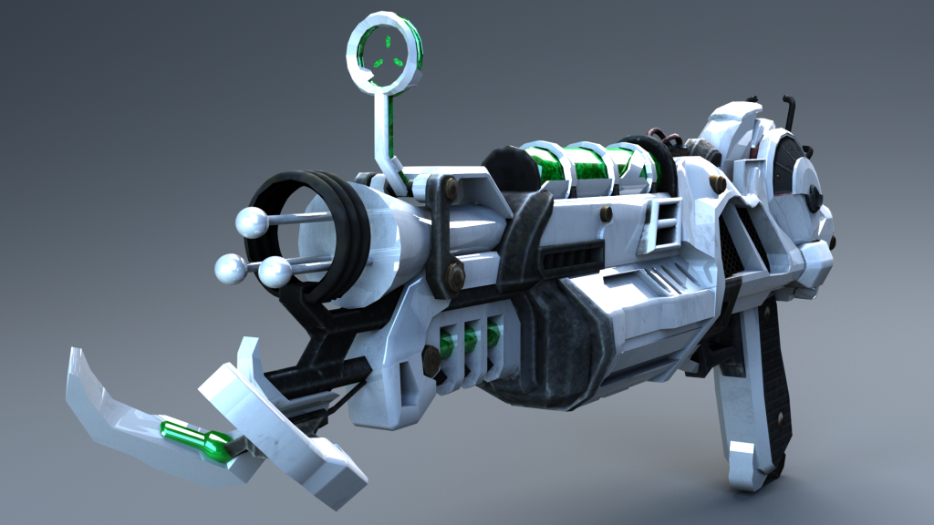
This is what my asset looked like with this texture applied:
Personally, I think this looks slightly better than before, as it adds an ever so slight “used/worn” aspect to the aesthetic.
Additionally, in Photoshop, I played around with increasing the saturation, brightness and contrast of the textures to see what the outcome would look like:
I do like this design, however, I preferred the darker look of the original texture and this looks too oversaturated, so I decided to not use this for my final asset. It also made the texture look lower quality for some reason.
As you will have seen from my renders from Component 1, I rendered a few different alternate looks to my weapon:
With black/grey ammo/optic:
With green ammo/optic glow:
Using the “Lambert” surface shader, as apposed to the “Phong” surface shader:
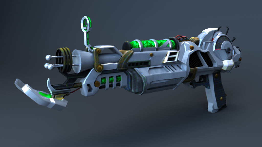
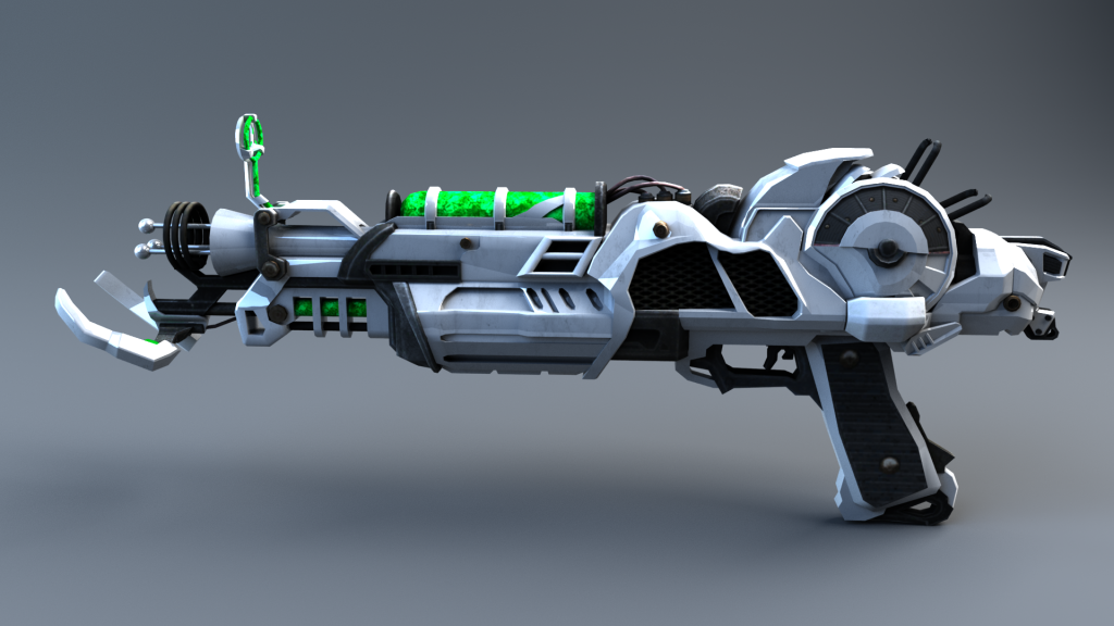
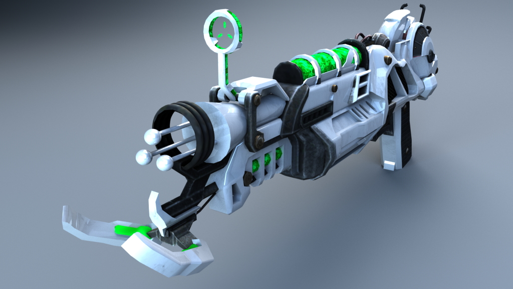
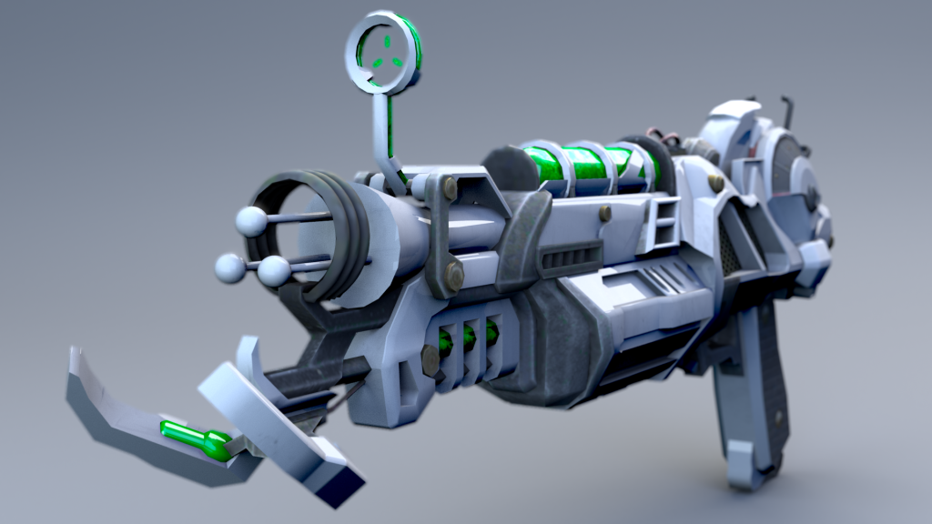
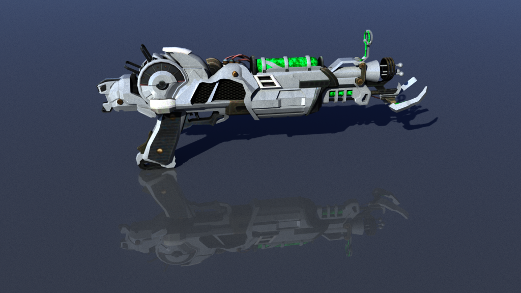
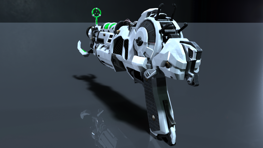
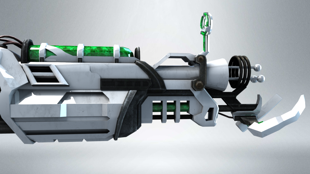
Before I could complete my final renders for component 2, I had to decide on which aesthetic I preferred for my final asset. Obviously, I ruled out the last style straight away since I had already found a better texture for the white portion of the weapon. In the end, I decided to use the Phong surface shader combined with the green ammo/optic glow. I think that the green stands out a lot more than the black ammo/optic and makes it look a lot more futuristic. The black blended in with the other dark parts of the weapon too much. The green glow also looks fluid and more dynamic. Additionally, I preferred the Phong shader to the lambert because the lambert shader made it look like a toy weapon with little reflectability. The Ray Gun Mark 2 is supposed to be a really powerful, advanced piece of weaponry, and so I wanted it to reflect and stand out. The Ray Gun Mark II is made of a made-up element from space called “Element 115” that has the capability to reanimate the dead. It makes sense for it to be shiny, like gold/silver, to give the player (should the asset be used in a video game) a sense of power-wielding it in their hands. It is not this shiny within Call of Duty, however, I wanted my version of it to look more powerful and rare.
This is the final aesthetic for my weapon that I was happy with:
Lastly, I did ask some friends/peers about what they thought of my asset for further feedback but they all told me that it looked pretty much perfect so it didn’t really help much with further constructive criticism.
Concept Designs:
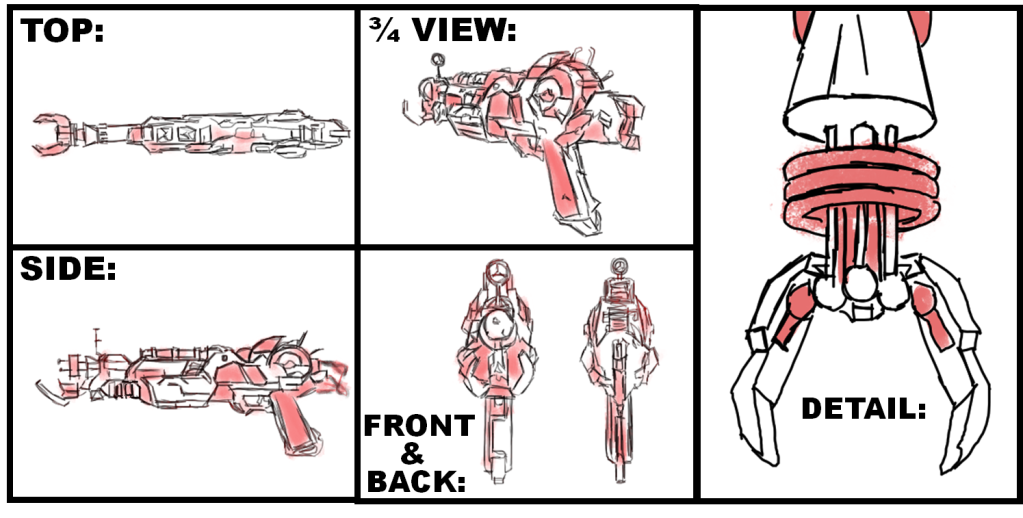
Before I could complete my final renders and beauty pass, I first had to complete concept artwork for my asset. This was to help give me an idea of staging and proportions.
Here are my completed design sketches:
I sketched 5 different perspectives of my asset: front, back, side, top, and a three-quarter view perspective. In addition to this, I also sketched an up-close view of the front of my asset, due to this area being quite complex and intricate compared to the rest of the model. It was important for me to be able to gauge the fine detail prior to completing my final renders. These concept designs allowed me to see how my weapon would be displayed when rendered and helped when modelling to get the dimensions and proportions accurate.
Beauty Render Pass:
Moving on, I began to execute a beauty render pass. I used the following render settings in Maya:
For my renders, I used the Arnold renderer – this uses mathematical algorithms to calculate how the light would naturally reflect off of my object in the real world, and so I felt as if this would look a lot more realistic than simply using the Maya Hardware renderer.
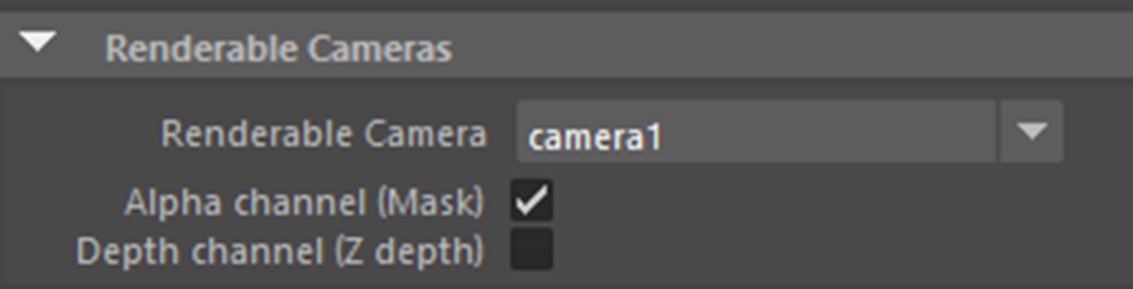
When rendering, I positioned cameras in the view that I wanted, and changed the renderable camera to whichever camera(s) I wished to render:
A good tip that I found myself using was renaming my cameras to their appropriate name to make it easier for me to distinguish between:
I setup a multitude of area lights with this “infinite” backdrop for an ambient look:
I messed around with various settings for the lights, and made some of the lights light blue to give the scene a nice dynamic shade between blues and greys.
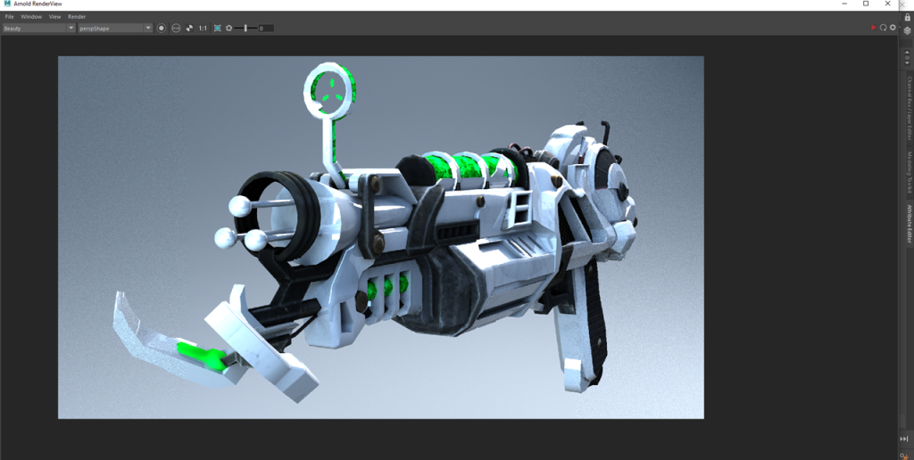
Once my render settings were setup I positioned my camera in the perspective that I wanted to view my asset for the beauty render pass:
From here, under the Arnold tab I clicked on Render:
After this, I went into the Render Settings > AOVs and selected the appropriate Active AOVs that I wanted to be able to alter within my Beauty Pass:
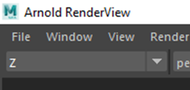
Now, within the Arnold Real-Time renderer I was able to select each AOV to display individually:
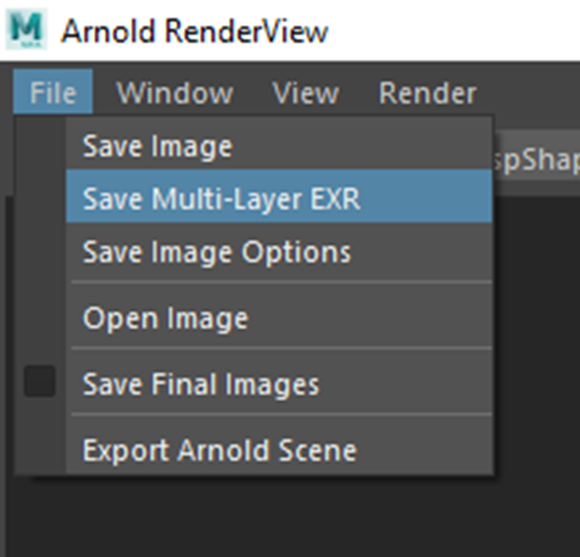
Next, I saved the beauty render as a “Multi-Layer EXR” so that I could access the individual AOV’s within Nuke:
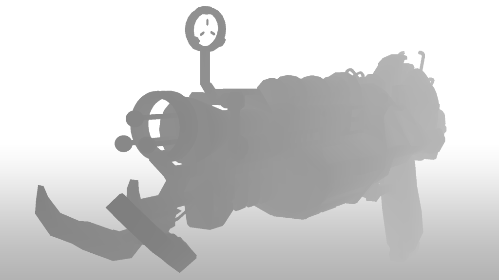
After this, I setup my Z-Pass:
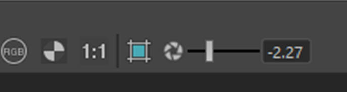
I had to lower the exposure because initially the render was plain white:
Here is what it looked like:
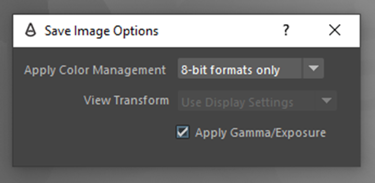
In order to save the image I had to apply gamma/exposure within the “Save Image Options”:
For some reason, when trying to save the image I kept on getting an error stating that it failed to apply the colour management options.
In order to fix this, I found that I had to go into the Maya preferences and “Enable Colour Management” and “Apply Output Transform to Renderer”:
This was the final result: (I added a backdrop from the above example)
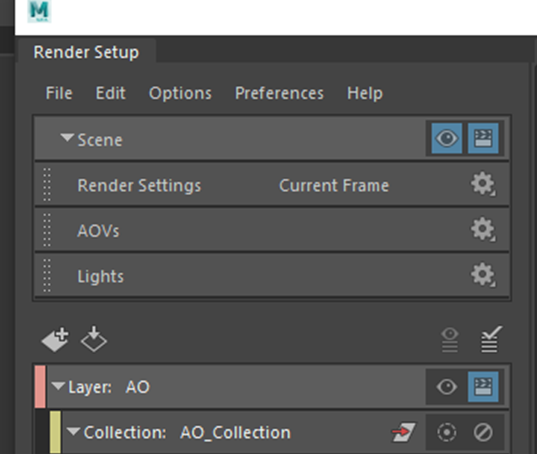
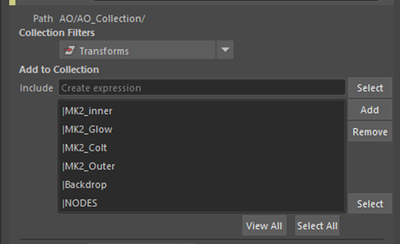
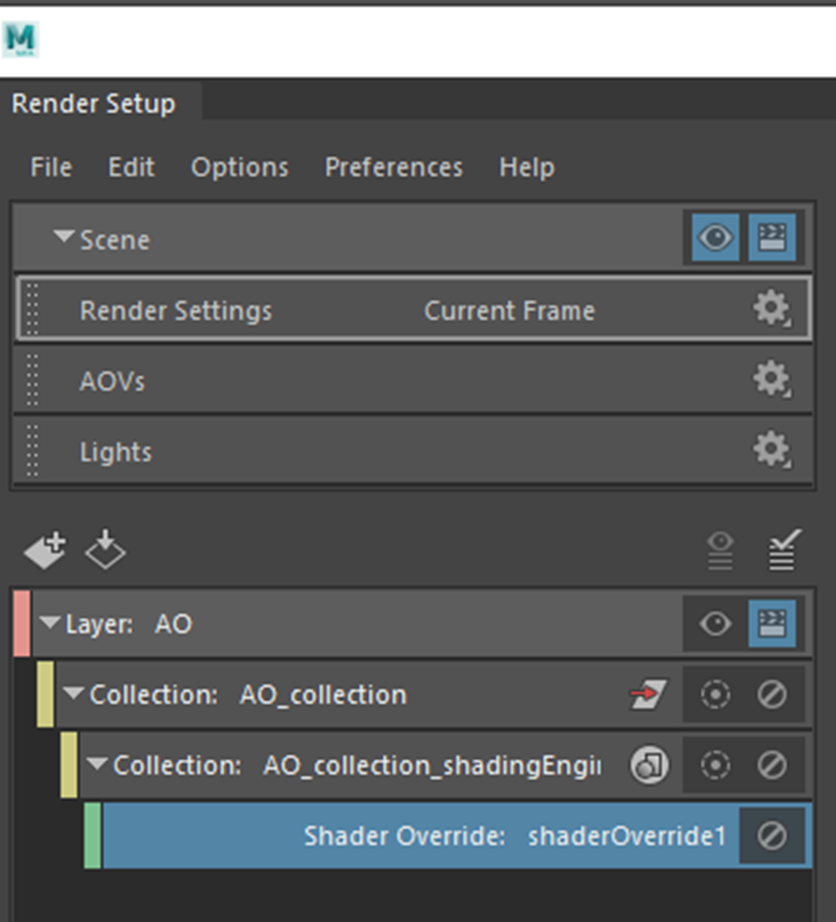
The final thing that I had to extract was the ambient occlusion. I did this by opening the Render Setup tab and creating a new render layer. I renamed it to “AO”. Next, I created a collection and renamed it to “AO_Collection”.
Then I added my asset parts and backdrop to the collection:
I set the collection filter to “transform”:
After, I created a shader override:
Then I applied “aiAmbientOcclusion”:
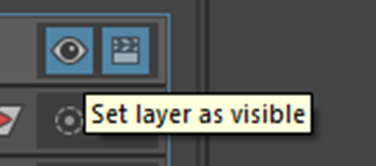
To display the ambient occlusion pass I had to click the eye to “Set layer as visible”. I could then switch between the beauty or Ambient Occlusion layers:
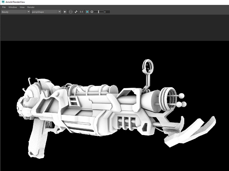
I adjusted the ambient occlusion setting slightly until I was happy with it:
Then I rendered the ambient occlusion pass. This is the final result:
I am happy with how the ambient occlusion turned out because I feel as if there is good tonality and not too many areas that are too dark.
After I had exported all of the appropriate AOV’s, I created a new Nuke script. I created a project folder and saved my script file to the folder:
I then clicked “Script Directory”:
I saved all my renders within a sources folder for my project:
I imported the files into Nuke:
From here, I changed the directory of the read nodes to start with a “../”. This ensures that should I open the file on another computer, it will still be able to locate the source:
Having set up my pipes in this way it allowed me to alter the Z-depth, specularity/reflection, coat, ambient occlusion, and emission layers individually instead of all of these attributes being grouped into one render. I used the HUE shift to slightly increase the brightness, saturation and colouration of my asset, the Z-Defocus allowed me to create an illusion of depth by using the data gained from the Z-Pass to blur the back of the weapon making it seem slightly out of focus, the glow node allowed me to add slight highlights to the reflections on my asset as if the light was reflecting from them. All my nodes were named appropriately so that I could easily follow the pass and not get mixed up.
The goal of my beauty pass was to make my asset look a bit more life-like, vibrant and look more 3-D and I have managed to achieve that pretty well with my Beauty Pass, however, due to my asset being quite up-close I think that some areas are slightly too blurry at the front of my weapon.
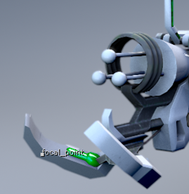
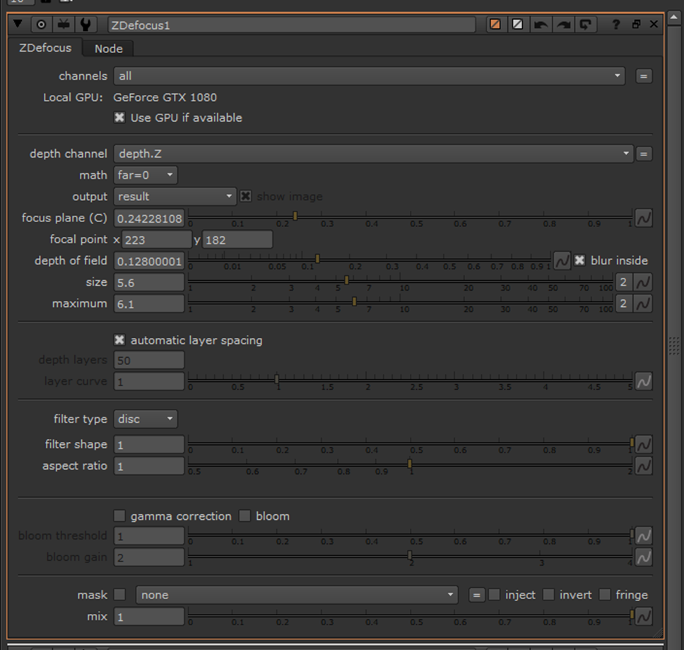
This is where I had placed the focal point for the Z-Defocus node:
This was done because I wanted the focus to be around 2/5th’s from the front of the weapon. I adjusted the focus plain, size, depth of field, and maximum attributes to achieve as close to what I wanted as possible:
Should I carry out another beauty pass in the future I think I will practise more with using the defocus node to try and master this feature.
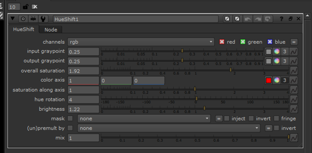
These are the settings that I used for the HueShift:
I only used the HueShift to minimally adjust the colour of my scene and make it a bit brighter/vibrant without over-doing the saturation.
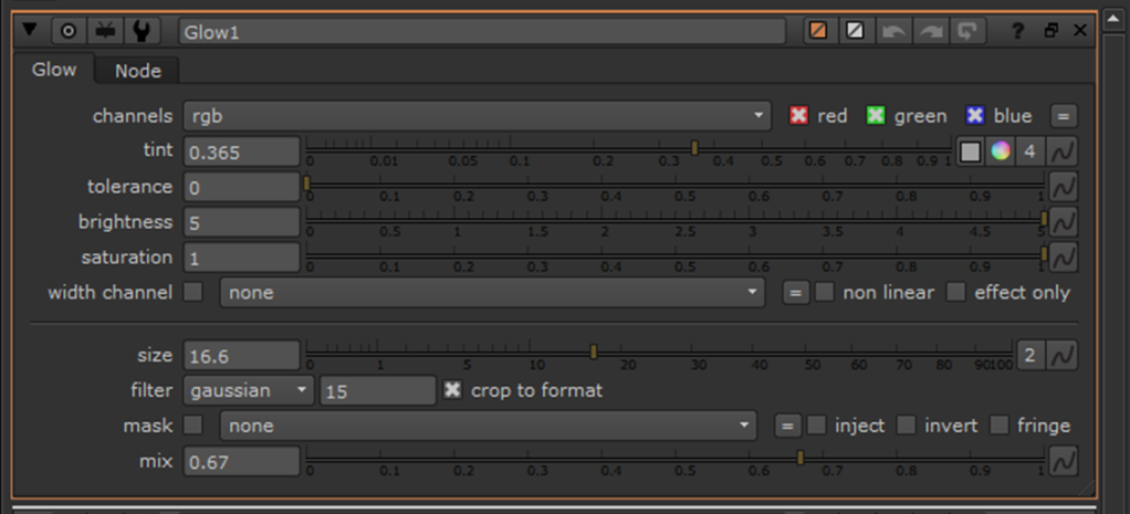
These are the settings that I used for the Glow:
Once I was fairly happy with the beauty pass, I created a write node to render the pass and attached this before the viewer:
Within my “Write” properties I set the output to “PNG” 1920x1080p and made sure that the colourspace was set to “sRGB”:
These are two different renders that I carried out:
In my own personal opinion, I prefer the first render. This render has greater reflectivity on the green glow and a slightly “grittier”, darker look; it looks more realistic than the second one, of which looks more like a toy gun. In the future, I think that I need to slightly better fine-tune the defocus and maybe position my asset and a sharper angle, however, that would be difficult with a thing weapon.
Here are the individual AOV’s for my asset scene:
Beauty:
Z-Pass:
Ambient Occlusion:
Coat:
Specular Direct:
Specular Indirect:
Diffuse:
Shadow Matte:
Final Renders:
These are all of the final renders that I carried out for my asset:
I am happy with the results of these renders, apart from the reflections of the trees from the HDRI image, however, I love the cold/icy look that the HRDI encompassed. I increased the reflectivity of the backdrop for the last render to give a slight reflection of the asset. Despite me liking this look, I felt like the blue reflection took away the default colour scheme of the weapon so I decided to carry out some further renders that I prefer to the above.
The rest of the renders were using Arnold Area lights and an infinite backdrop:
Top:
Underneath:
Ultimately, I am extremely happy with how my asset turned out and I think that it is a great first start. I managed to achieve the sleek, refined look that I wanted to make the weapon look more futurist. Some of the modelling techniques took a little while to master but having completed this asset I feel confident to take on similar projects in the future with better efficiency. I think that my asset could be somewhat improved with further attention to detail on the smoothness of the sides/top of my weapon, however, the weapon would most likely be used in a first-person shooter game where that wouldn’t be noticeable and it certainly wouldn’t be noticeable in a third-person shooter game. My favourite part of my asset is the black/white/green colour scheme, of which I feel really helps the weapons’ details stand out from one another and the green plasma blends perfectly. The textures could’ve been slightly higher quality, however, I got them from Black Ops 2 that released in 2012, so it’s understandable that they are a bit out-of-date. Despite this, it’s practically unnoticeable unless you’re quite close to the weapon, and once again no one would notice this in a video game. Furthermore, super-high-resolution textures would be a waste unnecessary memory that wouldn’t make much of a difference to the player.
Detail Renders:
A critique of the fine detail of my asset is the number of polygons used, however, like I stated earlier the weapon would likely only be used in a video game where the player would never be able to get super close to the weapons in-game. Games also struggle with memory issues so they try and save as much space as they can where possible, so I think fine detail in this scenario would be an unnecessary waste of game memory because no one would actually see it. The detail renders also display some of the bump maps of the textures to give it a more 3D look.
To conclude: throughout the course of this module my 3D modelling skill-set within Maya has improved tremendously. I now have the knowledge to apply textures, understand UV unwrapping/editing, overcoming problems, building complex assets from simple shapes, and I overall understand the Maya interface a lot better to help streamline my work. I now know what to avoid when it comes to texturing, using low-resolution images, obvious repeating of textures where the sides don’t match, and more. I have a basic understanding of how bump maps work, however, I used a texture from online so I had little practice with creating my own. In my spare time, I shall further practice this and my other learned skills in Maya to better refine my techniques for future projects. This module also helped me have a better understanding of staging with the concept designs, proportions, and lighting. I think that I have greatly improved at understanding good/bad lighting setups with Maya, especially using Arnold, and using HRDI images. All of these new techniques can be applied in next years modules.
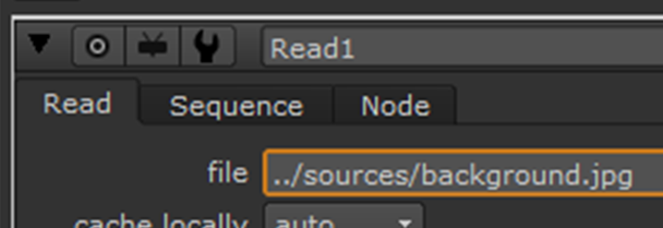
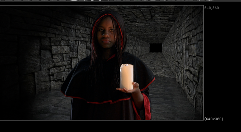
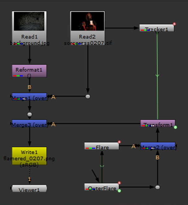
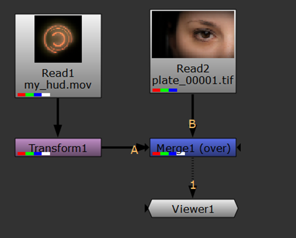
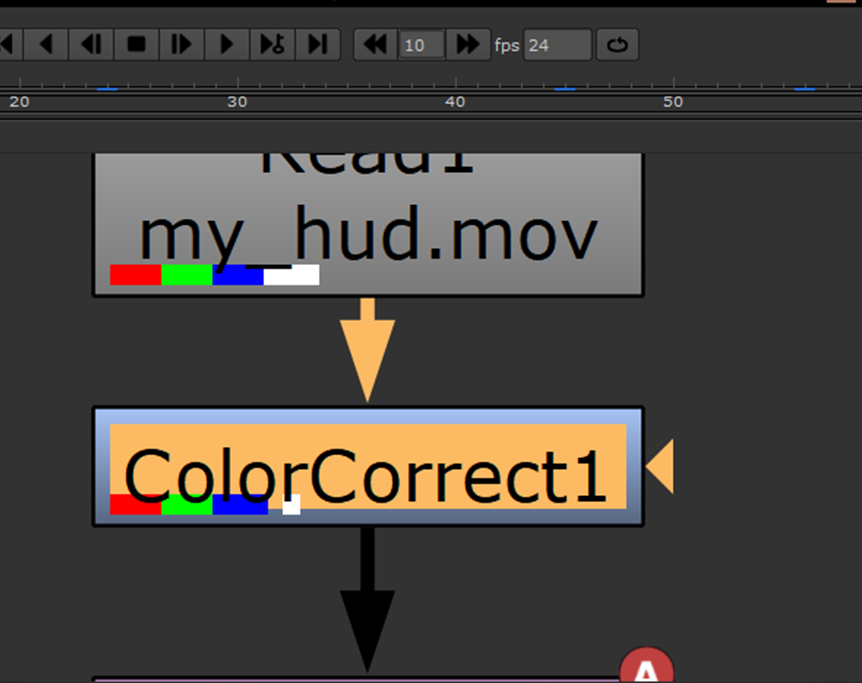
For our very first task, we had to complete a one-point motion track to allow us to add a larger flame to the candle that this woman is holding:
The first thing that I did was imported the provided source files into Nuke:
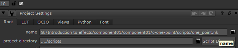
After this, I saved my script file to the project folder:
I then clicked “Script Directory”:
From here, I changed the directory of the read nodes to start with a “../”. This ensures that should I open the file on another computer, it will still be able to locate the source:
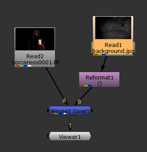
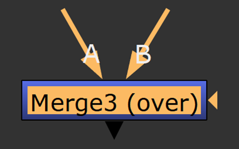
Next, I created a merge-over node and a reformat node:
I connected the pipes in this fashion, with the foreground being A, over the background- B:
I changed the format of the forground to match the background (640×360):
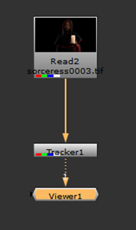
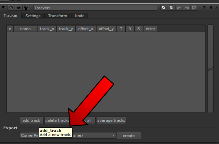
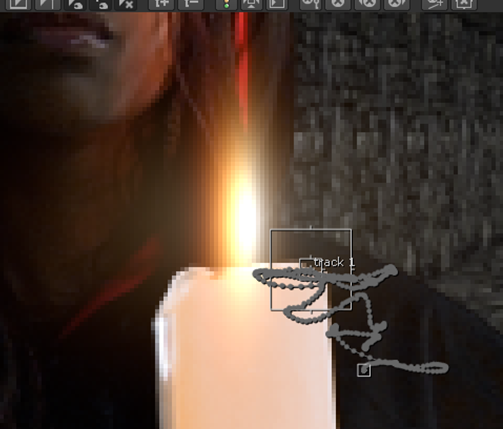
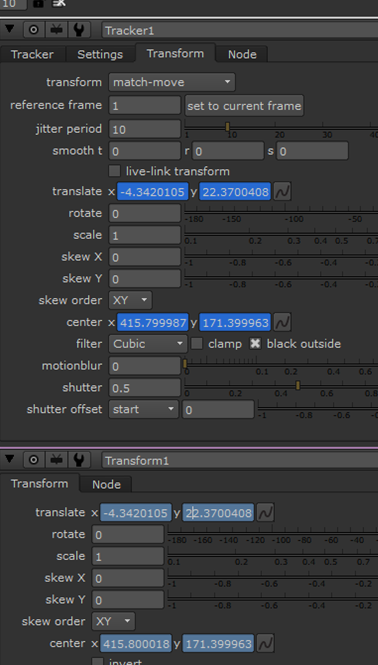
After this, I created a tracker node. This was to help me track the motion path of the candle that the girl is holding:
I separated the foreground from the background so that the tracker would just target that and attached it to the viewer:
After this, I added a track in the tracker’s properties:
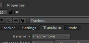
I set the transform settings to “Match-Move”:
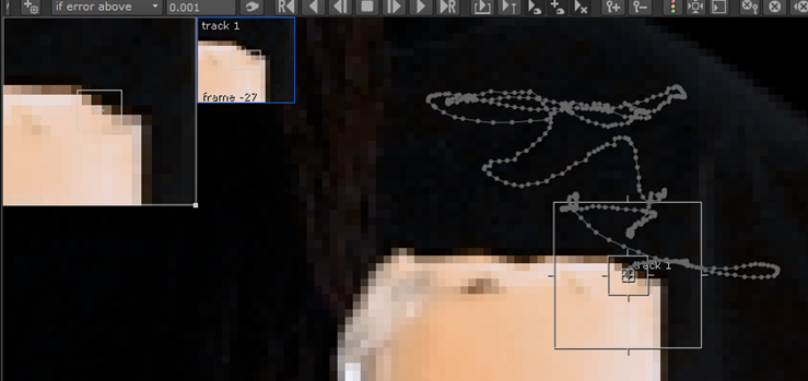
I tried to find an area of contrast on the image that would be the best place for the tracker box. I decided that the top right of the candle would be a good spot since there’s a heavy contrast between light and dark. High contrast helps increase the chances of performing a good track, as it’s easier for the algorithms to follow:
Once I positioned my tracker, I then clicked on “track_to_end” to start the tracking process:
After this was complete, I skimmed through the timeline checking if the tracker stayed in relatively the same place throughout; luckily it did. If it didn’t, I would’ve had to change the positioning along the way and re-track.
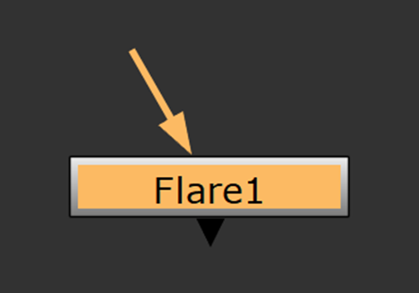
Next, it was time for me to add the flare to create the flame on the candle:
I created a merge node to preview the flare and I attached it to the A pipe:
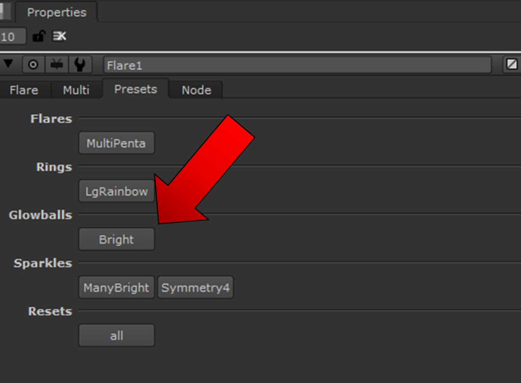
Within the properties, I headed to the “Presets” tab and clicked on “Bright”:
I moved the position of the flame to the middle of the candlelight and then adjusted the settings, such as the size multiplier, anamorph, ring colour, outer/inner falloff etc. until I was happy with how the flame looked:
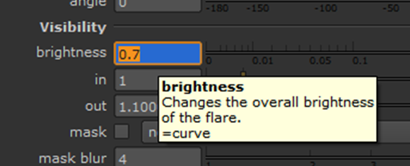
After this, I animated the brightness properties ever so slightly to create a “flicker” effect. To do this, I simply change the properties of the brightness around every 20 frames, alternating between highs and lows, and I set a key-frame at each point:
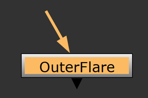
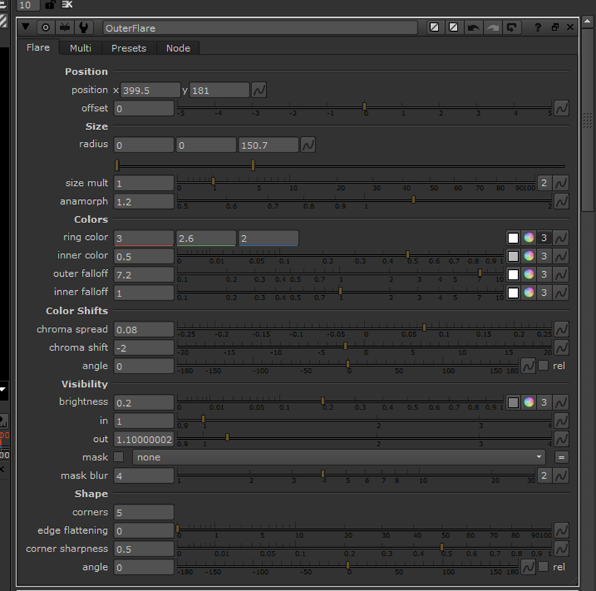
One I finished doing this, I created another flare node and renamed it to “OuterFlare” so that I could distinguish it to the main flare. This flare would simply act as an outer glow to the primary flare:
I messed around with the settings until I got a result I was happy with:
After this was done, I linked the outer and main flame’s brightness attributes together. I did this by holding “Ctrl” and dragging the brightness animation from the main flame to the brightness animation of the outer flame:
This created a green pipe linking the two:
From here, I altered the brightness for the outer flare at each of the keyframes to refine the glow.
Following on, I created a transform node and another merge node:
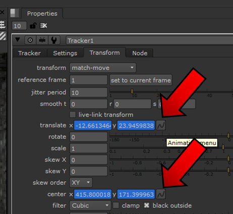
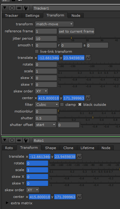
After, I held down “Ctrl” and dragged the translate and centre properties from my tracker to my transform node:
This created a link between them so that my flame would follow the motion that the tracker tracked.
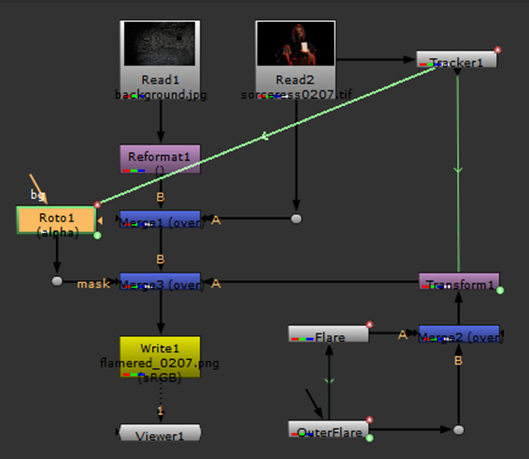
To continue, I connected all of the pipes together to what I had before and used dot nodes to keep everything ordered and make it easier to follow:
This is how I set everything up:
(I had also created a Write node for rendering the project once complete that I’ll explain in a second)
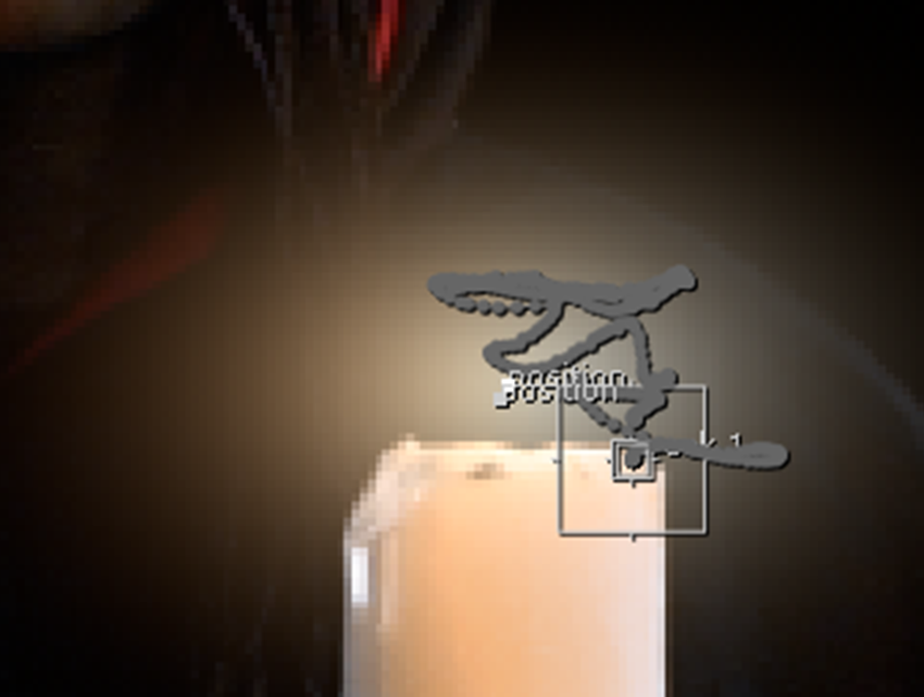
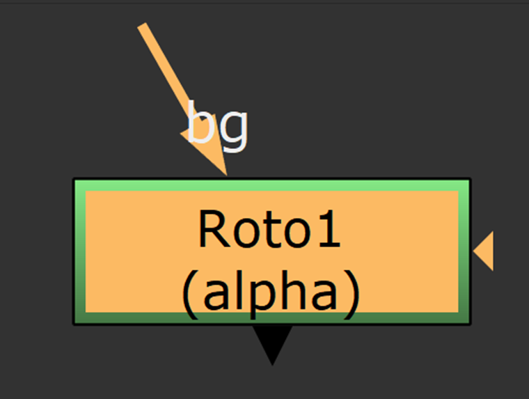
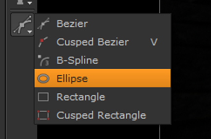
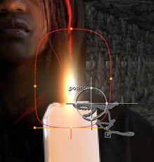
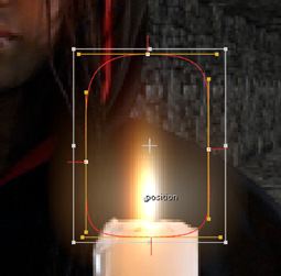
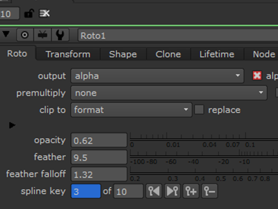
Once all of this was set up, my project was pretty much complete. The last thing that I did was I added a roto-node:
I masked this to my merge 3:
I created an eclipse around the glow at frame 1:
I positioned the eclipse to start at the base of the candle so that the glow wouldn’t spill down:
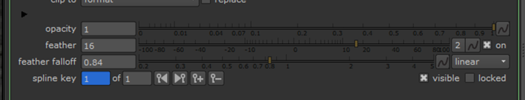
I feathered my ring to smooth the glow:
After this, I once again held down “Ctrl” and dragged my translate and centre properties from my tracker down to my roto. This was obviously to create a link so that it would follow the track:
After this, I adjusted some of the key-frames that were slightly out of place.
This is my final pipe setup:
Now that the project was complete, it was time to render. Like I said earlier, in order to do this I had to create a “Write” node:
I attached this right before the viewer:
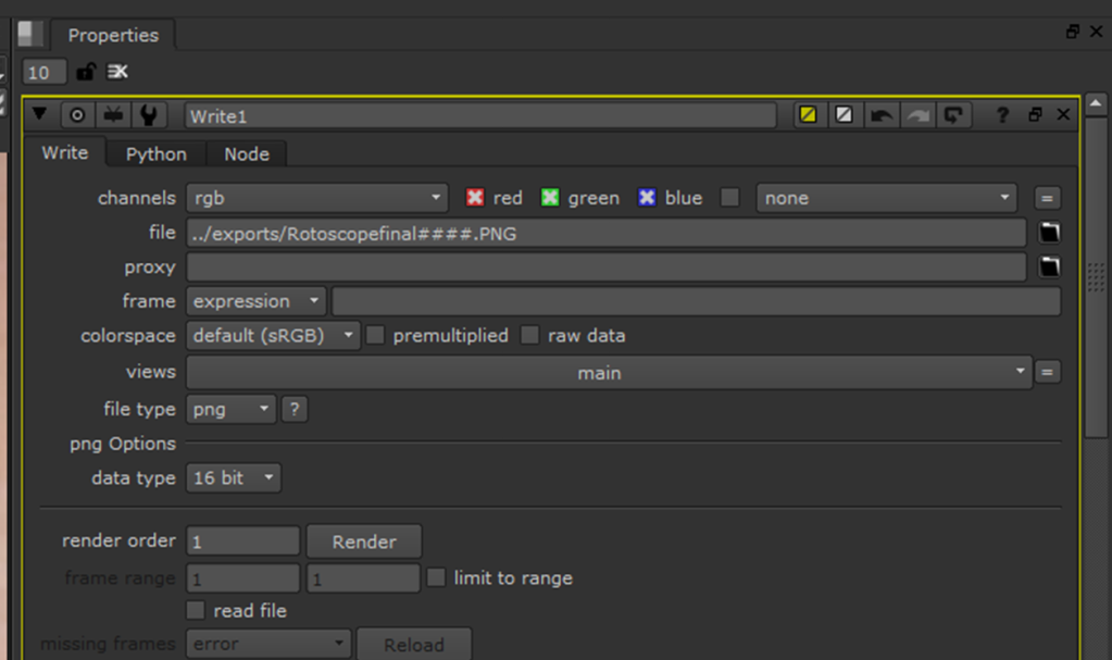
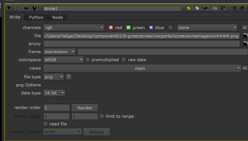
Within my “Write” properties I set the output to “PNG” and made sure that the colourspace was set to “sRGB”. This was so that I could render an image sequence, as when I tried to render in .mov, it wasn’t working for some reason (I think my computer didn’t have the right codec installed). I set the output location and added “####” to the end of the name so that each frame wouldn’t just write over the same file and each would be consecutively numbered:
Finally, I clicked render and made sure that all 400 flames would be rendered:
Here is my final render:
Task B: Two-Point Motion Track:
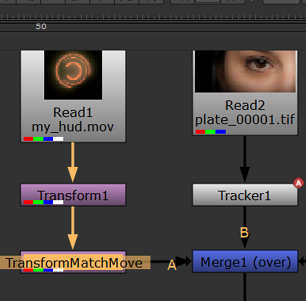
For our next task, we had to animate a sci-fi inspired contact device on-top of an eye. First, we had to create a two-point motion track so that we would have to do less manual key-framing.
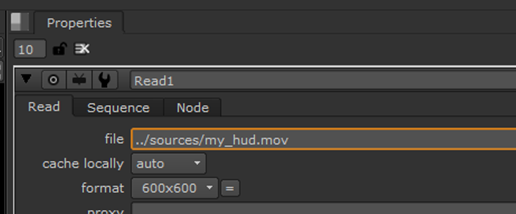
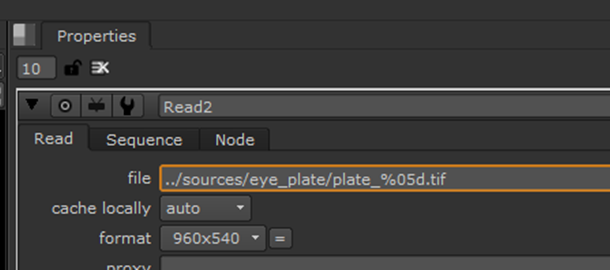
The first thing that I did for this task was I imported my source files into Nuke:
After this, I saved my script file to the project folder:
I then clicked “Script Directory”:
From here, I changed the directory of the read nodes to start with a “../”. This ensures that should I open the file on another computer, it will still be able to locate the source:
After, I created a merge-over node and a transform node:
I connected the pipes in the following fashion, with the hud being A, over the plate – B:
I used the transform node to reposition and scale the hud over the centre of the eye:
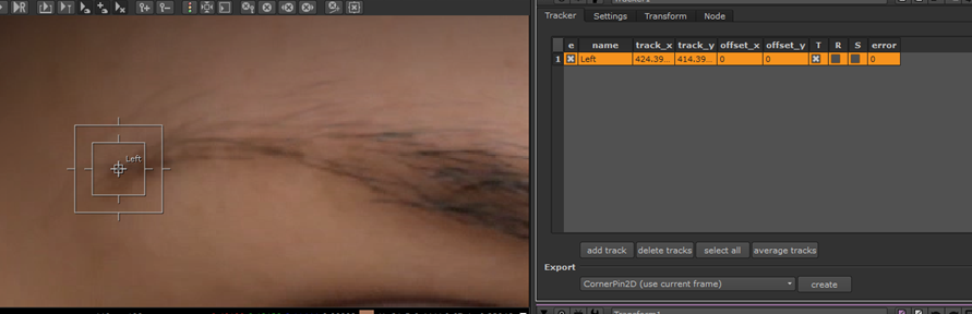
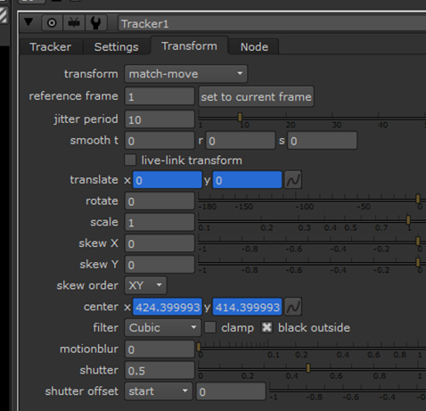
Once complete, I created a tracker node that I would use to follow the motion path of the face to animate the eye’s lense:
I created a track and labelled it “left” and positioned it on the left of the eyebrow. I tried to find an area of contrast on the image that would be the best to place the tracker box. I decided that this would be a good spot since there’s a heavy contrast between light and dark. High contrast helps increase the chances of performing a good track, as it’s easier for the algorithms to follow:
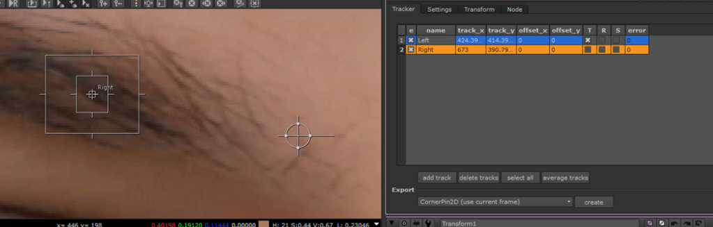
Since the face is moving in position, rotation, and scale, I created a second track that I labelled “right”. I placed this on the right of the eyebrow:
I set to the two tracks to “Match-Move”:
I then highlighted both of them and clicked “Track-To-End” from frame 1:
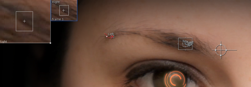
After the tracking was complete, I skimmed through the frames to ensure that the tracks stayed in relatively the same place throughout:
Luckily they did so I didn’t need to make any adjustments.
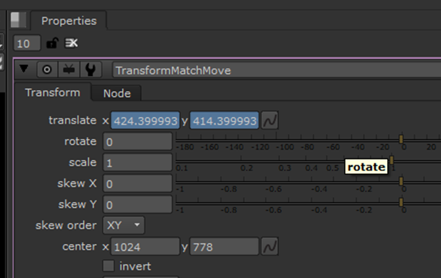
Next, I created another transform node and renamed it to “MatchMove”. I attached the pipes as so:
The purpose of the transform node was to match the movement that I just tracked. In order to do this, I linked the transform to tracker 1:
This created a green pipe linking the two:
After this was complete, I went through and manually adjusted some of the keyframes that were out of place until I was happy with how it looked.
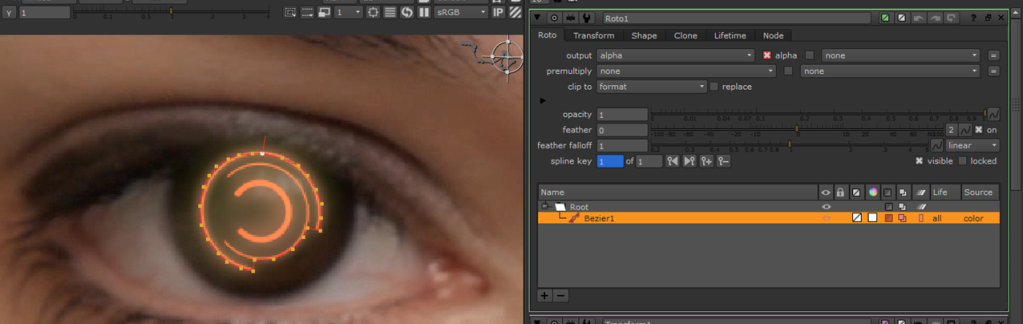
Task C: Travelling Matte Rotoscope:
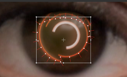
Once that process was complete, it was time to move onto the rotoscope. The sci-fi contact lens cuts over the top of the eyelid, and obviously, it shouldn’t show up when the eye blinks. To fix this, I had to create a travelling matte rotoscope to achieve the final look.
The first thing that I did was attach a rotoscope node with the BG pipe connected to merge 1:
Using the bezier tool, I began to mark around the contact lens.
With the properties, I applied feather and slight opacity to give the hud a more realistic look and blend into the eye.
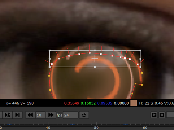
I animated the rotoscope by slowly making my way through the important frames and cutting my hud. The software interpolates in between the frames:
When moving through the frames, I could select the whole bezier and then just move it into position. Then I could adjust individual or multiple handles:
The most important part was to track the motion when the eye blinks. This needed the most keyframes, as there was more sudden movement here than the rest of the video, and so the interpolation wouldn’t work as well:
Once I was finished with the rotoscope, I began to colour correct the scene.
I added a “grade” node to adjust the white and black points of the hud, as it was too bright for my liking:
I positioned two colour correct nodes as so:
These were to adjust the saturation levels. I turned down the hud’s saturation more than the face so that they would match:
I did think of applying a reflection to the HUD, but since I had already made it opaque, it already picked up the eye’s reflection.
After I was complete with this task, I created a “Write” node and positioned it above the viewer. I adjusted the properties to be a 16-bit PNG output image sequence.
Finally, I rendered the scene.
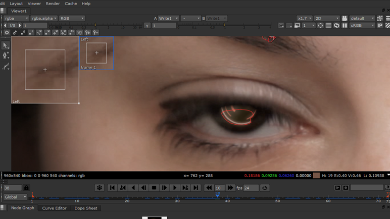
This is what my final pass looks like:
Here are my final renders showing 3 colour correction styles (I tested out a few other colour correction styles too, but these were ultimately my favourite):
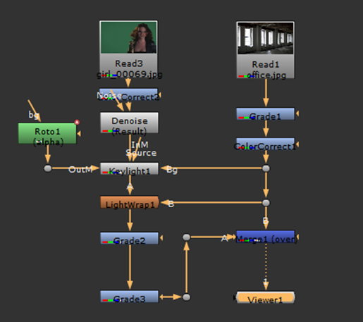
Task D: Greenscreen Removal & Composite:
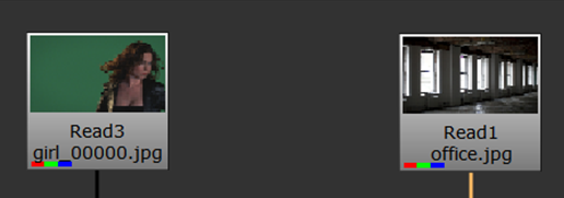
Moving on, for the fourth task we had to appropriately key a green screen of a woman over a background.
The first thing that I did for this task was I imported my source files into Nuke:
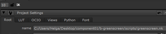
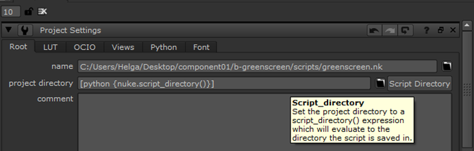
After this, I saved my script file to the project folder:
I then clicked “Script Directory”:
From here, I changed the directory of the read nodes to start with a “../”. This ensures that should I open the file on another computer, it will still be able to locate the source:
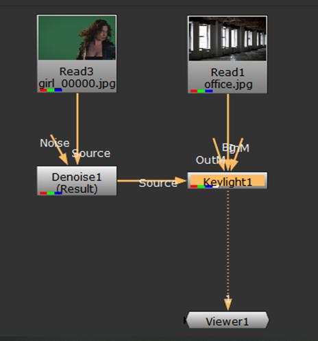
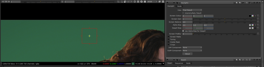
After setting up my project, I imported a denoise node to reduce the grain on the green screen and I also imported a Keylight:
This is how I assigned my pipes, with the background being connected to the BG Keylight pipe:
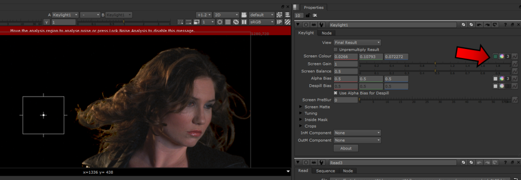
To select the key colour, I clicked this button in the keylight attributes:
This allowed me to use the eyedrop tool to select an area from the greenscreen to key from:
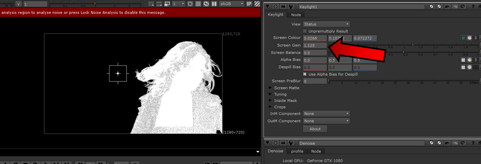
To select a key, I pressed “Ctrl + Alt + Drag” on my screen in an area that I felt best to fit a marque. To check how well my selection was, I changed the view in the key-light to “Status”:
Once I was happy with my selection, I simply pressed the eyedrop button again to finalise it:
To reduce the noise, I simply increased the gain:
Status and screen matte were useful so that I could check if I was erasing too much fine detail from the hair:
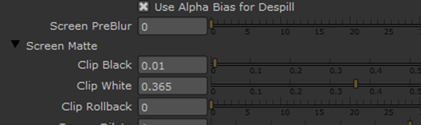
To refine the matte, I used the clip black and white tool:
I slightly turned up the screen softness to smoothen the edges ever so slightly:
Once this was done, I created a root node and attached it to my key light. This is to remove any unwanted area of the matte…
…connected to the OutM Keylight port:
Using the rectangle tool I drew around the subject:
I applied slight feather to it:
I ensured that the girl stayed within the area throughout.
Then I set the Crops – OutM Component property in the Keylight to “Inverted Alpha”:
Now, I removed the spill on the girl. To do this I selected the Alpha Bias eyedrop marker in the Keylight properties:
Then, like before, I pressed “Ctrl + Alt + Drag” on my screen in an area of the edge of the girl that had slight spillage. After I was happy with it, I clicked the button again.
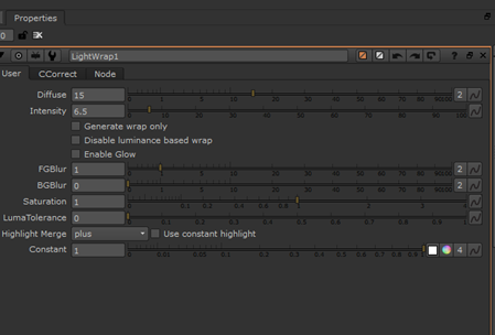
Moving on, I added a light-wrap node:
I adjusted the diffuse amount and intensity:
This was animated:
Once this was done, I moved onto the colour correction and applied grade and colour correction nodes as such:
The grade tools allowed me to select the black/white points from the image using the eyedrop to match up the two subjects, as well as gain, lift, offset etc.:
I also adjusted the gamma:
I used the colour correction to increase the saturation, with the background being more saturated, so that the woman and background would match. I adjusted the contrast, gamma, gain and other options too:
I tried out a few different colour correction looks:
In the end, I ended up settling for a darker tone.
Now, it was time for me to render, so I connected a “Write” node to my viewer:
I set the output destination and format to .PNG to export an image sequence:
Finally, I rendered my file:
Here is my final pass setup:
Here is my final render:
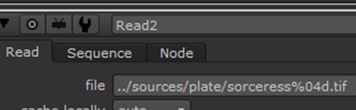
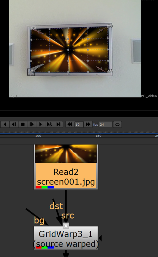
Task E: Four-Point Motion Track:
Finally, the last task was to complete a 4-point motion track. This was fairly straight forward, however, the provided footage was quite poor quality, of which made it a little more difficult to track.
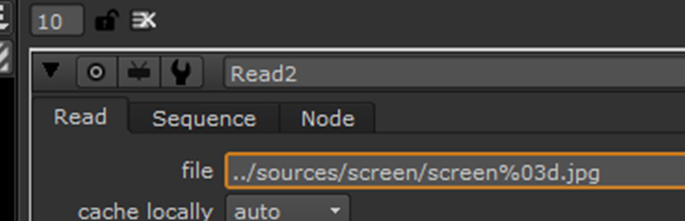
The first thing that I did was I imported the provided source files into Nuke:
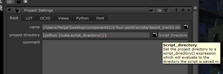
After this, I saved my script file to the project folder:
I then clicked “Script Directory”:
From here, I changed the directory of the read nodes to start with a “../”. This ensures that should I open the file on another computer, it will still be able to locate the source:
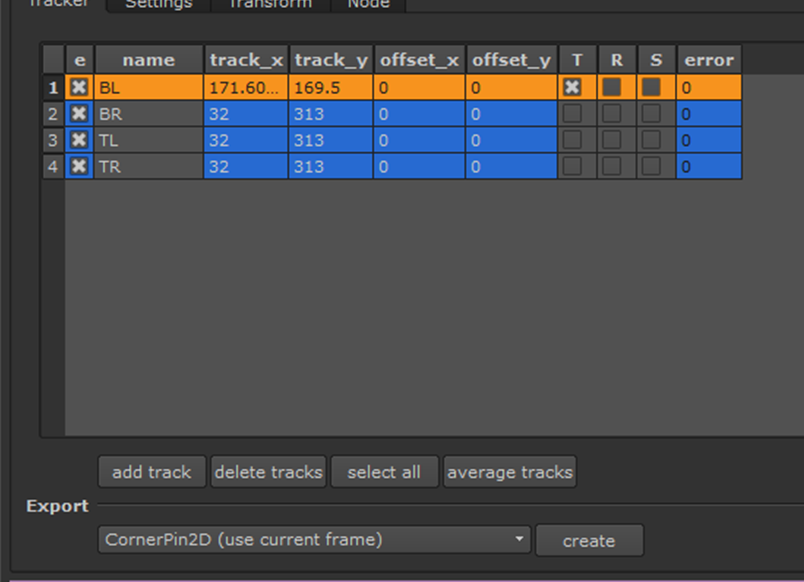
Once my project was ready to go, I created a tracker and attached it to the plate:
From here, I created a track and labelled it as bottom left:
I positioned it in the bottom left-hand corner of the TV screen where I felt like there would be a good contrast to make it easier to track.
I repeated this until I had created a tracker for every corner:
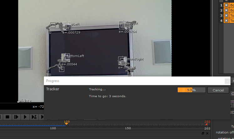
After complete, I highlighted all four of the tracking points and clicked “track to end”:
The software then began to track the screen:
Once it was done, I skimmed through the timeline seeing if each of the tracking points stayed in relatively the same position throughout. During the end of the clip, the tracks lost their position due to the zoom in and out, so I had to re-position the markers there and re-track, but it was fairly simple to solve.
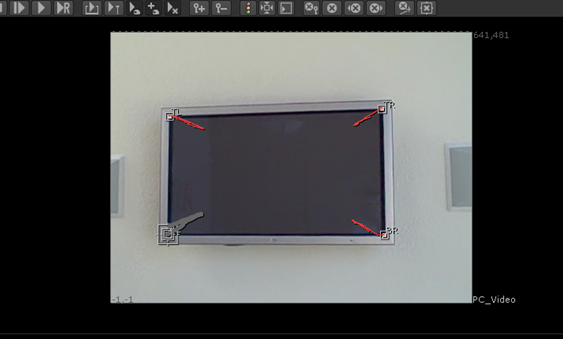
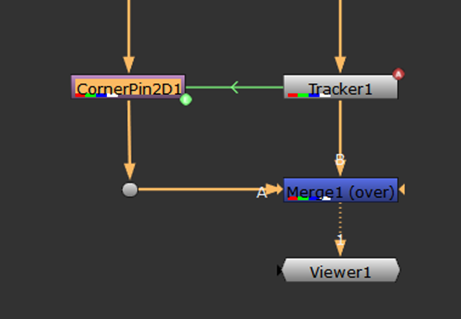
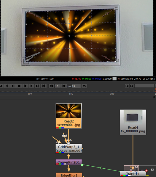
I then added a merge node. I connected the pipes in this fashion, with the plate being A, over the screen – B:
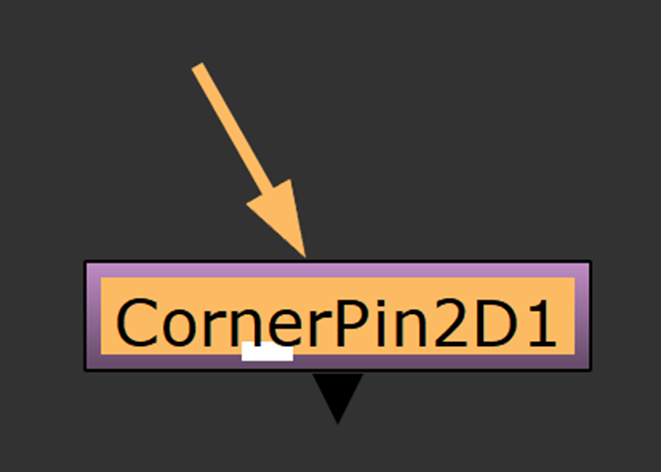
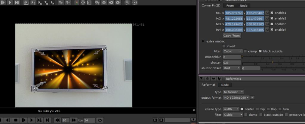
After this, I created a CornerPin node:
I attached it to my Read 2 using a “Dot” to keep my pipes tidy:
Within the properties, I linked each corner to each of the trackers. Naming them helped me identify which is which:
It looked like this once they were all linked:
After setting this up, I skimmed through the timeline to make sure that my corner pin worked throughout; luckily it did.
This created a green pipe linking the corner pin and the tracker:
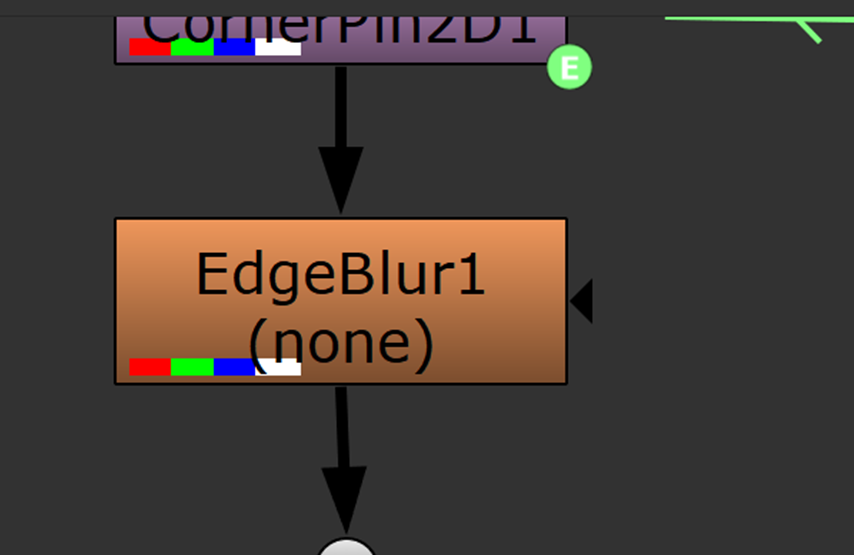
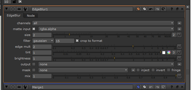
Next, underneath the corner pin I added an Edge Blur node:
This is so the plate can blend in nicely with the screen. Within the properties, I changed the size to “2”. I didn’t want it to be too high, otherwise, it wouldn’t look natural:
In addition to this, I added a “Grid Warp” node to my plate so that I could refine its shape throughout the corner-pin track:
I animated it throughout making slight adjustments to give it a slight bevel effect:
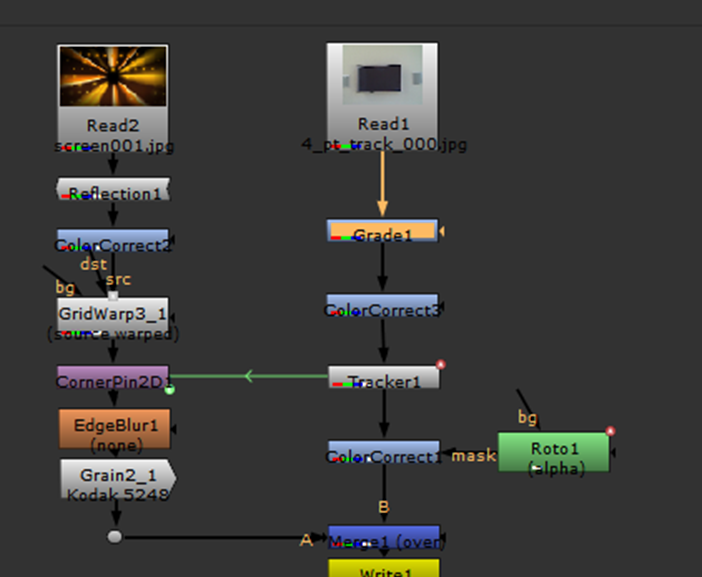
Once my plate was properly assigned to the screen, I began to refine the visuals with colour correction. I created a colour correct node and masked a roto to it:
I gave the screen a slight yellow tint and made the feathering high to make it seem like the light is being shone from the screen.
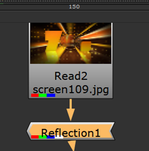
I then added a reflection node so that the screen would be able to retain the original reflection from the screen, otherwise, it wouldn’t look real:
After this, all that was left to do was finish off the colour correction.
I added grade and colour correct nodes to the following areas:
I adjusted the saturation and contrast of the screen/matte so that they would appear to have been shot from the same camera:
Using the grade nodes I altered the black/white points:
I messed around with the gamma to see what various different “looks” would look like, but since the footage was so poor quality colour correction didn’t really help it all too much.
Once I was happy with the colour correction, I added a write node to the viewer:
I set the output destination and format to .PNG to export an image sequence:
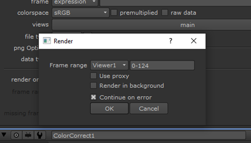
Finally, I rendered the sequence:
Here are my two final renders using two different colour correcting styles: